Timeless Interior Design for the Year Ahead
January always brings that craving for a reset. You’ve reorganized the pantry, bought a new planner (that you’ll forget about by March), and maybe even signed up for a yoga class. But what about your home - the space you actually live in every day?
This is the perfect moment to look around and ask: Does this space still reflect who I am and where I’m going? Instead of chasing the latest trend (hello, mushroom-inspired everything), consider investing in something with staying power: timeless interior design. The kind of design that makes your heart skip every time you walk through the door, even years later.
Why Timeless Interior Design Works Year After Year
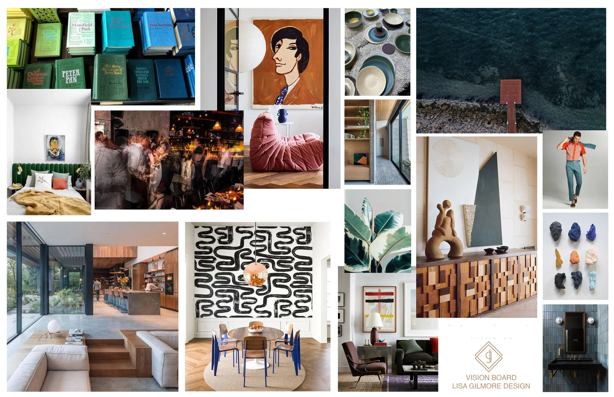
At Lisa Gilmore Design, we believe your home should tell your story, not echo the latest trend carousel. Timeless interior design, to us, means creating spaces so rich in personality, soul, and craftsmanship that they never feel outdated - just you, elevated. We’re talking layered textures, bold choices, thoughtful details, and a design so good it still makes you smile 5 years from now.
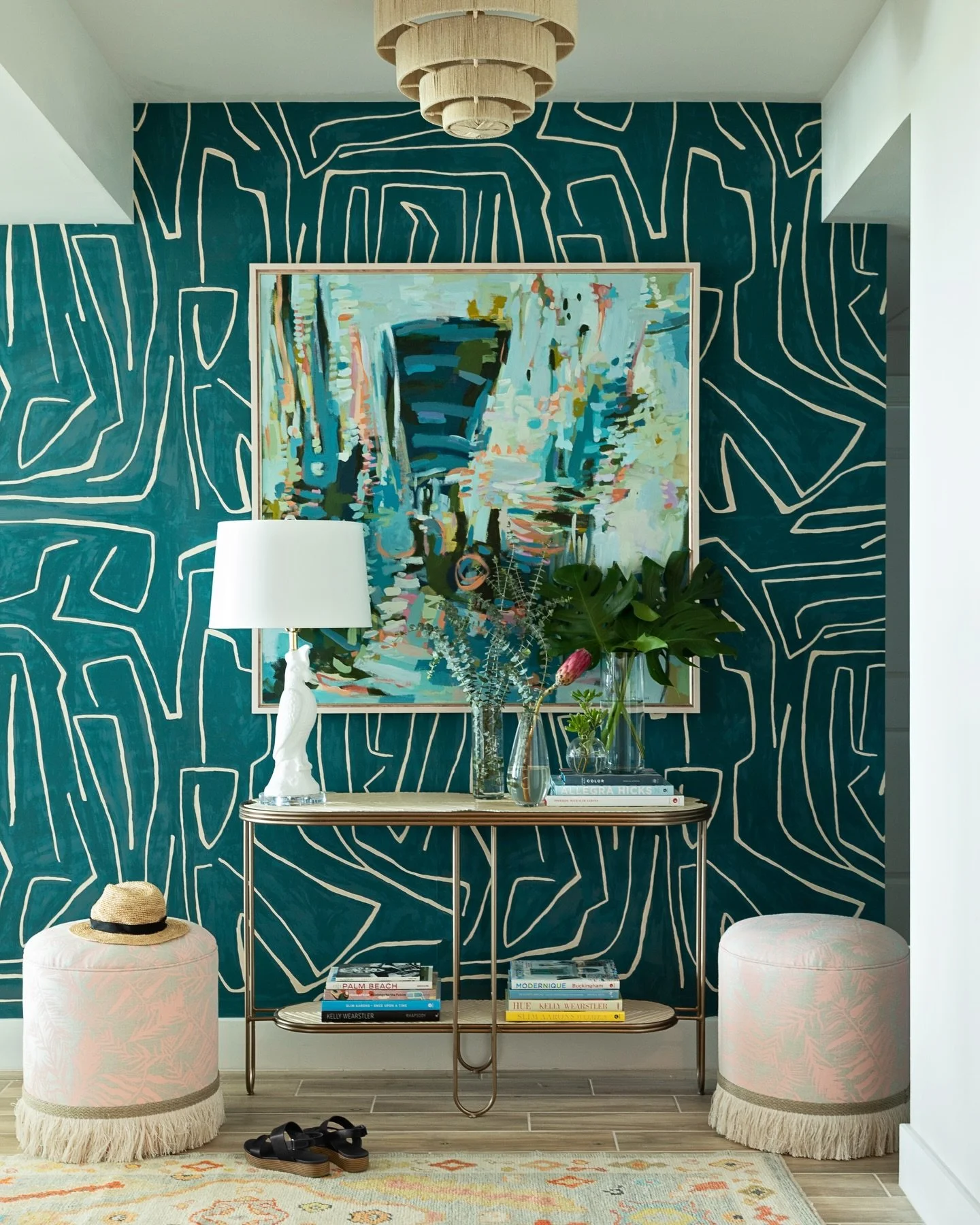
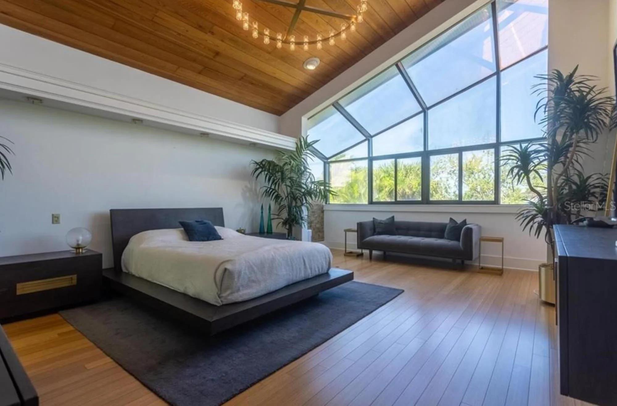
photo: Mid-Century Modern Reno - Lisa Gilmore Design, St-Petersburg
What Makes a Design Timeless?
At Lisa Gilmore Design, we believe timeless doesn’t mean tame. It means tailored. It’s a design that evolves with you, not one that begs for a makeover every time a trend fizzles out.
Here’s what timeless interior design means to us:
Quality over quantity. Think natural stone, real wood, and fabrics that feel like a hug.
Color with purpose. Whether it’s deep emerald or soft blush, the palette is curated, not chaotic.
Details that delight. Custom millwork, architectural interest, layered lighting—things that make a space yours.
A strong point of view. Cookie-cutter isn’t our thing. A timeless home reflects you, not Anthropologie’s greatest hits.
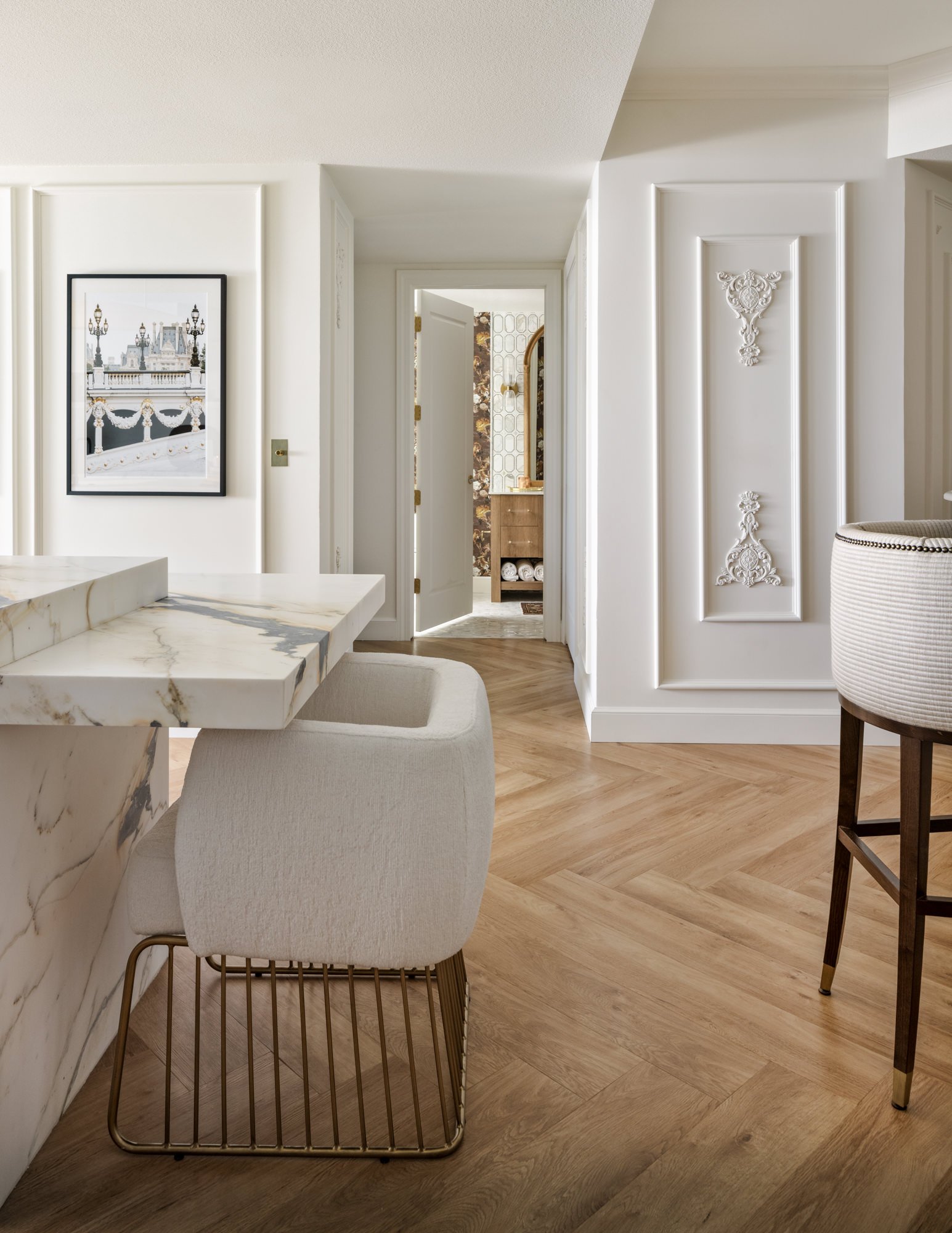
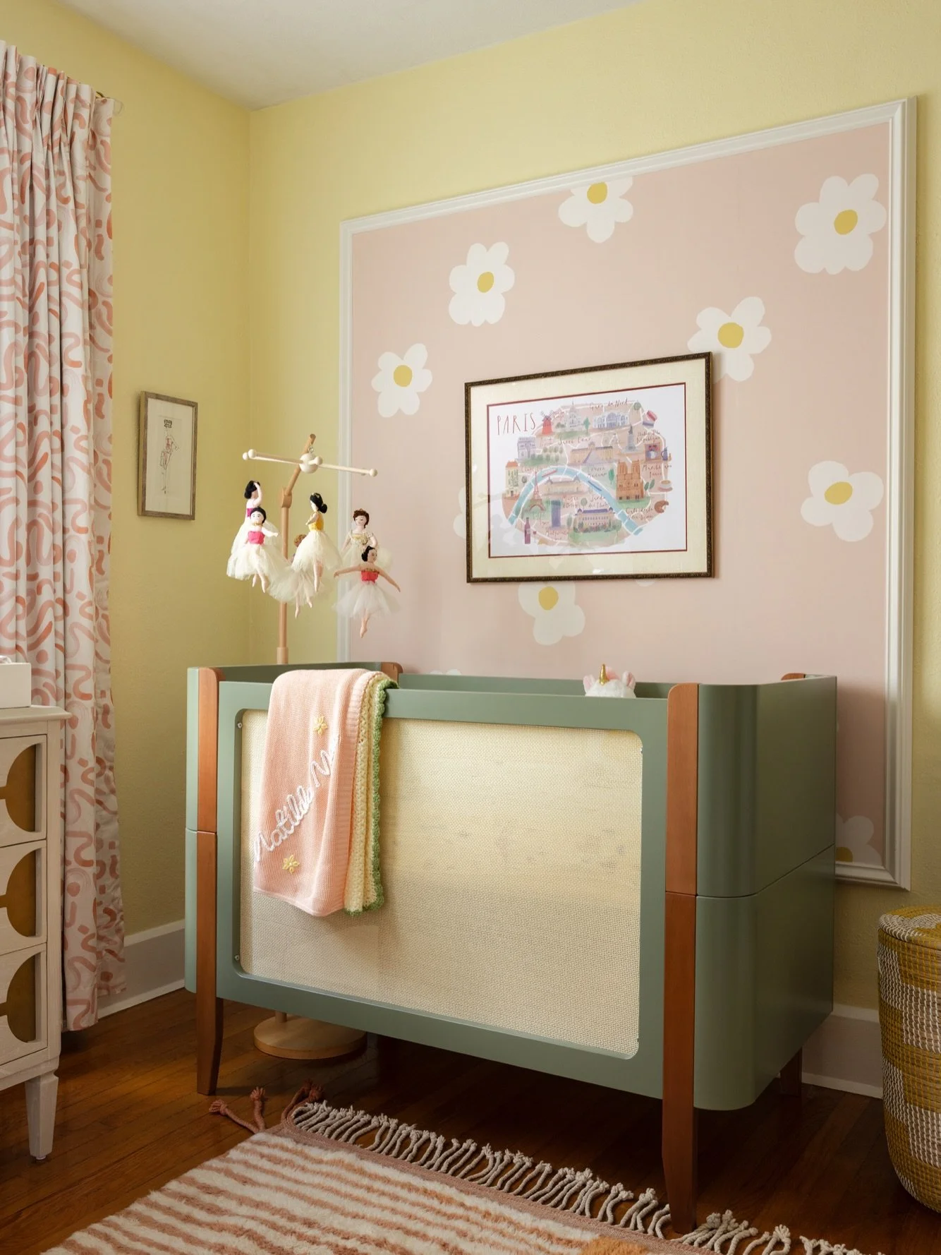
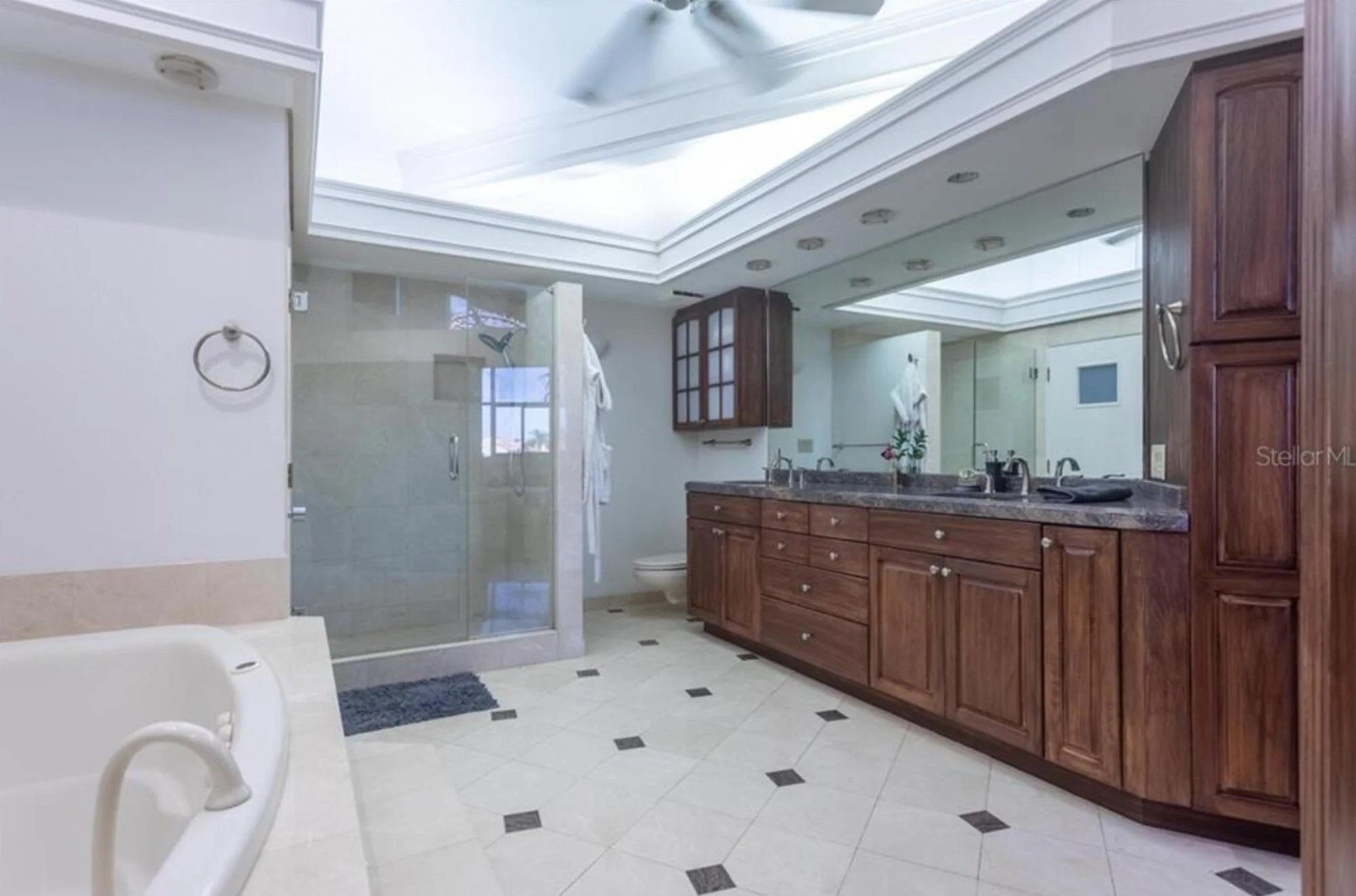
photo: Parisian Condo Reno - Lisa Gilmore Design, Tampa
With good design bones - balance, harmony, proportion - you can add, tweak, and refresh without losing the magic.
How Lisa Gilmore Design Approaches Timeless
We don’t do one-size-fits-all. We do you, dialed up to “wow.”
At LGD, timeless doesn’t mean playing it safe. It means designing a space that feels like the best version of your life - now and in the future. That starts with getting to know what you love, how you live, and where we can stretch your comfort zone just enough to make things exciting.
We’ve worked with clients over years and across homes, designing spaces that grow and evolve with them. From bold wallpaper in a powder room to a dream kitchen years in the making, the common thread is always this: design with staying power and serious personality.
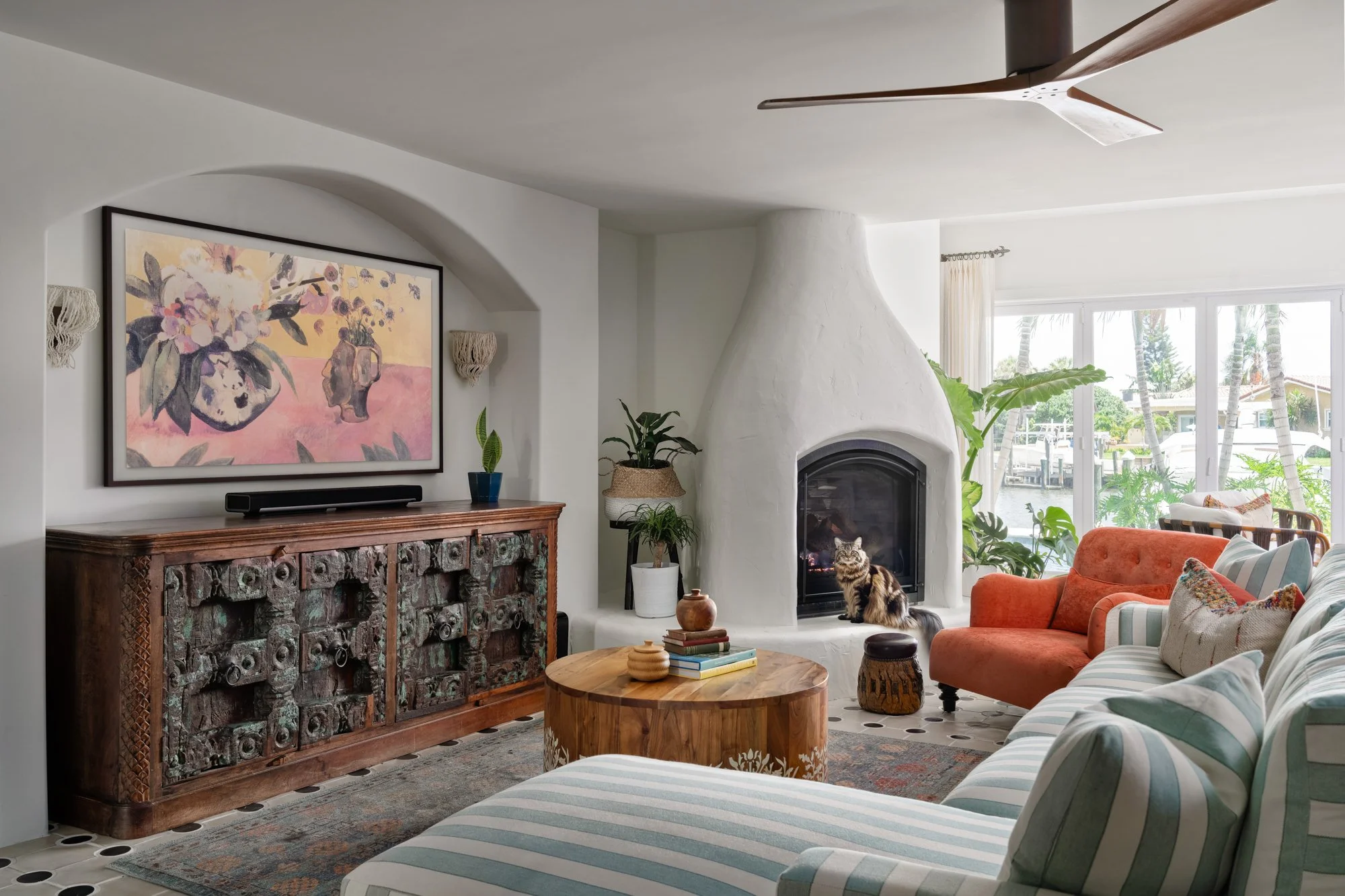
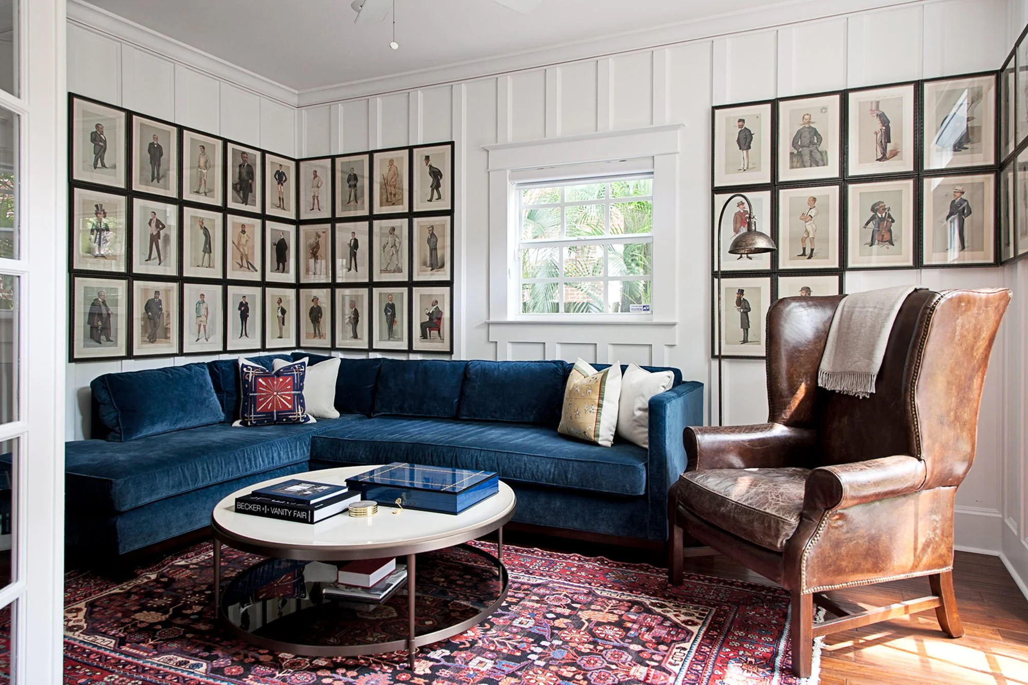
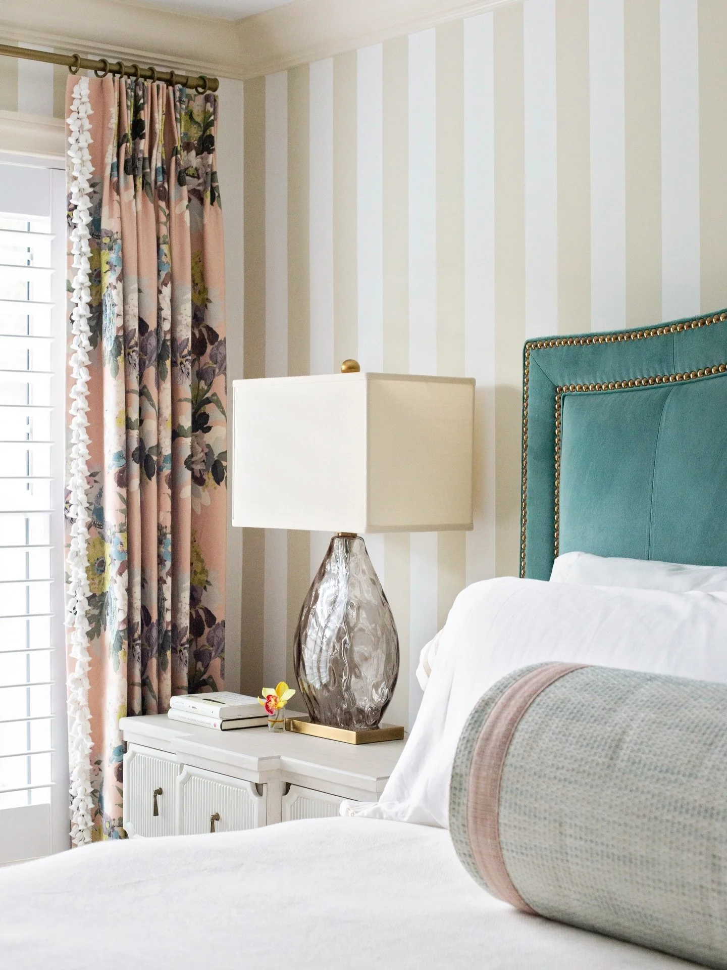
BRITISH LIVING ROOM - LGD ST-PETERSBURG FL
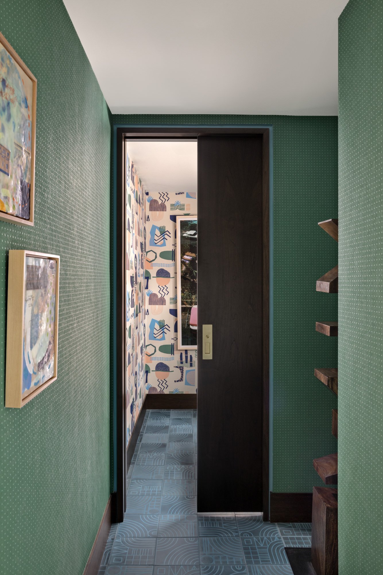
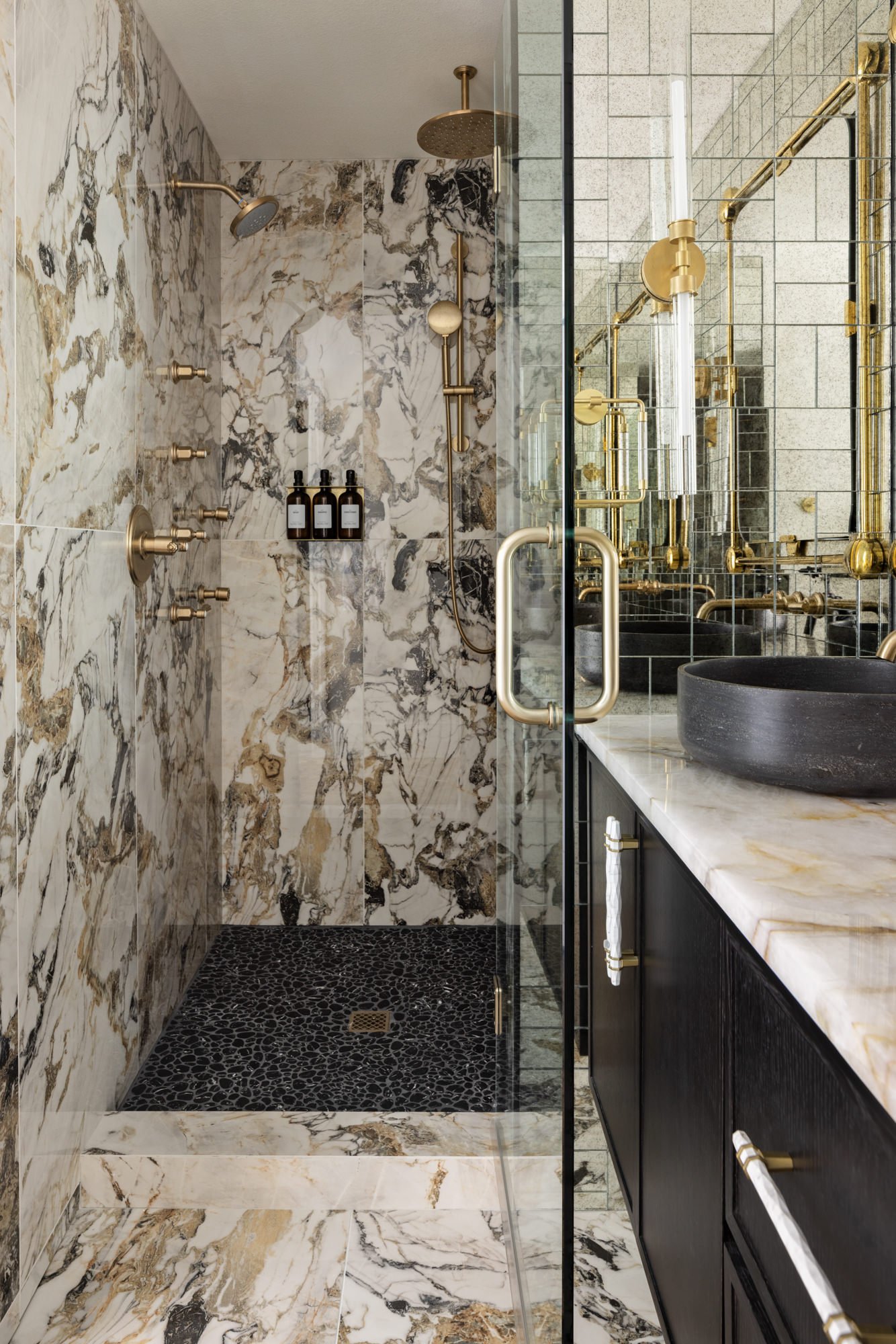
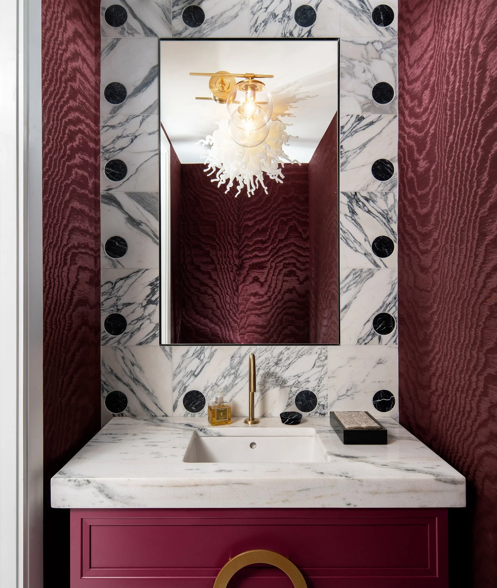
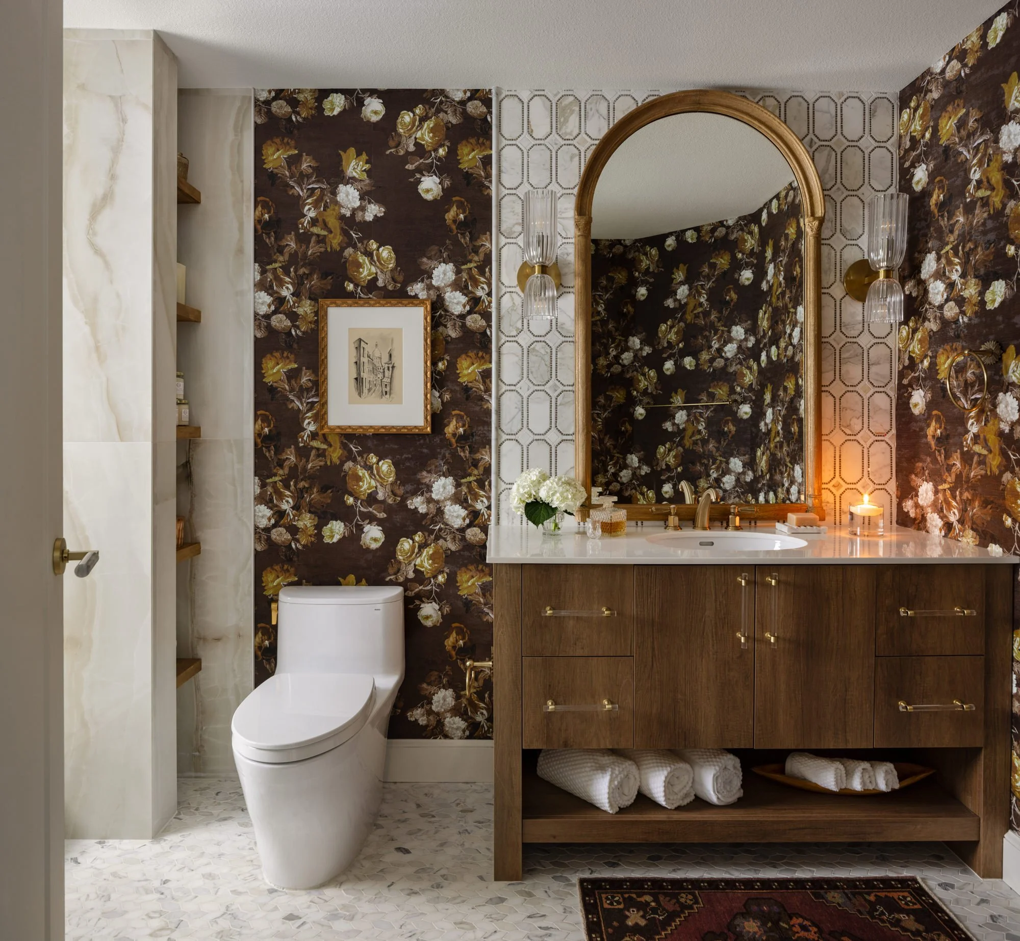
BOLD POWDER ROOM - LGD FLORIDA
Timeless Doesn’t Mean Trendless
You can still have fun. You just don’t need to redo your entire home every time a new “it” color drops.
Timeless design gives you the foundation - trend touches are the sprinkles. Want to test out terracotta tones or try curved furniture? Let’s bring that energy in through pillows, art, or a fabulous accent chair.
It’s all about knowing where to be trendy and how to keep it flexible. Your space stays current without becoming a time capsule.
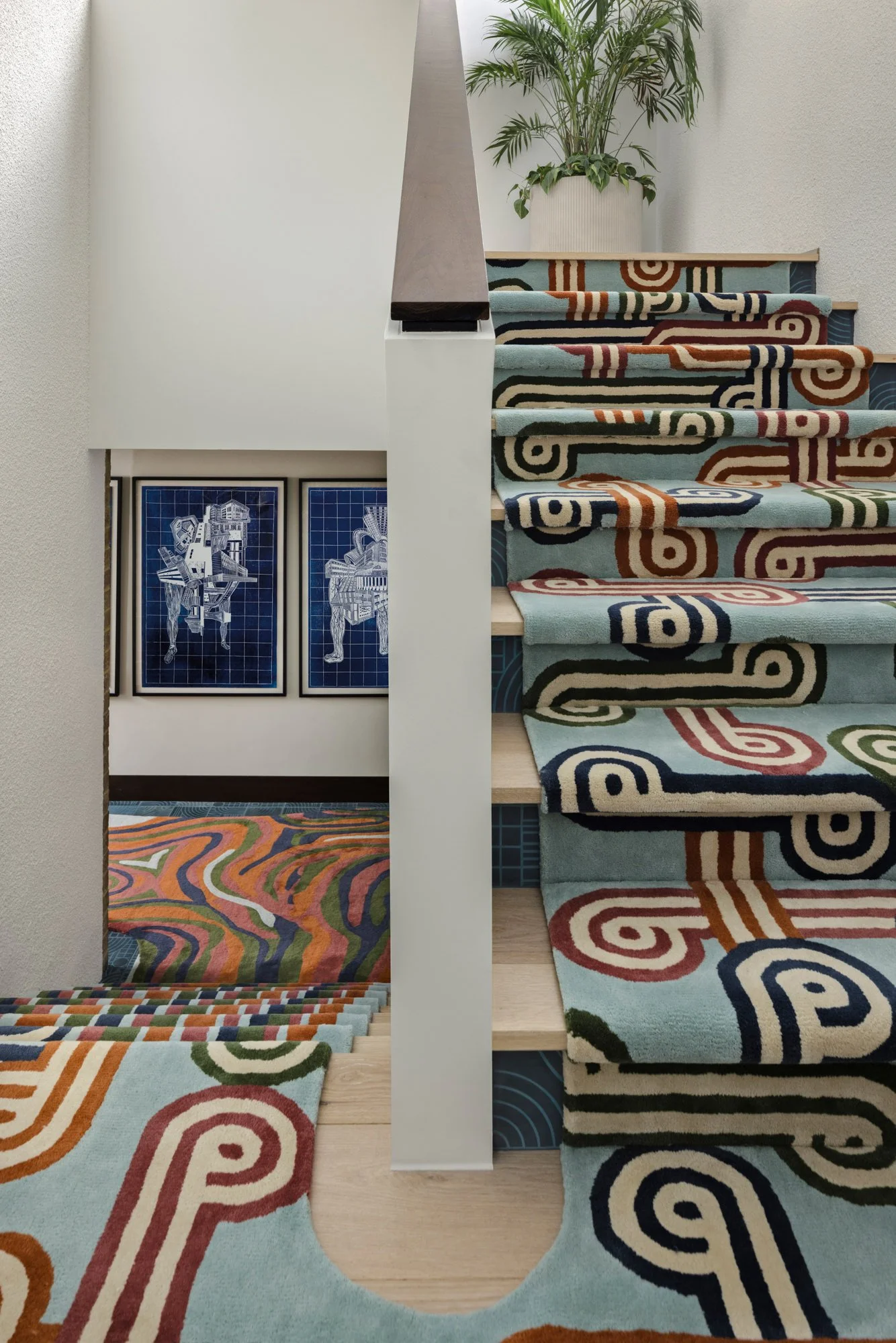
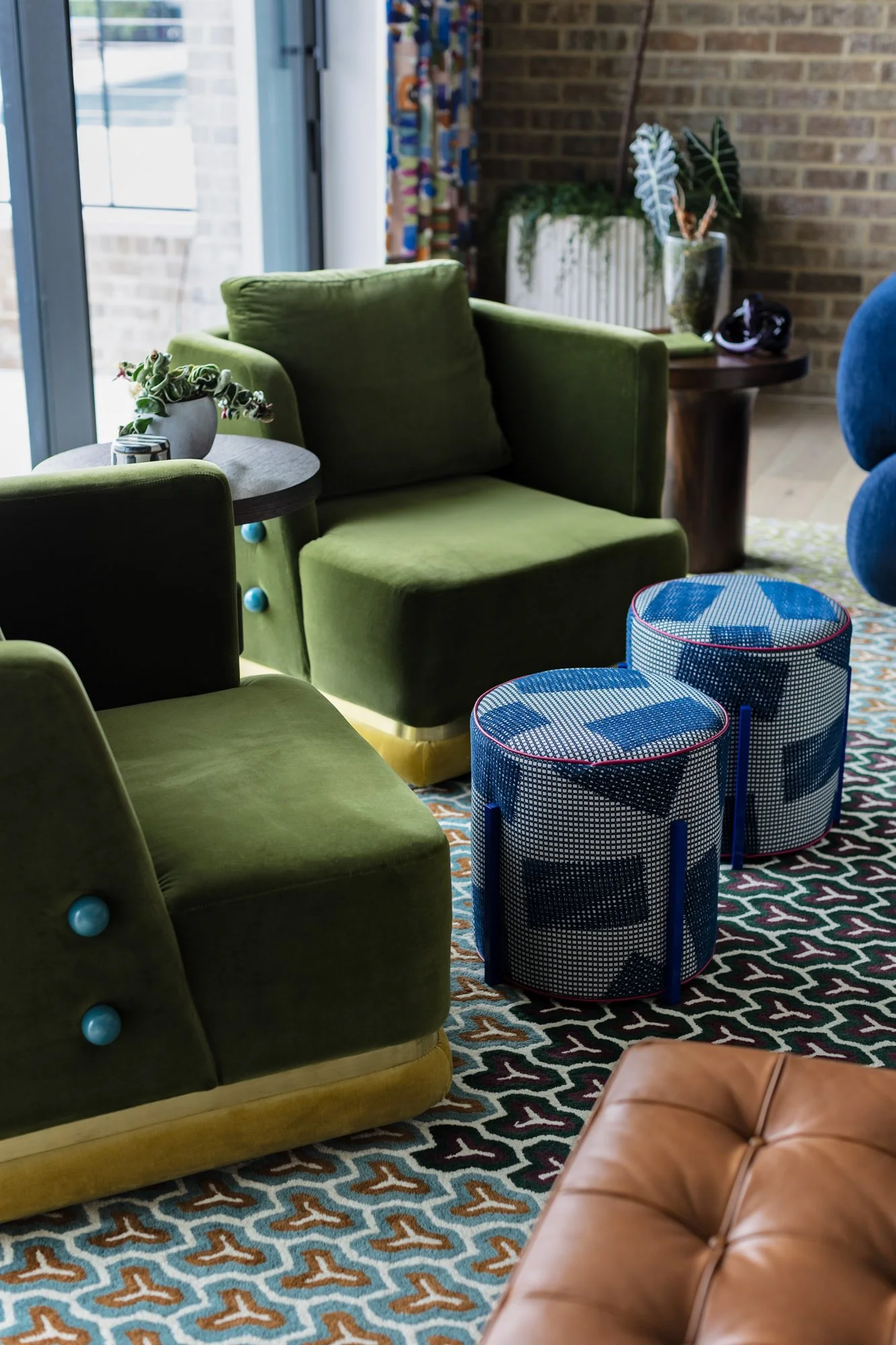
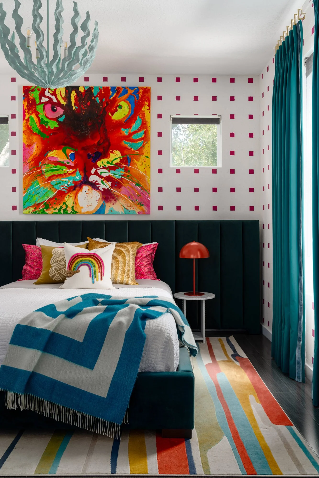
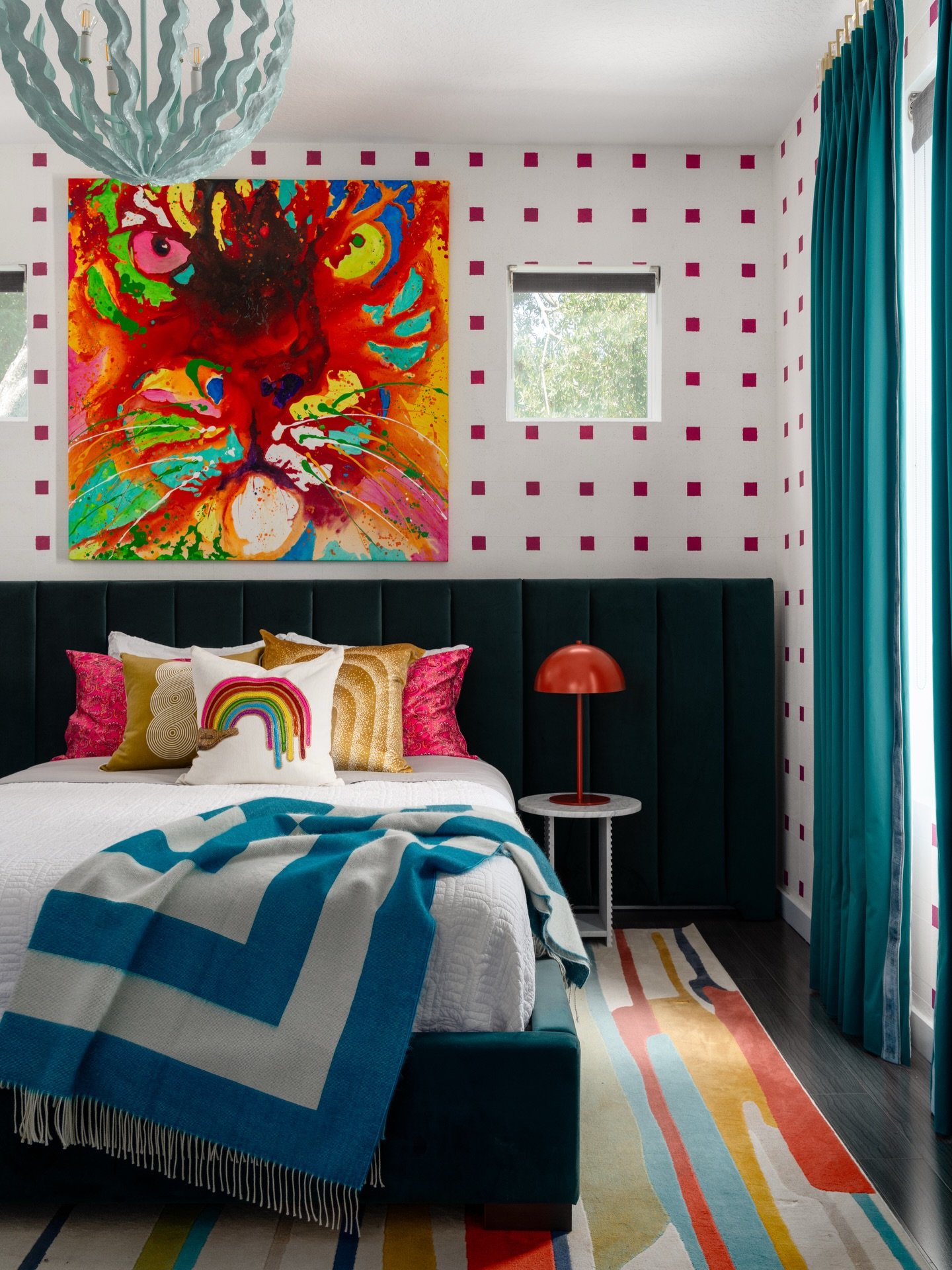
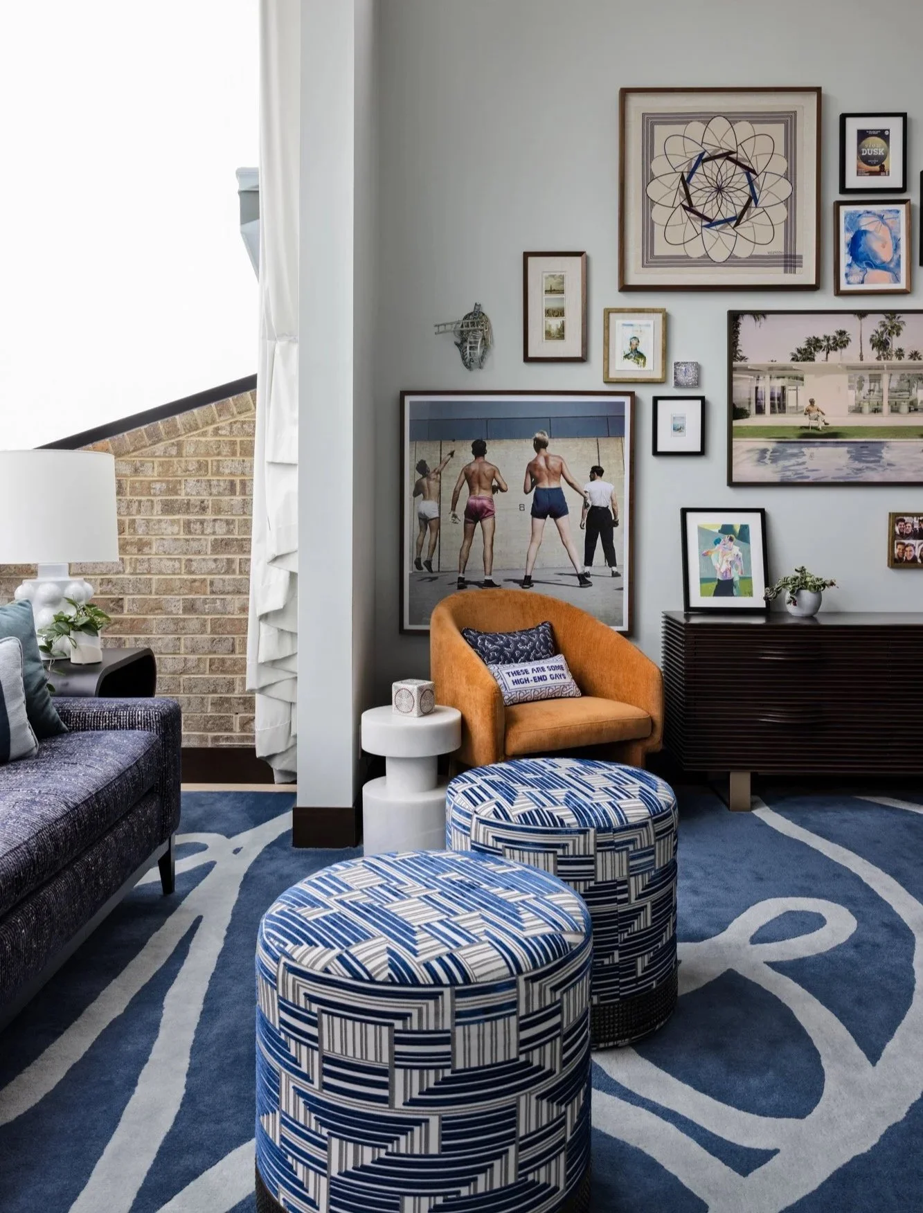
Photo: Bold, Colorfull Interior Design - Lisa Gilmore Design, Clearwater Fl
FAQs: Timeless Interior Design, Decoded
1. What is a timeless interior design style?
It’s style that sticks - in the best way. Timeless interior design means choosing high-quality materials, classic shapes, and thoughtful details that always feel relevant. At Lisa Gilmore Design, that could look like bold jewel tones paired with traditional molding, or vintage accents layered with luxe finishes. It’s not about being bland or beige - it’s about being brilliantly you, with staying power.
2. What is the 3-5-7 rule in interior design?
This little styling trick is all about balance. Odd numbers are naturally more dynamic to the eye, so when you’re arranging items - say, on a shelf or coffee table - group them in threes, fives, or sevens. It keeps things feeling curated, not cluttered. At LGD, we love using this rule to make accessories feel intentional, not accidental.
3. What is the most popular decorating style for 2026?
2026 is leaning into earth tones, organic shapes, and laid-back luxury, but timeless interior design still reigns supreme. Why? Because it plays well with trends and transcends them. Our clients don’t have to redo everything when the style winds shift. They just swap in a few new accessories and voilà - their home still feels fresh, and totally theirs.
Start the Year with a Space That Lasts
This is the year your home should rise to meet your life, not the other way around. If you're ready to create a space that feels like you, and keeps feeling like you for years to come, Lisa Gilmore Design is here for it.
Reach out to book a consultation or explore our portfolio for a little eye candy and bold design inspiration. Let’s make timeless look anything but typical.
