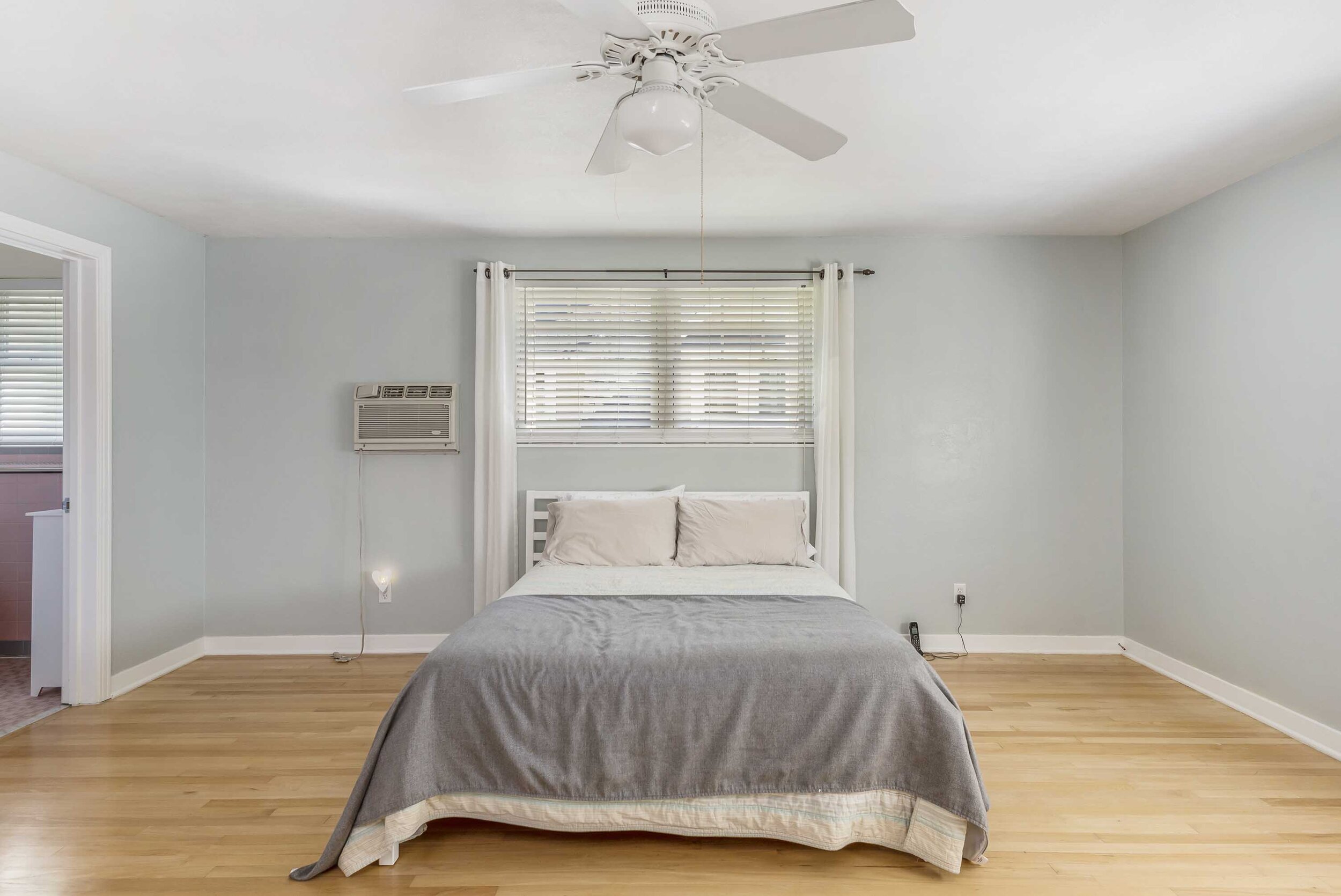
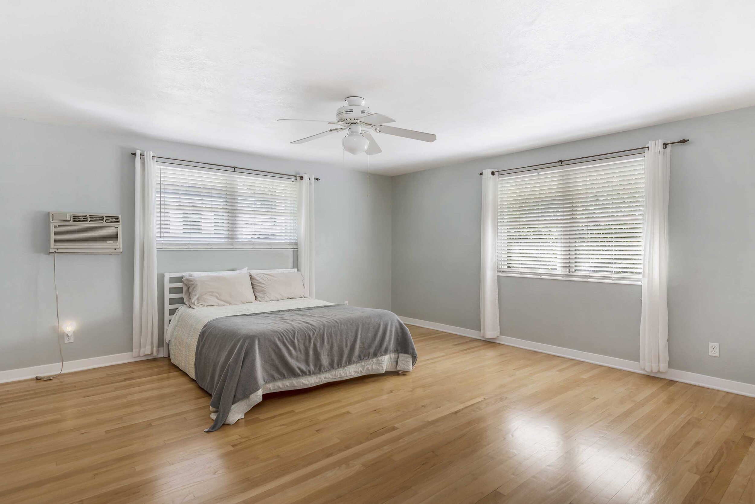
A little while back, we shared a great transformation of this family room. Such a fun before and after. The after showcases the homeowner’s bohemian modern personality in a very fun and approachable way! Today, we want to take you on a little tour of the master suite, and this was a fun transformation as well, to say the least!
This old home features a very large master bedroom and a very small master bathroom – we didn’t want to change the layout of the space, so we opted to make it feel bigger and more connected through the use of materials and design eye trickery!
Notice in the before photo below, how the room feels overly large, a bit cold and everything feels too small for the space?
To help combat that, we chose a great pattern wallpaper to draw your eye to that area of the space, custom drapery and a bed that fits a better scale to the room made this room feel grand and appropriate, without weird blank spaces or overbearing furniture.
Insider Designer Trick:
Do you have a window smack dab in the perfect spot for your bed? However, don’t know how to address it?
Opt for a lower bed headboard (however, not too low) we don’t want it to be an overwhelming bed, like we are trying to hide the window. Instead, make the headboard feel appropriate scale with the window, then dress the windows with drapery to connect it all together.
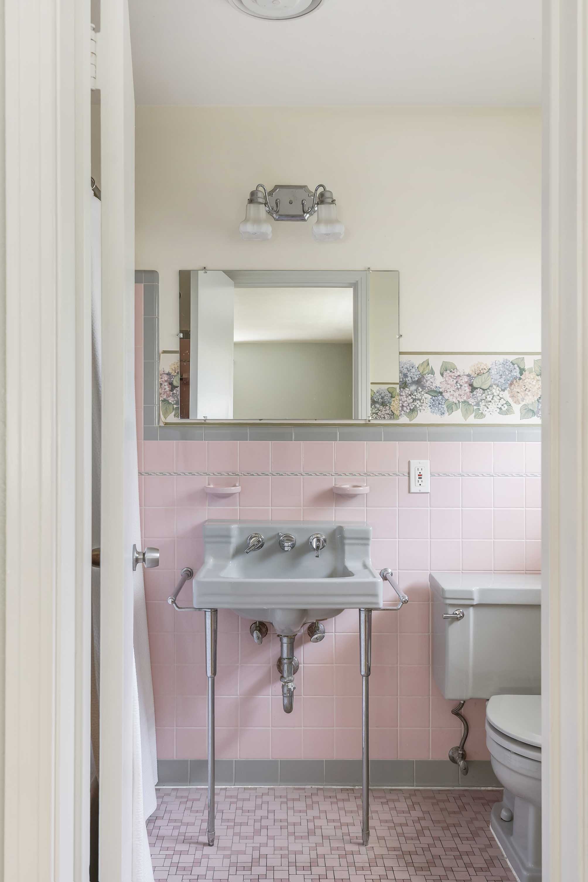
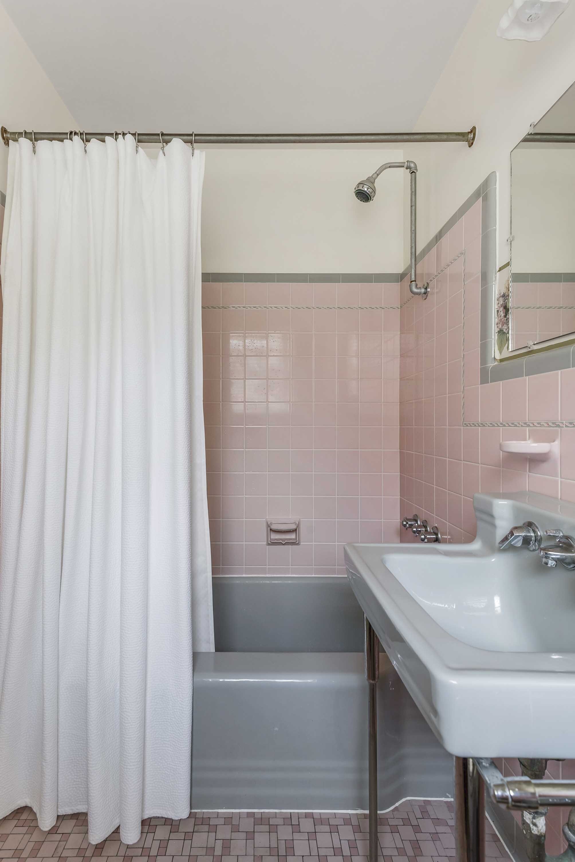
The master bathroom was once a very retro old Florida look – honestly, the quaintness was super charming and part of me was sad to remove it!
However, in order to update the home, we couldn’t leave behind this old Florida pink gem.
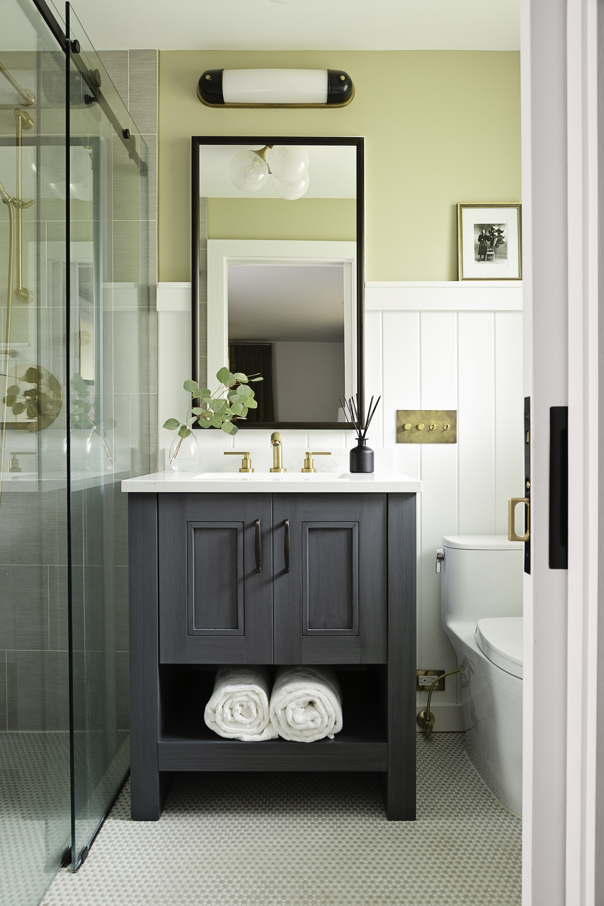
To keep the bathroom updated, appropriate in size scale, and also keep some charming character for the older home, we selected a variety of finishes that help marry all the needs together.
For this renovation, the client decided it was okay to remove the tub. It honestly wasn’t doing much for the space and because it was so small, it was really acting against our goals to make the room feel a bit bigger, without adding more inches to the space.
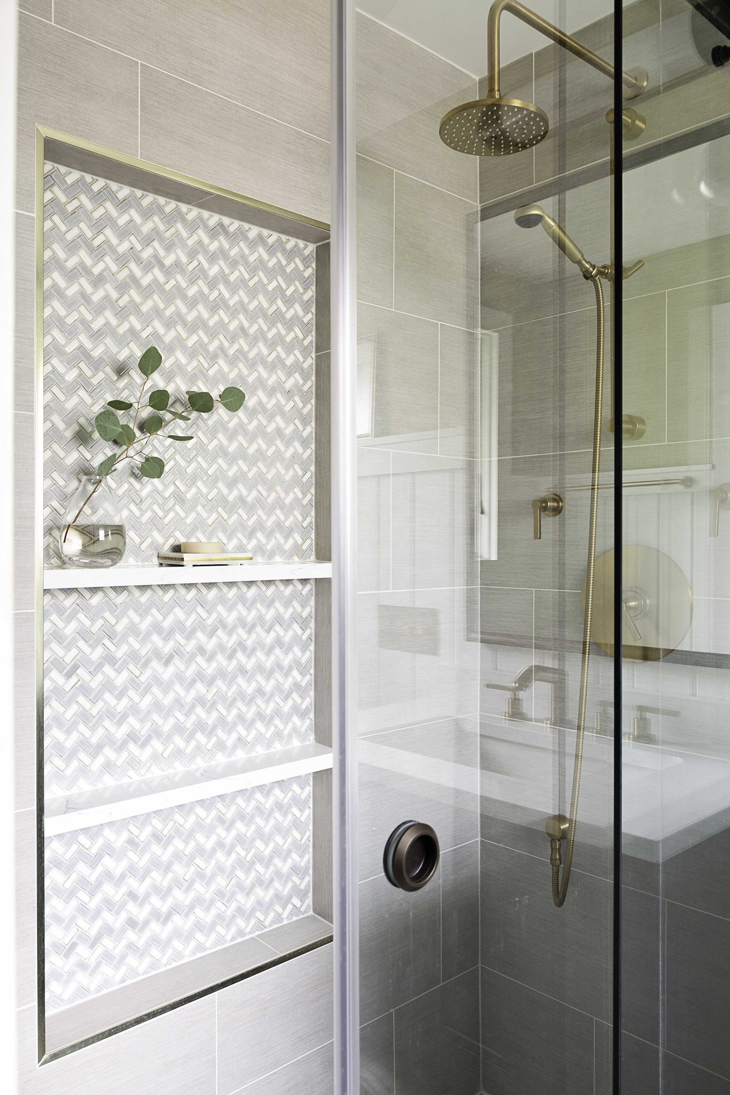
We did a great walk-in shower with beautiful tile selections, the main floor tile continued into the shower with a great subtle pattern that added to the old house’s flair and charm.
One of my favorite things to add to a shower is an oversized shower niche, I often am not a fan of the smaller ones, and when you design them just right they can be a beautiful visual focal point to the shower and not a visual annoyance!
You can see, that this bathroom took on a beautiful new life, while the older pink tile was charming and sweet, now it’s got a level of luxury and feels larger without losing the character of an old home.
Are you feeling inspired about how you can update your space without changing the footprint? Comment below with your favorite parts or questions about this great before and after!


