St. Petersburg Home’s Bedroom and Bathroom Design Reveal
As part of a bold, full-home renovation by Lisa Gilmore Design, this primary suite was designed to stand apart, while still playing beautifully with this St. Petersburg home's overall midcentury modern spirit. Inspired by the polish of a New York hotel suite and infused with fashion-forward flair, the bedroom and bathroom were reimagined as a masculine retreat full of architectural edge, artful layers, and meaningful personal details.
Tailored Tranquility in a St. Petersburg Home: Midcentury Style Meets NYC Hotel Chic
What a difference a vision makes. Take a look at how this St. Petersburg home went from sleepy to statement-making.
ST PETERSBURG HOME MOOD BOARD - LISA GILMORE DESIGN
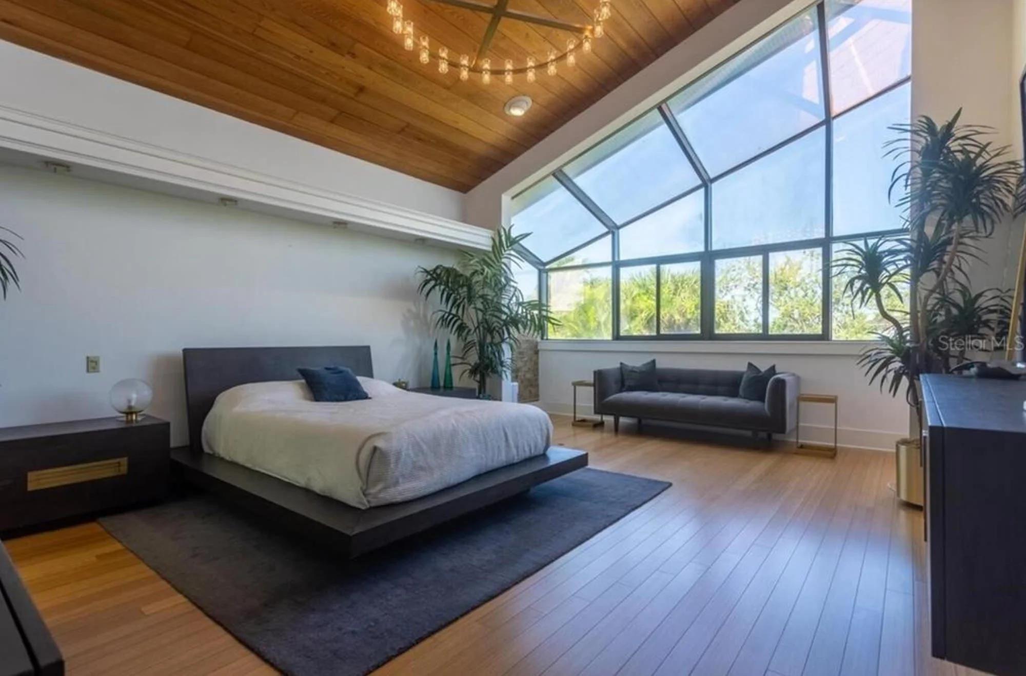
Before: St Petersburg Home’s Primary Bedroom With All The Right Raw Materials
This dreamy St. Petersburg home bedroom had all the architectural charm you could ask for - vaulted wood ceilings, a wall of windows, and space to stretch. But the vibe? A little too mellow. The furniture felt heavy, the palette leaned dark, and the room lacked that signature sparkle we love to bring to a primary suite. It was begging for a bold refresh to match the sunny, style-forward personality of the home.
After: A Tailored Bedroom Retreat in This St. Petersburg Home
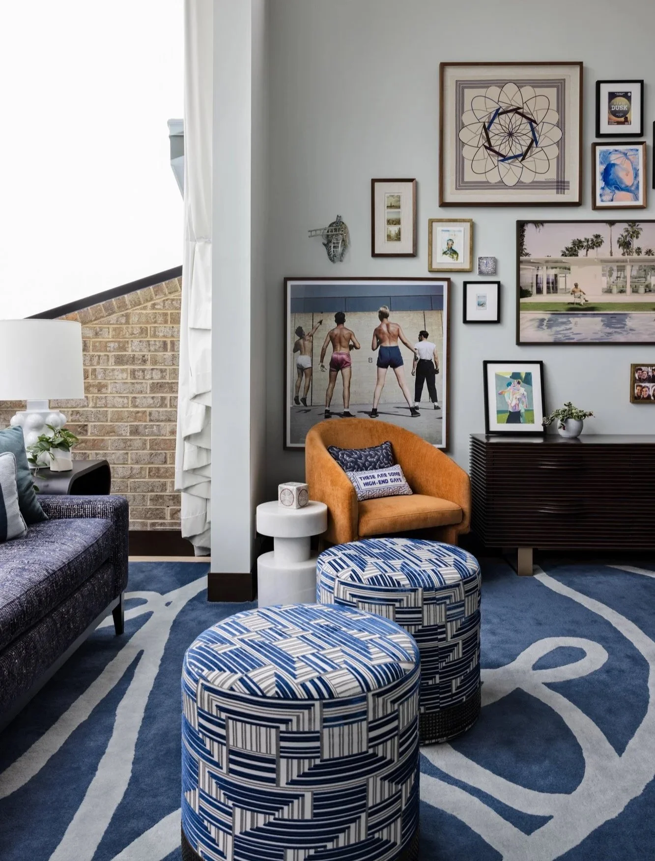
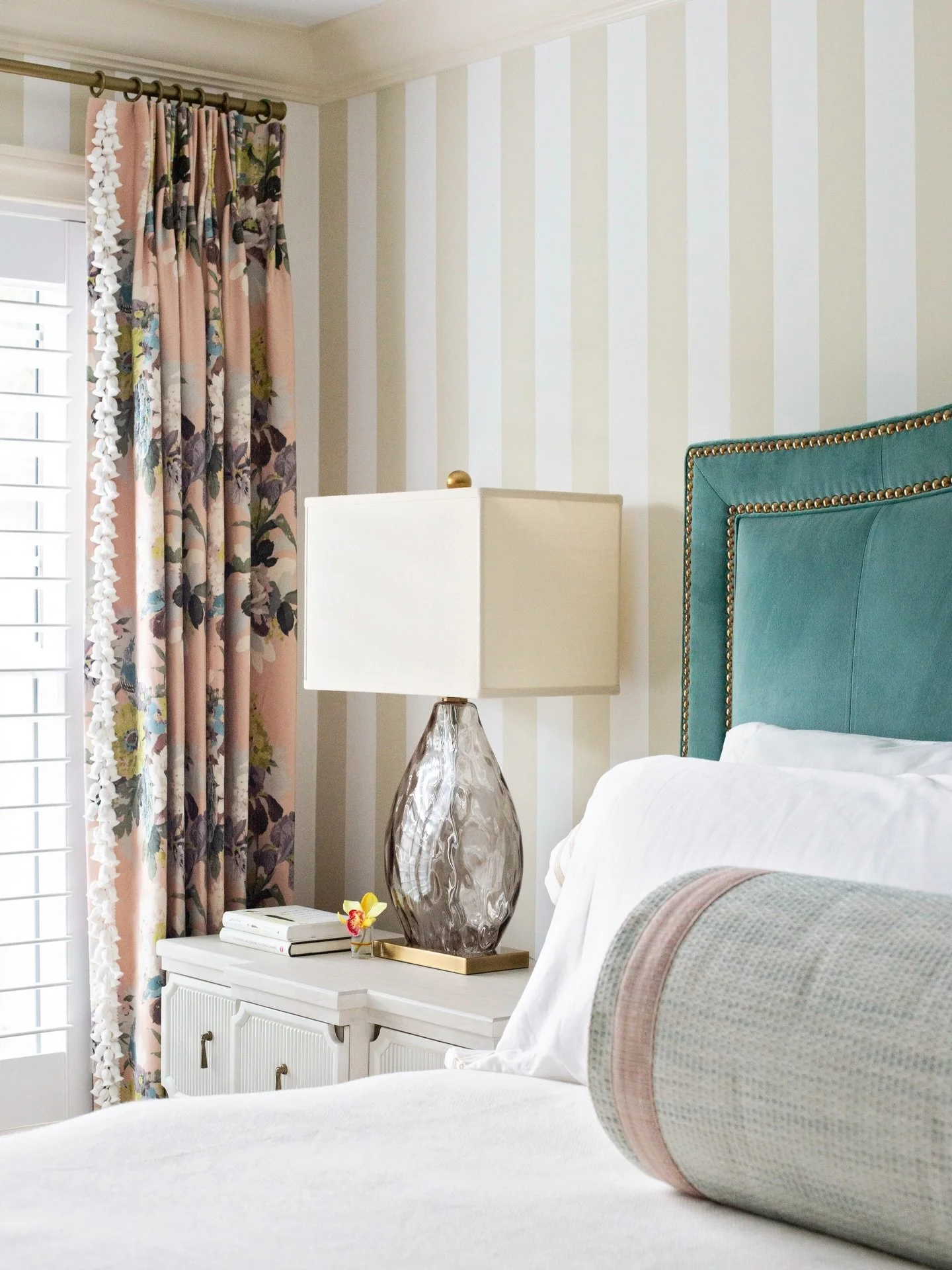
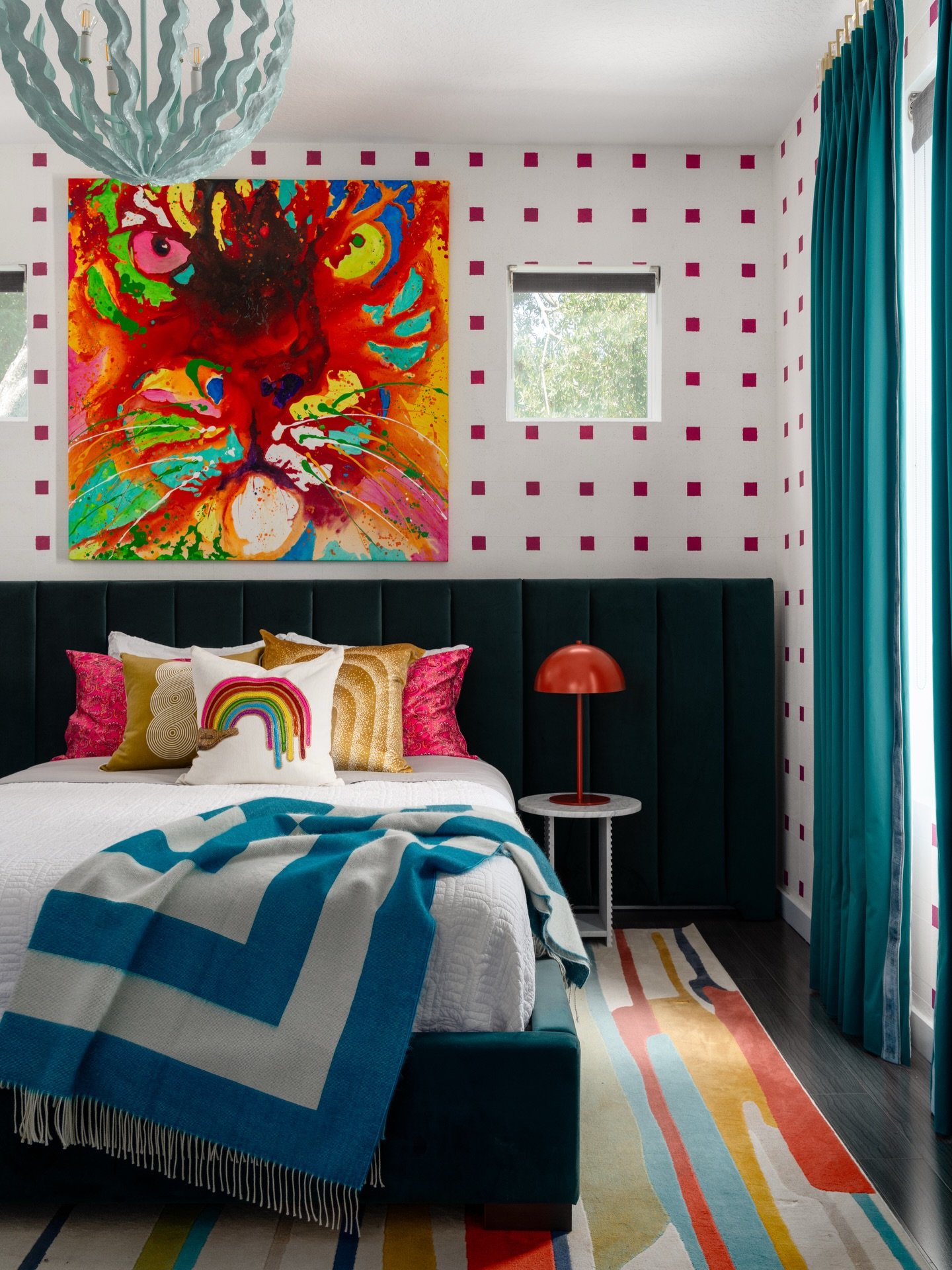
This isn’t your average nap zone. From the graphic wallpaper to the custom ottomans and rug - designed by Lisa and brought to life by local artisans - every inch of this bedroom was made to dazzle.
The teal velvet headboard adds drama without taking itself too seriously, while layers of playful patterns keep your eyes dancing around the room. The gallery wall features pieces that trigger the clients’ memories, including old photos of a grandparent’s trip to New York.
The striking angled windows flood the space with Florida sunshine, making the whole room feel like a chic treehouse for grown-ups. With seating areas for lounging, reading, or just admiring your fabulous taste in this freshly reimagined St. Petersburg home.
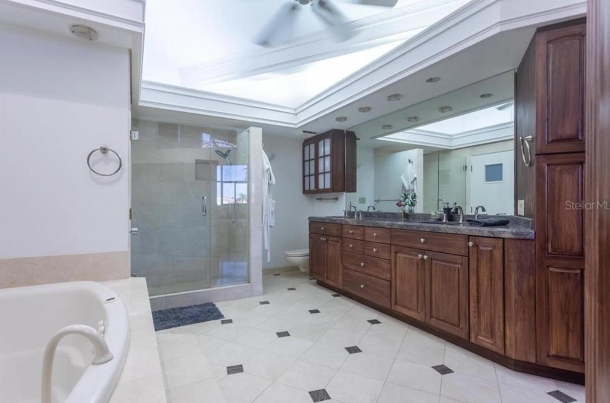
Before: Average St Petersburg Home’s Primary Bathroom
The bathroom in this St. Petersburg home was spacious and full of potential, but it felt more like a time capsule than a tranquil escape. With dated tile, bulky cabinetry, and a dim layout, it lacked the personality and polish that the rest of the home was leaning into. While the footprint was generous, the finishes didn’t quite live up to it. This space was clearly ready to swap “blah” for spa.
After: Unapologetically Luxe: A Bathroom That Elevates This St. Petersburg Home
Let’s be honest: this bathroom didn’t come to play - it came to indulge.
The sculptural tub takes center stage against a bold charcoal wall, perfectly framed by a minimalist nude sketch that whispers art gallery meets spa day. Just to the side, a cozy wooden stool stands ready with a good read, a glass of wine, and a candle because... self-care, darling.
The adjacent shower feels like a luxe retreat carved from the earth itself - draped in richly veined marble and grounded by a pebble-stone floor that gives your feet a gentle massage as you rinse off the day.
And those walnut vanities? They’re the dashing co-stars, flanked by graphic wall tile and arched mirrors that say, “Yes, you do look fabulous.”
FAQs: Everything You Need to Know Before Buying a St. Petersburg Home
Have questions before you pack your bags and move to paradise? We’ve got answers - St. Petersburg style.
1. Is it expensive to live in St. Petersburg, FL?
St. Pete living isn’t exactly bargain-bin cheap, but it’s not luxury-label exclusive either. Think of it more like a fabulous boutique find: stylish, sun-drenched, and worth the splurge if you know how to shop smart. Housing is the biggest budget item, especially in neighborhoods near the water or downtown. But Florida’s no-income-tax policy does give your paycheck a bit more wiggle room. If you’re willing to live a little farther from the action (or you’re not picky about having a Gulf-view balcony), you can still score a stylish spot that doesn’t drain your savings account.
2. What salary do you need to live comfortably in St. Petersburg, Florida?
Ah, the magic number - how much do you really need to live your best life in the Sunshine City? If you're imagining morning coffee on the porch, a few dinner dates each month, and enough left over for a Target run and your Spotify Premium, a salary around $60K to $90K should do the trick. A single person might get by with a little less, but if you’ve got expensive taste (or a love for local art, boutique gyms, or beachy cocktails), a bit more cushion is nice. Like most things in life, comfort here is all about balance - sunshine, savings, and just enough space for a spontaneous weekend getaway.
3. Is St. Petersburg, FL a good place to live?
In a word: yes. But let’s unpack it, because St. Pete isn’t just good - it’s glow-up-worthy. With more sunshine than you’ll know what to do with, a thriving arts scene, delicious food, and beaches that feel like postcards, it’s easy to see why people fall in love with this place. You’ve got charming bungalows, vibrant murals, and a calendar packed with festivals and farmers markets. Sure, traffic can get a little cranky and housing prices are climbing like a vine on a pergola, but if you’re looking for creative energy, coastal beauty, and community vibes, St. Pete delivers - sparkle and all.
Whether you're dreaming of a midcentury modern oasis or a hotel-inspired retreat, we’ll help you create a St. Petersburg home that reflects your boldest design goals.
Ready to turn your bedroom and bathroom into a bold, beautiful escape? Whether you live in St. Pete or across the globe, our team would love to bring your vision to life. Fill out our design inquiry form, and we’ll be in touch. For more inspiration and glam-filled ideas, follow us on Instagram or sign up for our newsletter.
