One of the biggest benefits of building a home is being able to choose everything– from the crown molding to the flooring and everything in between.
But people who desire a home with character or one in an established neighborhood usually buy a pre-owned home. While pre-owned homes have many advantages, it’s common for buyers to get a home that doesn’t exactly fit their style.
Think wall-to-wall carpet, dark wood paneling, popcorn ceilings, and pastel bathrooms.
And, though our client’s newly purchased home wasn’t outdated, it still didn’t fit her traditional and elegant style.
One room the Lisa Gilmore Design team re-envisioned was the formal living room.
Formal living room before
Before, the room was a bit too modern with a crystal chandelier, light coastal blue walls, and dark wood flooring.
Formal living room before renovation
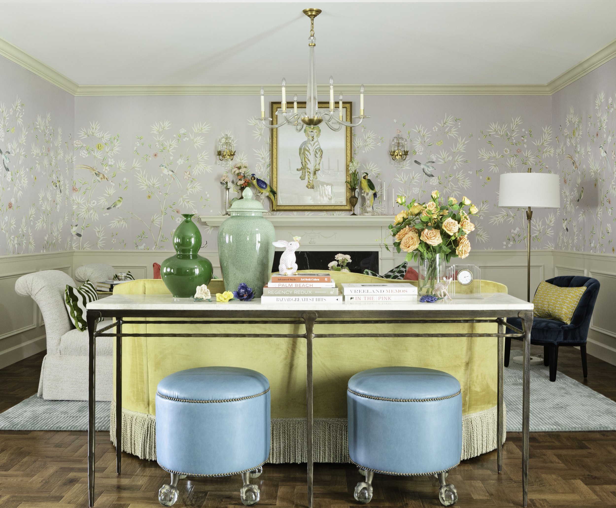
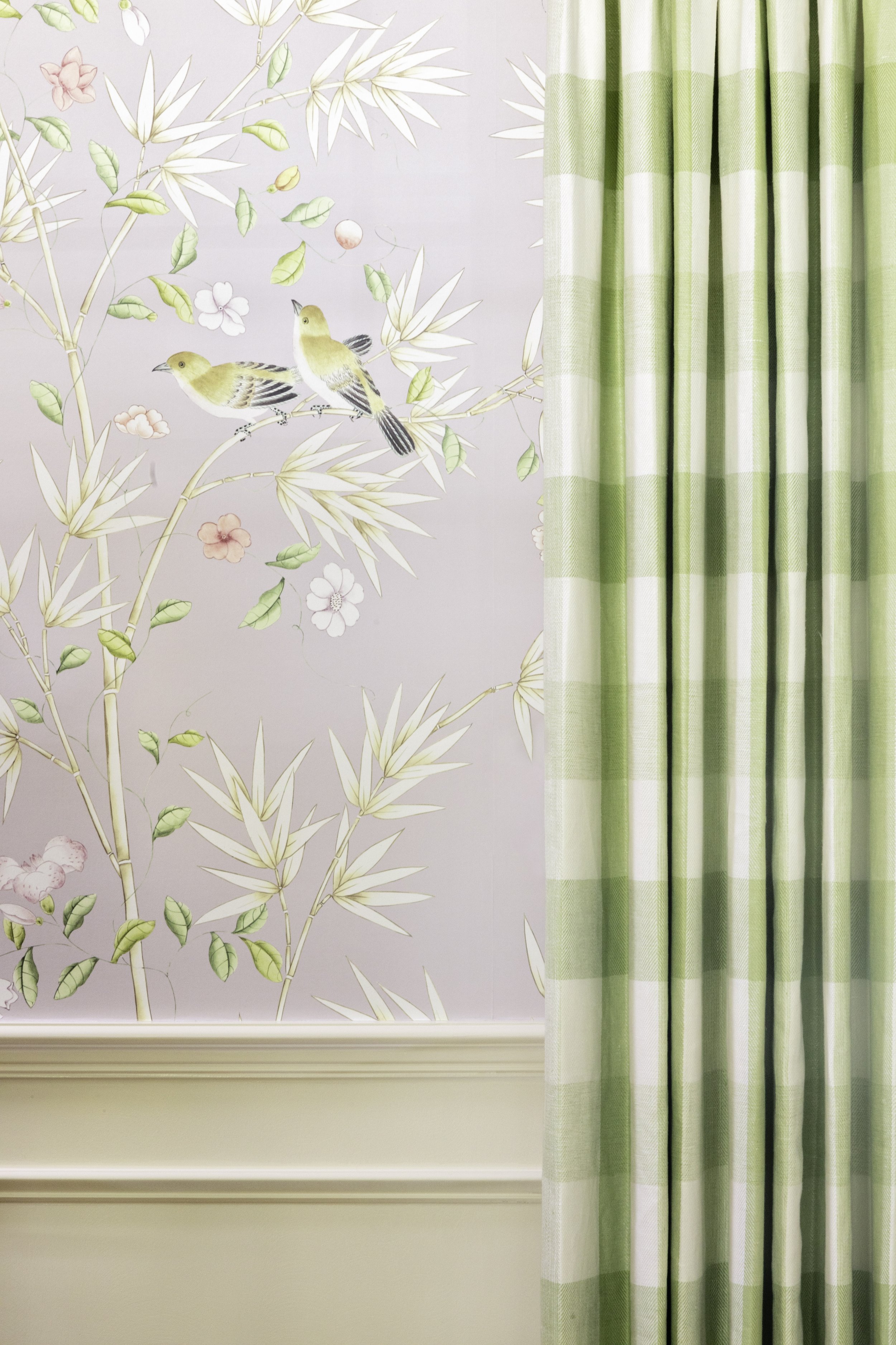
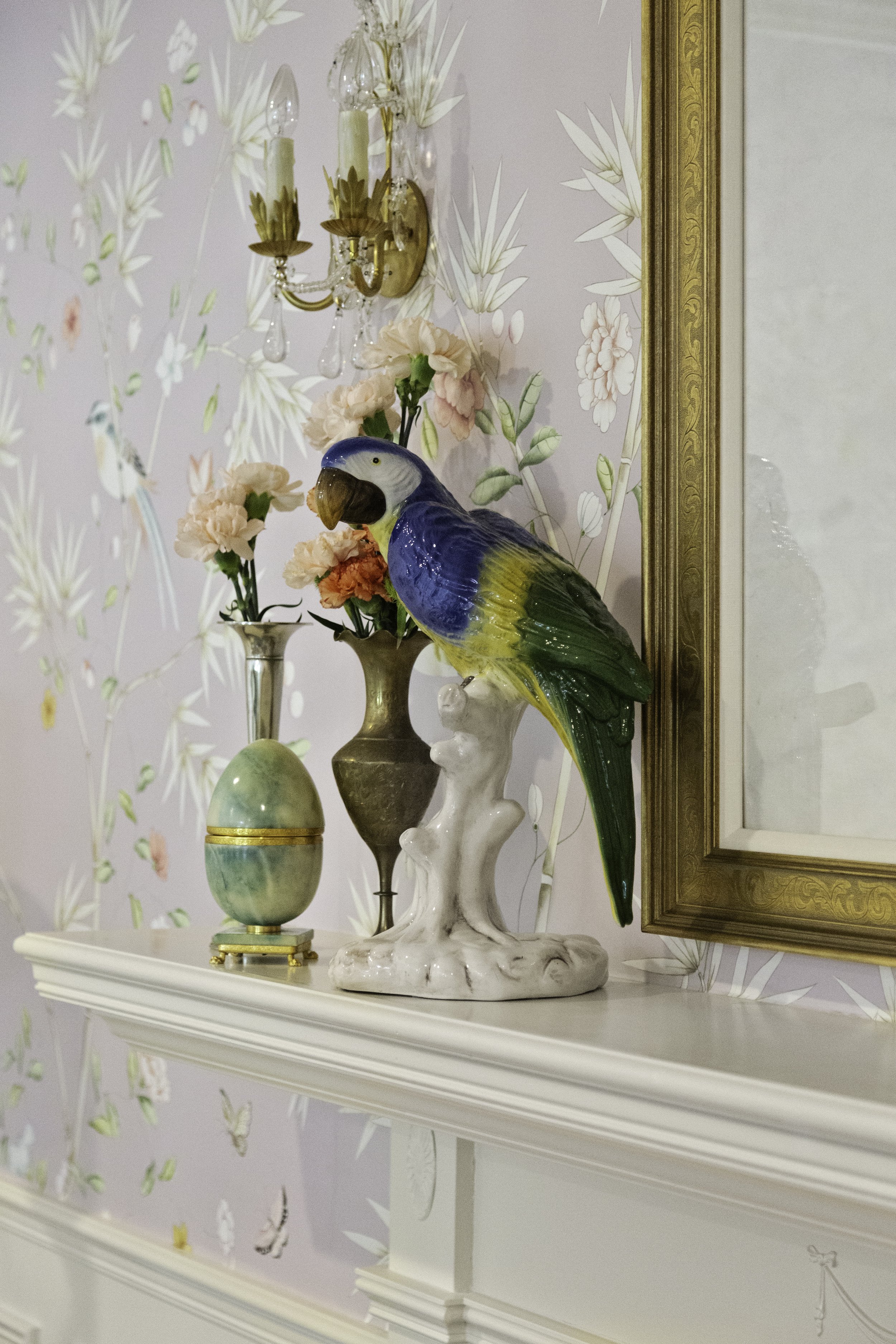
To make the room feel more timeless, we chose a palette of softened primary colors mixed with neutrals. The gorgeous, classic chinoiserie wallpaper creates a feeling of being at one with nature, while delicate ornaments featuring birds and rabbits embody life.
We were also able to reuse the homeowner’s side chairs and reupholster them in a light, cream fabric.
Our goal for the entire home renovation was to add warmth and luxury to the space, while ensuring it was still inviting at the same time. You can read more about the whole project at Homes and Gardens.
But if you are unable to completely renovate a room, there are still ways to inject your style into a room. Consider small investments such as changing the lighting, painting the walls or furniture, replacing the window treatments, or adding accessories like rugs, art, and decorative accents.
To get more tips, see our projects, and find ideas for adding liveable glamour to your home, follow me on Instagram or sign up for our newsletter.


