ART COLLECTION

FEATURED IN RUE MAGAZINE

 
LISA GILMORE DESIGN | VINTAGE ART GALLERY WALL
 

AN ANTIQUE & ART COLLECTOR'S LUXURY MODERN CONDO

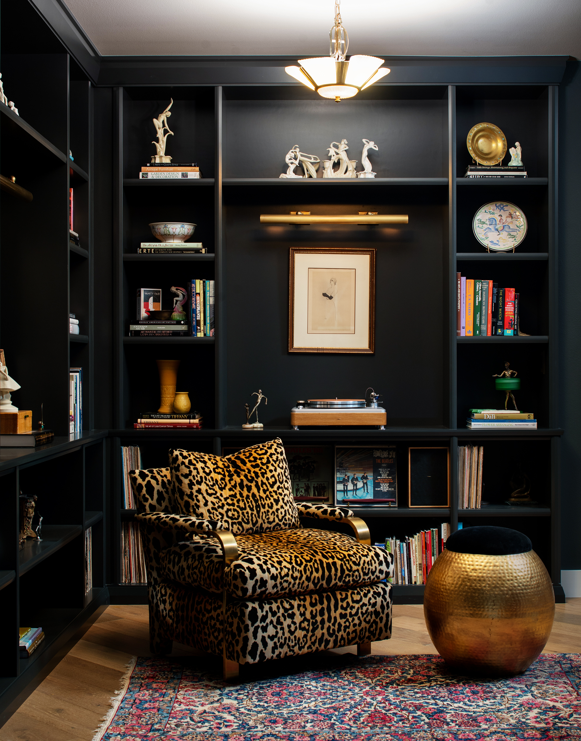
This modern condo located in Tampa, Florida is the home of an avid antique and art collector. This soulful interior design project by Lisa Gilmore Design was featured in Rue Magazine. The modern condo was transformed into a moody artful living space. Featuring navy walls, an impressive art collection, Arts & Craft furniture, Art Deco collectibles, a home library and home office with major style. With wallpaper, fabric and lighting from William Morris, Frank Lloyd Wright & Kelly Wearstler.

Photos Seamus Payne
LISA GILMORE DESIGN | ART DECO INSPIRED LIVING ROOM
LISA GILMORE DESIGN | CUSTOM PRIVATE LIBRARY
 

THE DARK NAVY WALLS ARE THE PERFECT BACKDROP FOR THE OWNER’S ART COLLECTION.

 
LISA GILMORE DESIGN | ARTS & CRAFTS INSPIRED OFFICE
LISA GILMORE DESIGN | ART DECO - MODERN BEDROOM
LISA GILMORE DESIGN | NAVY WALL ART DECO INSPIRED HALLWAY
LISA GILMORE DESIGN | CUSTOM BUILT ART COLLECTION DISPLAY
LISA GILMORE DESIGN | BLACK & WHITE TEXTURED WALLPAPER
 

THE OVERALL DESIGNG IS INSPIRED BY THE ART DECO AND ARTS & CRAFTS COLLECTION.

 
LISA GILMORE DESIGN | CURIO CABINET AND VINTAGE ART GALLERY WALL

DESIGN PROJECT:: TIMELESS MONOCHROMATIC PHOTO TOUR PART III (not so monochromatic room)

You've seen part I and part II of this beautiful residence, the whole space is primarily monochromatic finding interest with textures and patterns.

Well, there is one room in the house that is simply not monochromatic. We really got to have fun with this space. I think I will let the photos speak for themselves...

Through the glass french doors into the beautiful sunlight family room

What are those snippets of art I am seeing in the space? Well, my friend, they are exactly forty-four vintage sketches from Men's Vanity Fair. Can you say eye-candy? It really is a feast for your eyes, you can spend hours staring at the walls (good staring at the walls, that is!) at these gents. Each sketch has such a fun story, hanging them in such an impactful way was a no-brainer. 

A lot of small details went into the design of this home, one of my favorite are these pillows we had custom made from Hermes scarfs. They compliment the antique vegetable dyed area rug so well. 

Sunshine filters in so beautifully in this space, Mr. Franklin is most happy in his custom fabricated dog bed, that perfectly fits the space!

It's really hard to decide which area of this home is our most favorite? Part I, II or III? Cast your vote below!