A Guest Room to Spark Your Inner Maximalist
Let’s be honest. Your guest room might be a bit.. boring.
Unless you're hosting friends and family like it’s a bed and breakfast, your guest room probably spends most of its time doing one thing: collecting dust (and maybe your holiday decorations and ironing board). But what if it could do more? What if it could become your favorite room in the whole house?
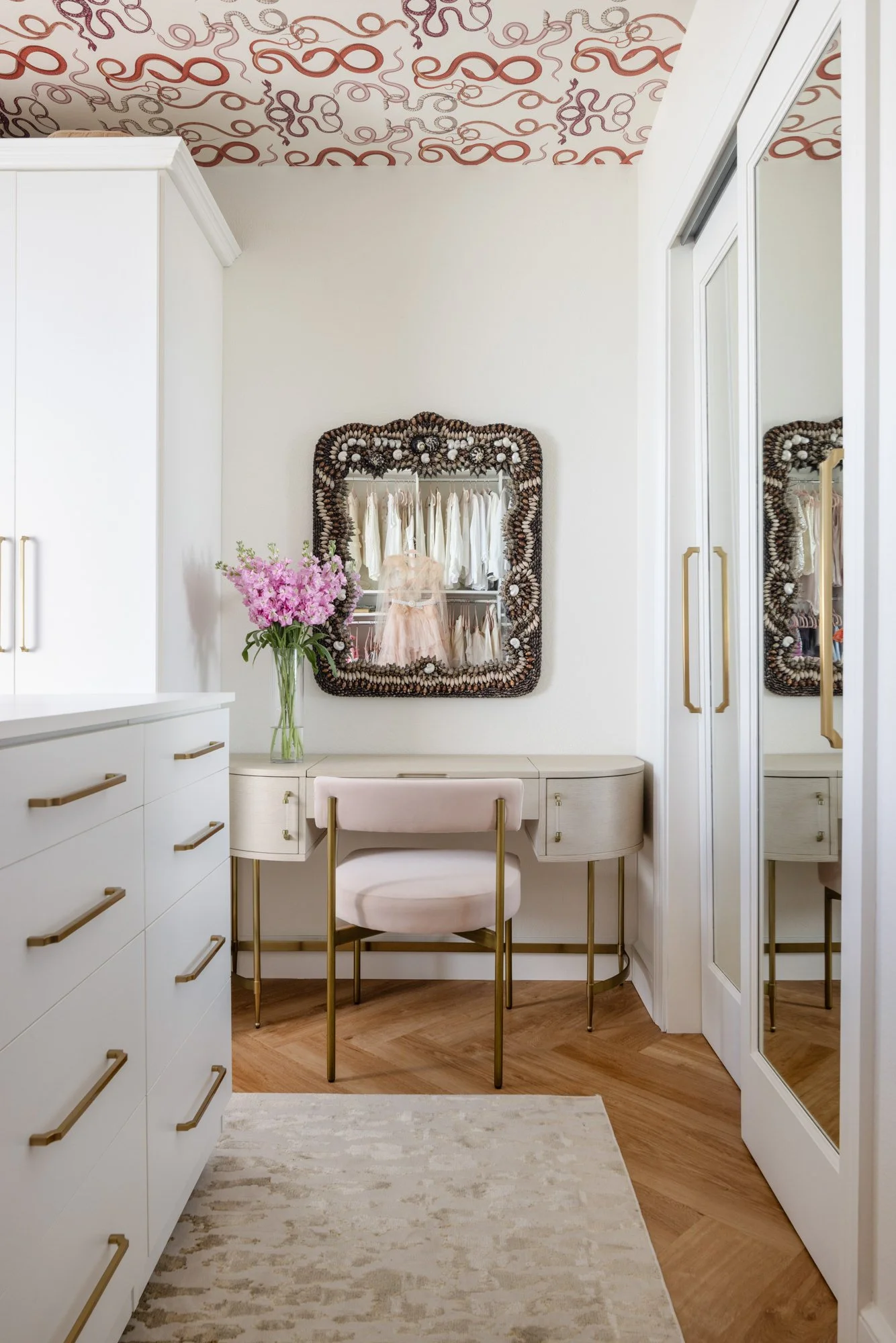
In our Parisian Retreat condo project, we gave a bare guest bedroom the ultimate glow-up, turning it into a glamorous dressing room that feels like stepping into a French fashion fantasy.
The Best Guest Room Ideas Start With YOU
We love our guests, truly. But your home should work for your day-to-day life, not just the occasional visitor. So instead of letting that extra room sit empty 360 days a year, why not reimagine it into something you’ll actually use? Like…
A dreamy dressing room
A chic home library
A zen meditation nook with a disco ball (we don’t judge)
In this case, our client had the wardrobe of a style icon and a guest room that was just begging to be fabulous. We took it from bland to bam, and we’re walking you through every sparkling detail.
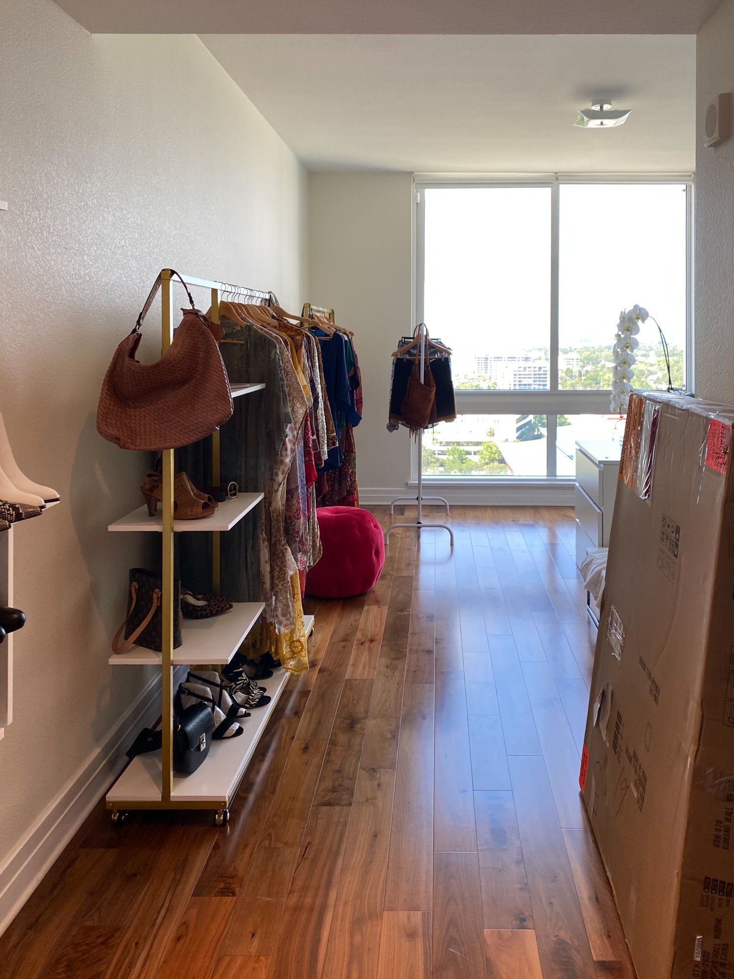
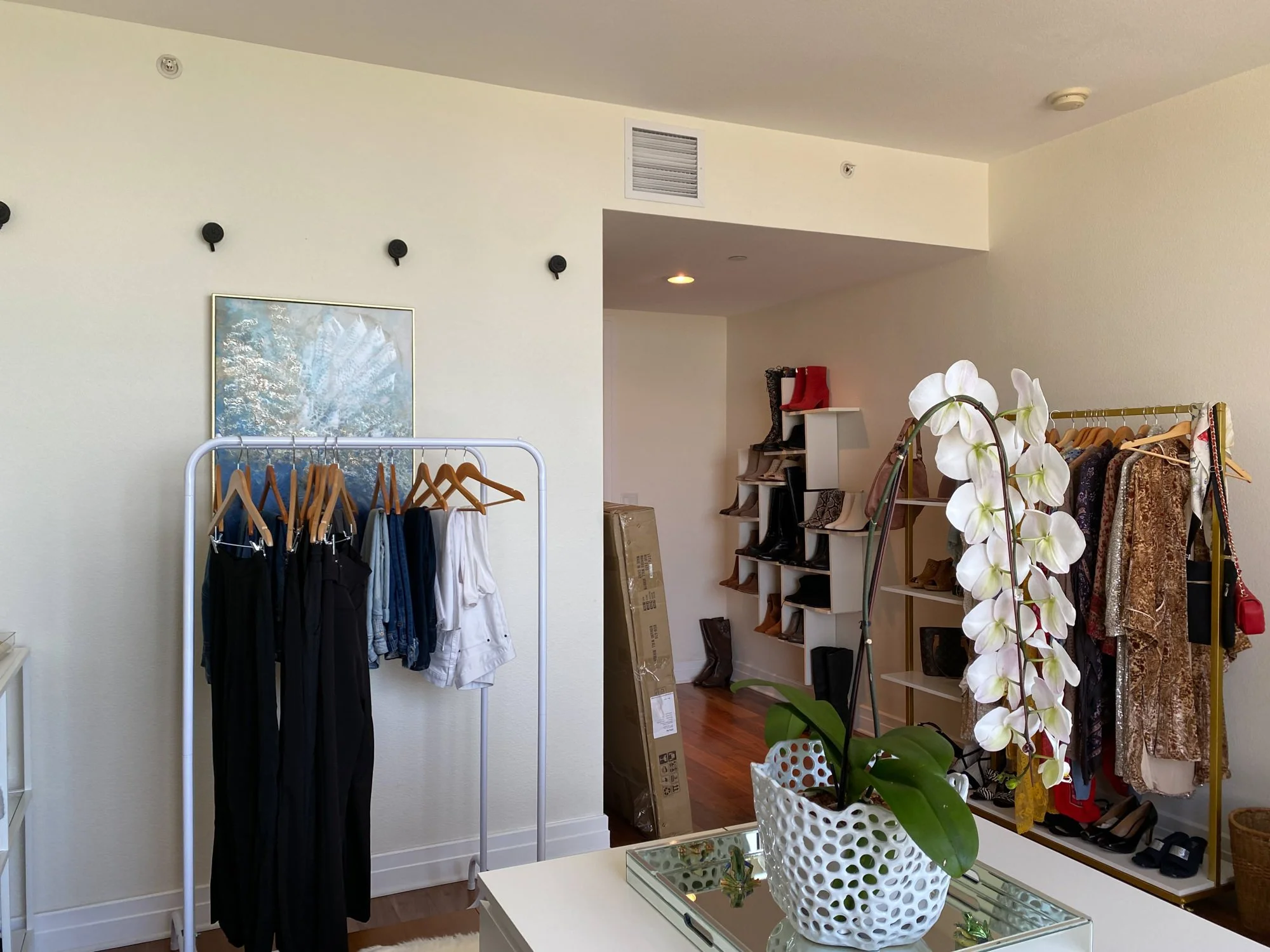
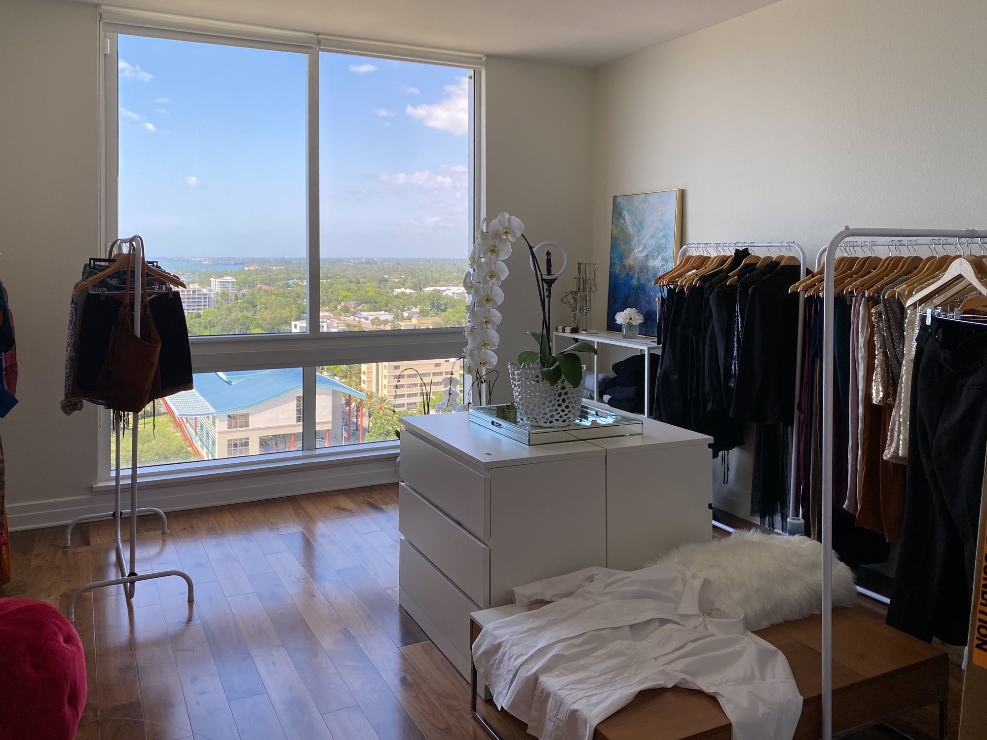
Before: A Diamond in the (Very Stylish) Rough
Let’s set the scene: beautiful natural light, sky-high views, and the unmistakable energy of potential. What the room didn’t have? A clear identity or functional flow.
It had all the bones - it just needed the flair.
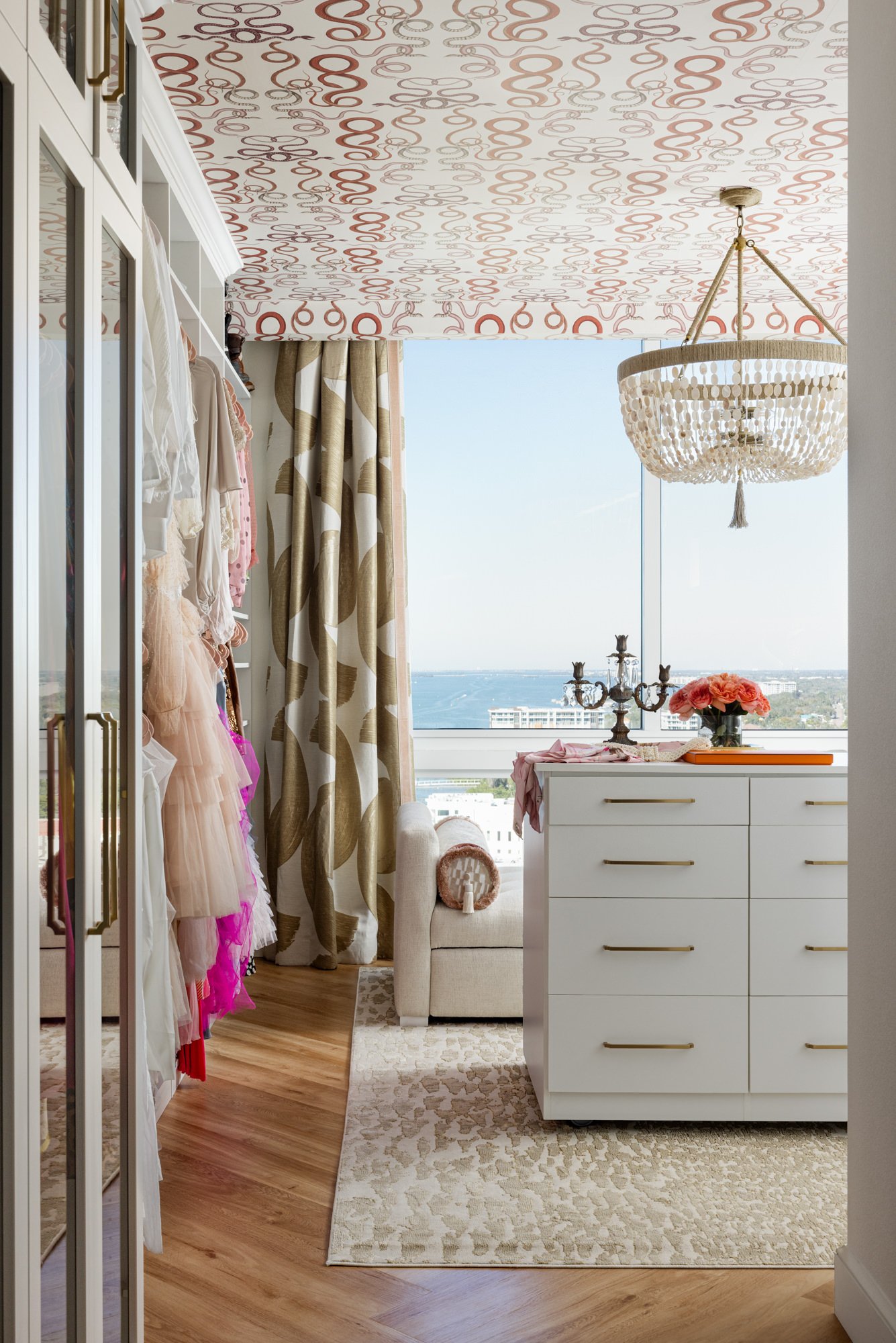
After: Boutique Dressing Room Energy Activated
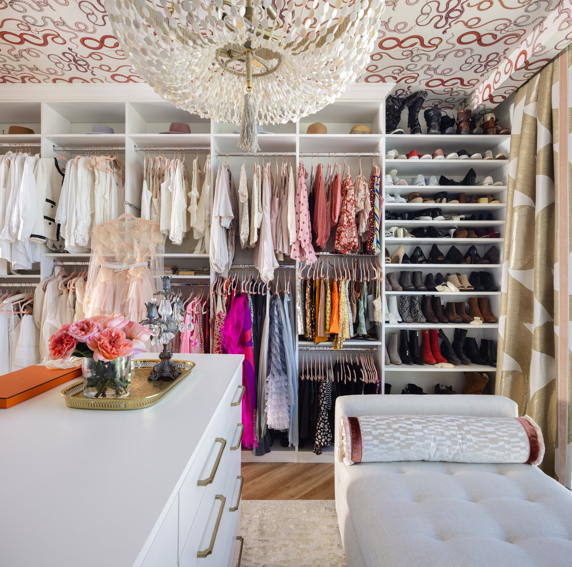
Enter bold pattern, custom millwork, perfectly curated lighting, and just the right amount of sparkle. We transformed this room into a walk-in wardrobe and personal sanctuary. Imagine a space that inspires your outfits, your mood, and maybe even your next spontaneous dance party.
A few favorite highlights:
Snake-print wallpaper on the ceiling - because a room this fabulous deserves drama from top to bottom
Custom closet storage all around - a place for everything (and then some)
A moveable island - perfect for staging outfits, styling accessories, or twirling dramatically while holding a glass of bubbly
A chic daybed that pulls out to a queen-size bed - because your dressing room can still moonlight as a guest room if it needs to
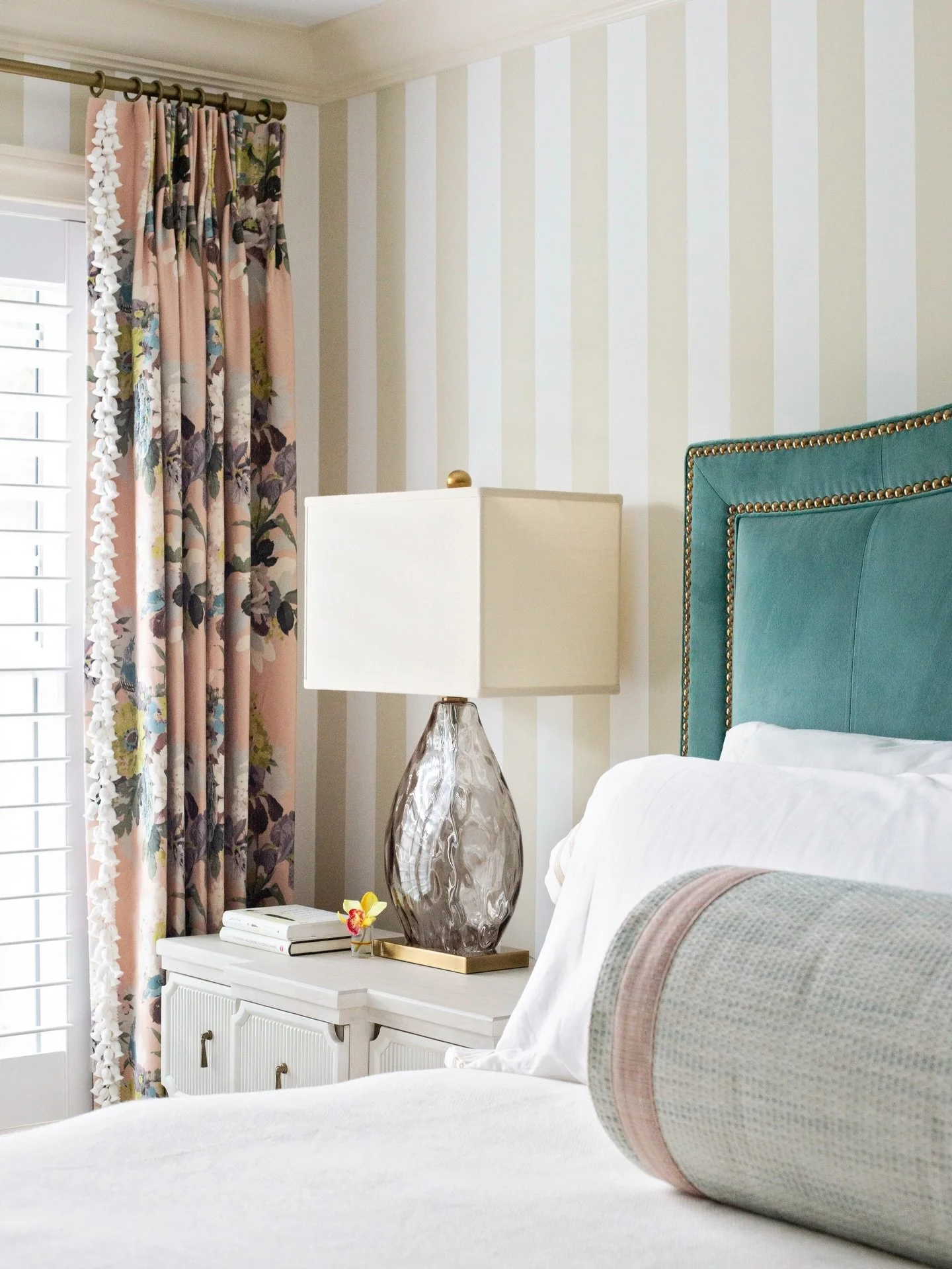
Dramatic drapery, layered lighting, and those personal touches that make it unmistakably her
This isn't just a closet, it's a full-on vibe. And a strong argument for making bold, unapologetic design choices that center you.
It’s Not Just a Closet. It’s a Daily Experience.
Why save the pretty stuff for special occasions? This dressing room brings the drama in all the right ways and makes even picking socks feel like an act of self-care.
Of course, you might still be wondering how to make the most of your own guest room, and what it really needs to be a magical getaway for your guests.
FAQs: Your Guest Room Questions Answered
1. How do you make a guest room special?
Start by thinking beyond beige. A memorable guest room blends comfort with a little magic: think layered lighting, plush bedding, a signature scent, or a surprise feature like a reading nook or vanity. A space that whispers you’re welcome here, but with a wink.
2. What should every guest bedroom have?
Comfort is queen: a cozy mattress, fresh linens, a spot to stash a suitcase, and light that doesn’t require an engineering degree to turn on. Add a few elevated extras - a robe, a candle, a cheeky local guide - and you’re officially hostess of the year.
3. What are common guest room mistakes?
The biggest? Designing it only for “just in case.” If you only use the space once or twice a year, it’s time to let it pull double (or triple) duty. Whether it’s your home gym, crafting haven, or a jaw-dropping dressing room, let it earn its keep.
Moral of the Story: Your Home Should Spark Joy AND Be Smart
We’re all about spaces that reflect your life, your habits, and your style - not someone else’s Pinterest board. So if your guest room is gathering dust, it might be time to give it a new job title.
At Lisa Gilmore Design, we believe in designing spaces that feel like you: bold, personal, and a little bit unexpected.
If this makeover has you eyeing your guest room with fresh curiosity (and maybe a little mischief), we’d love to help you dream bigger. Fill out our design inquiry form to get started, and we’ll be in touch with next steps.
Want more tips, project reveals, and inspiration for adding livable glamour to your home? Follow us on Instagram or sign up for our newsletter - it's like a virtual glass of champagne delivered straight to your inbox.
