DESIGN CHAT: BLACK & WHITE COLOR PALETTE

As much as we love color here at Lisa Gilmore Design.  We also LOVE a black & white palette. There is something timeless, classic yet versatile about the opposite attraction of black & white.  Whether itโ€™s tile or drapery or vintage zebra print chairs, we have done it all and will continue to. The key to a black & white palette is texture and to not be afraid to go BOLD. 

Texture and Mixed Metals can make an amazing palette! 

Texture and Mixed Metals can make an amazing palette! 

Living Room Vignette by Lisa Gilmore Design 

Contemporary black and white master bedroom by Lisa Gilmore Design

Black and white formal living room by Lisa Gilmore Design 

DESIGN CHAT:: KID ART GALLERY WALLS

HOW TO DISPLAY YOUR BUDDING ARTISTS' MASTERPIECS

As parents, we all think our children's artwork is amazing and has the potential of being world famous some day.  We are bombarded with handprints, scribbles, sweet holiday sentiments, and everything in between.  We love our children and their budding talents but what can we do with ALL the art that is sent home?  My answer is... MAKE A GALLERY WALL!!  Gallery walls are fun, sentimental, and a great way to have your children get involved in personalizing your home.  

Lisa Gilmore Design has recently installed two family homes incorporating kid art gallery walls.

Lisa Gilmore Design New England Family Home Project

We changed up the frames with this design.  We chose mixed metals, white, and black frames to highlight the children's art.  We added some structural, non-kid design elements to break up the wall a bit.  The art is hung in a balanced yet, whimsical way.  

Lisa Gilmore Design Bold, Vibrant, Chic Project

Lisa Gilmore Design Bold, Vibrant, Chic Project

For this project, we hugged a corner and varied the size of frames and artwork size significantly.  The bright colors of this growing Picasso flows into the bold, chicness of the home's design. 

To add a kid art gallery wall in your home, please remember these few tips: keep it fun & creative, leave room for additions, and be prepared to feel random sentimentality when you look on your wall. 

Happy Hanging! 

kristin signature.jpg
 

BOHO CHIC NURSERY

DREAMY LITTLE SPACES

Excited would be an understatement when we were approached by a long time client and friend to design their second daughters nursery!

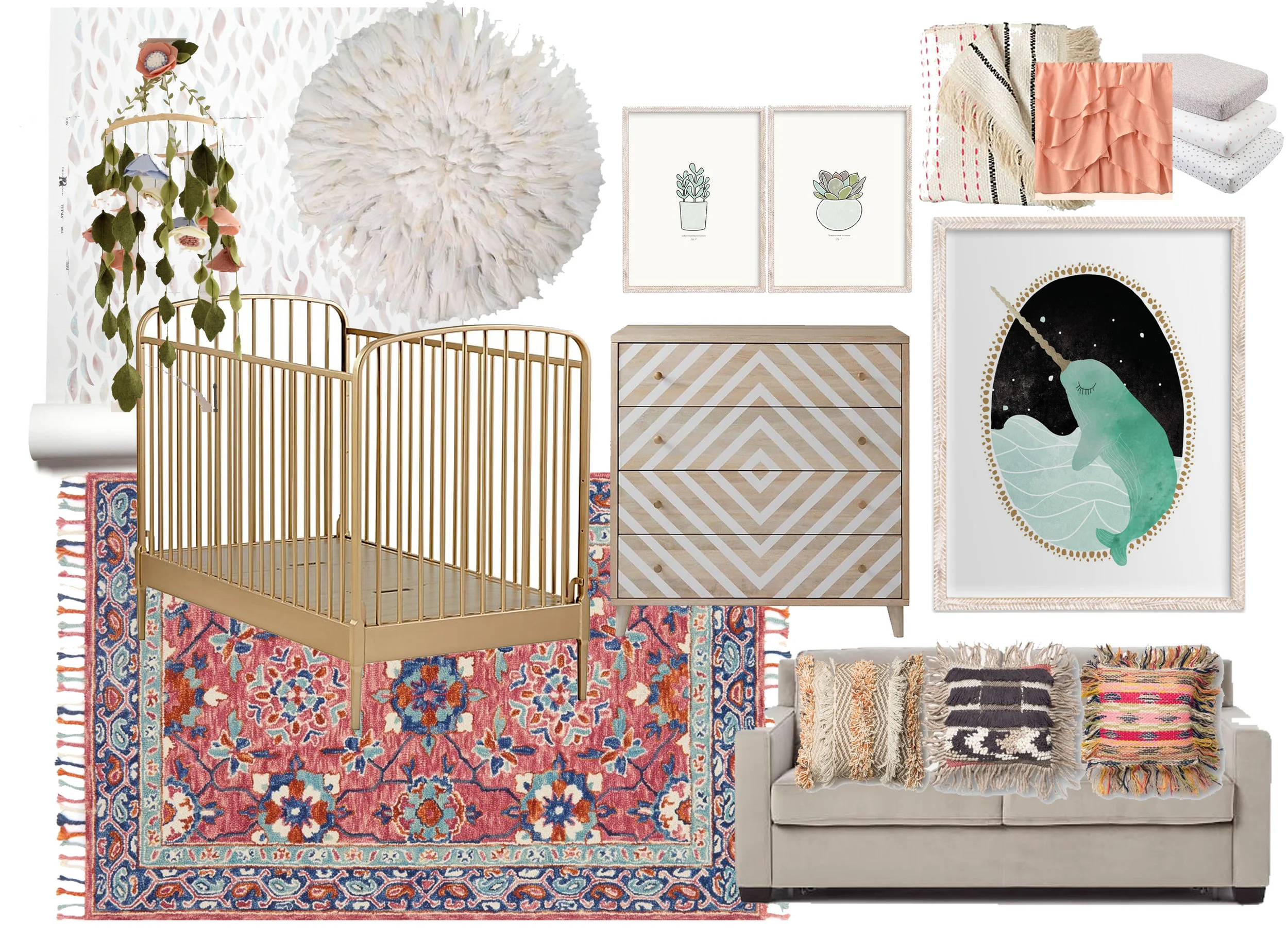
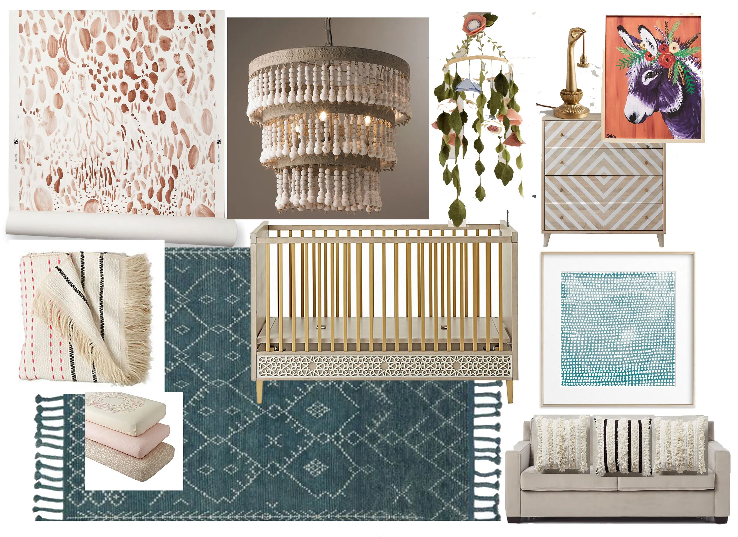
When we found out our client wanted a bohemian vibe- visions of tassel, textures, muted tones, and layers emerged. Just enough detail to create a cozy yet playful space!


Option 1- Whimsical Bohemian Vibes

Option 1- Whimsical Bohemian Vibes

Option 2- Wildflower Boho Chic

Option 2- Wildflower Boho Chic


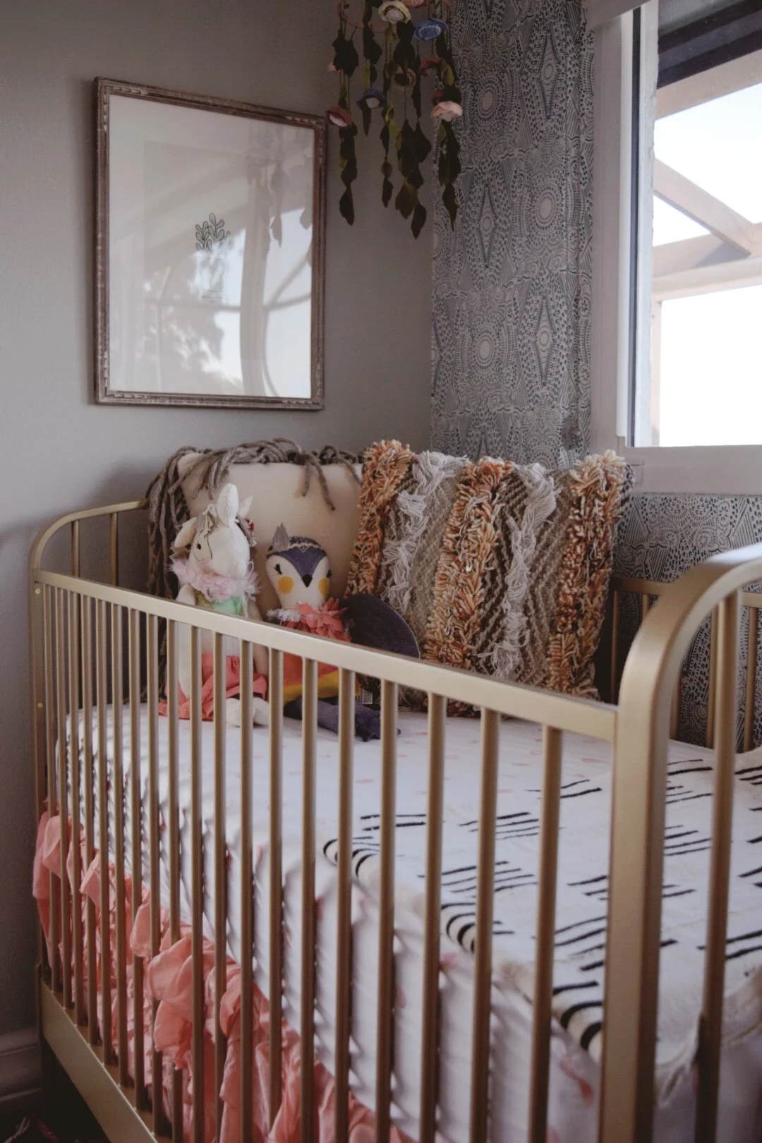
And the winner was ..... Whimsical Bohemian Vibes (well with a few minor tweaks)!


Mixing bold patterns and subtle prints- Lisa Gilmore Design

Mixing bold patterns and subtle prints- Lisa Gilmore Design

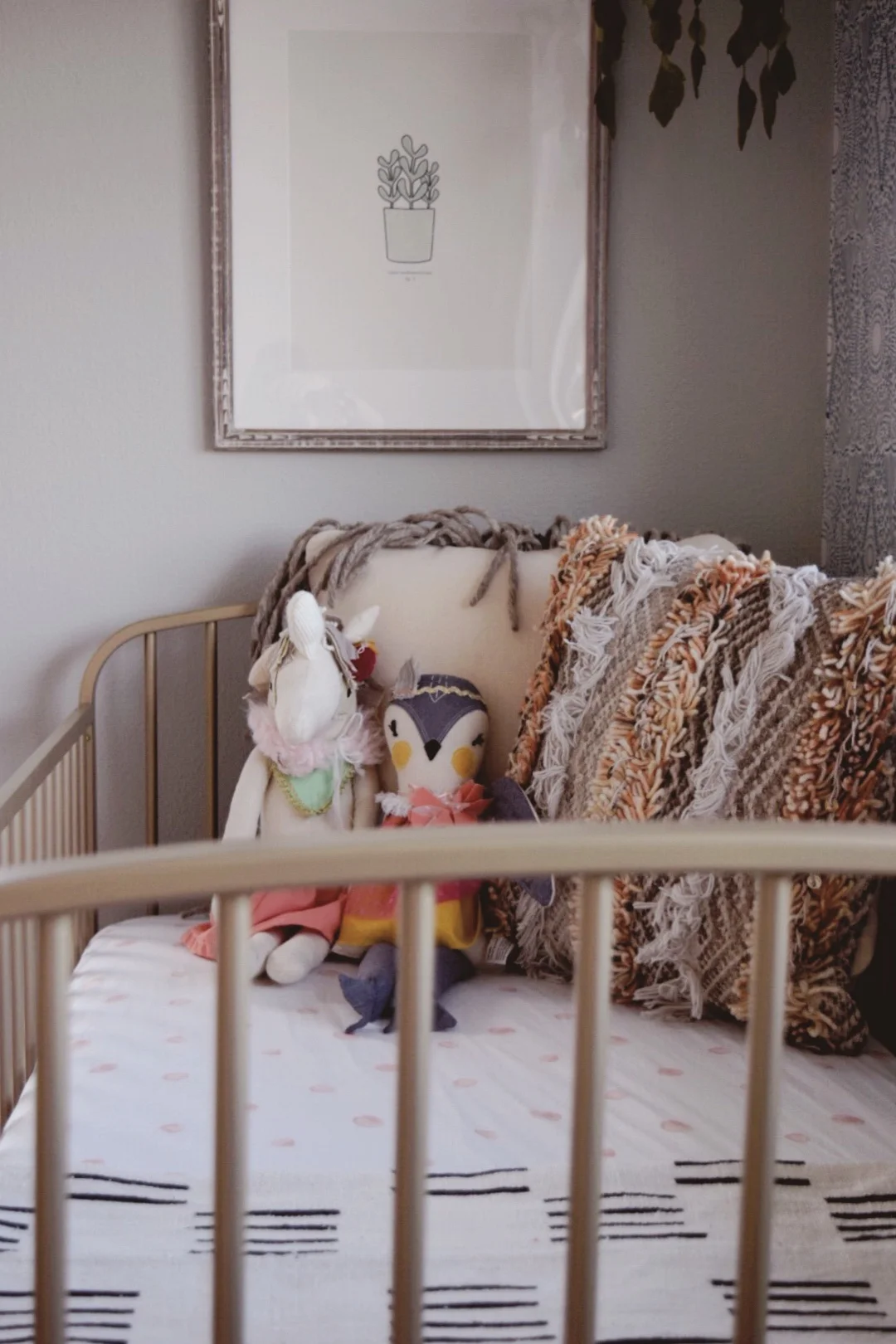
Minimalist artwork and layers of texture -Lisa Gilmore Design

Minimalist artwork and layers of texture -Lisa Gilmore Design

Brass elements paired with ornate wallpaper details- Lisa Gilmore Design

Brass elements paired with ornate wallpaper details- Lisa Gilmore Design

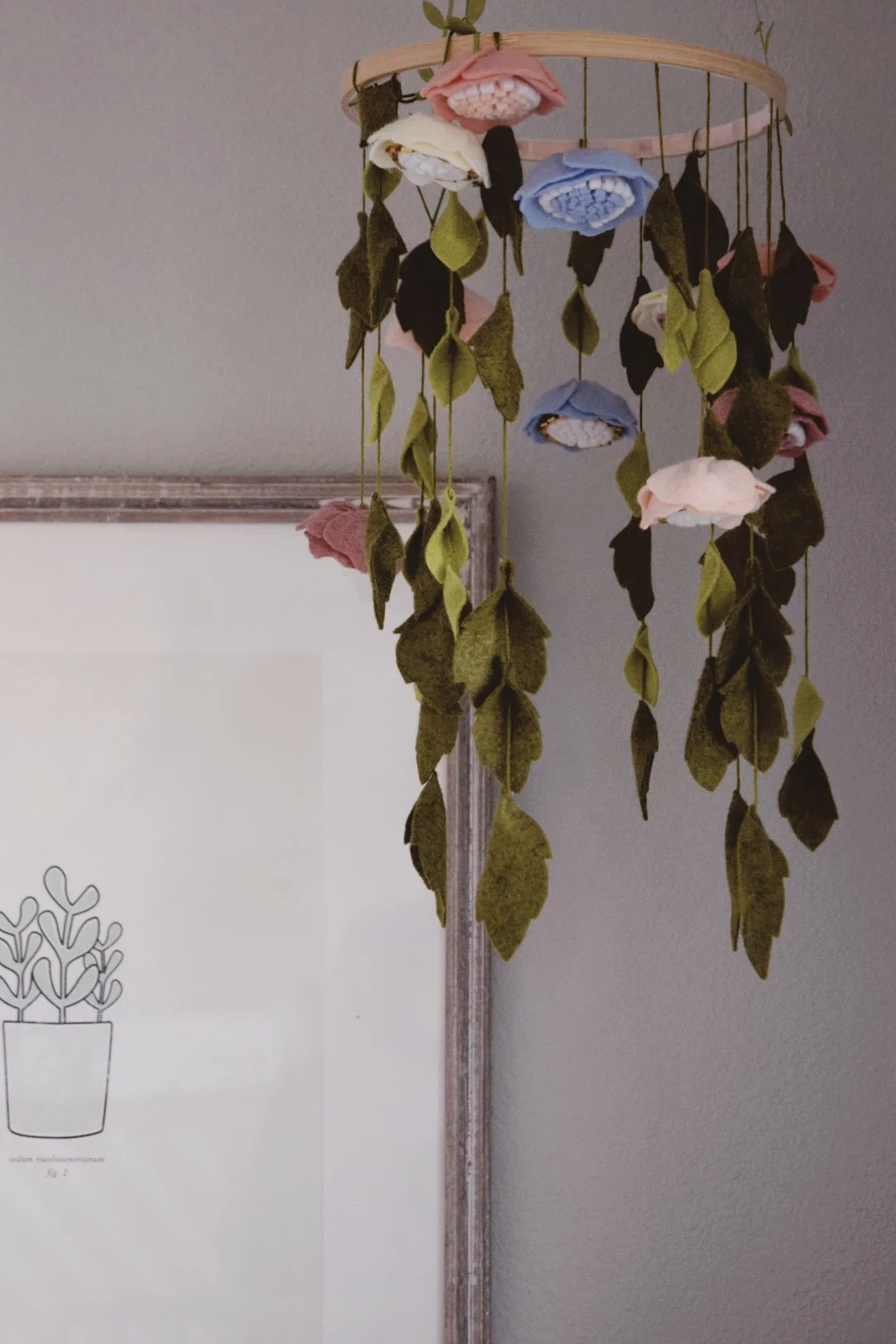
Delicate handmade felt flower mobile- Lisa Gilmore Design

Delicate handmade felt flower mobile- Lisa Gilmore Design

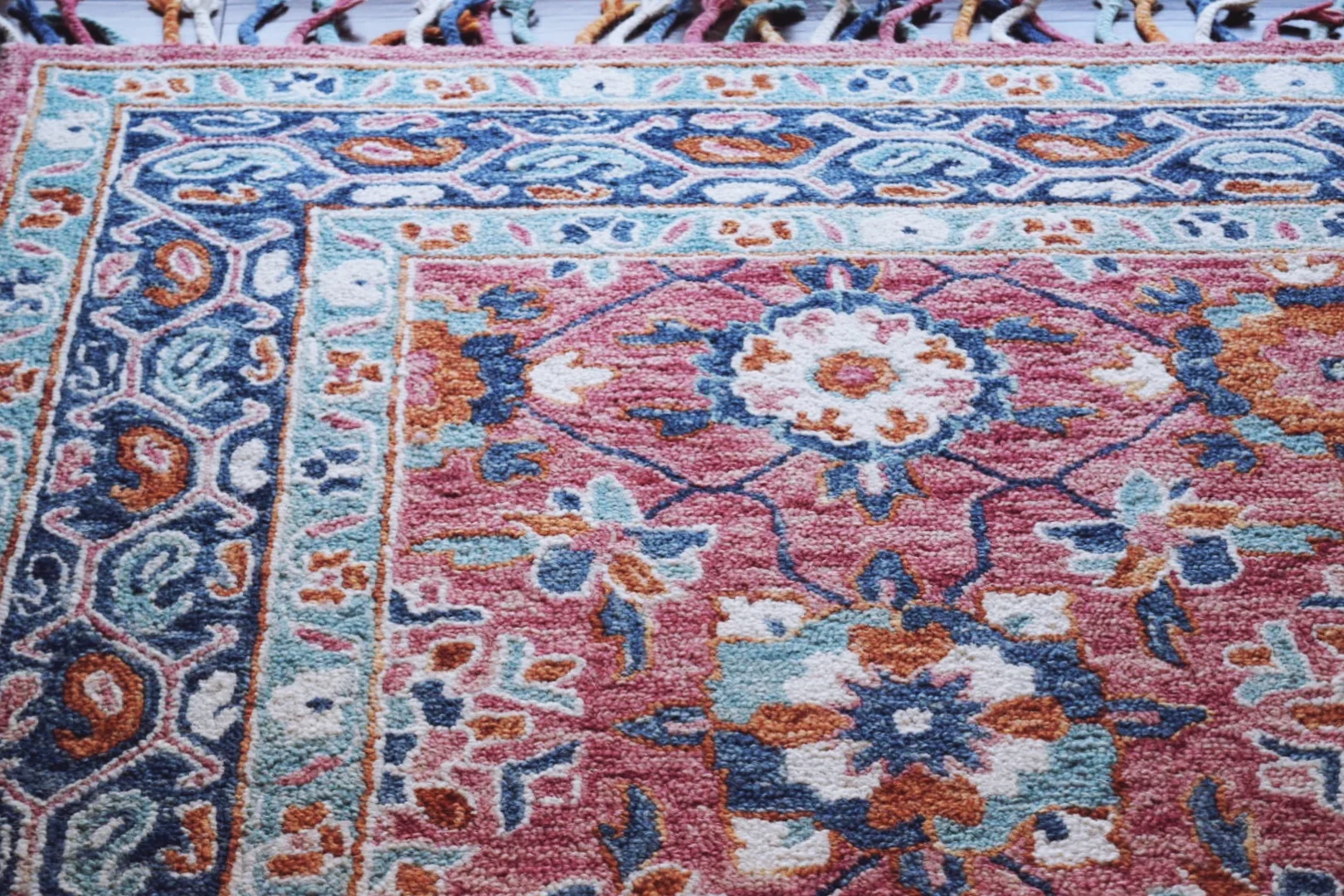
Beautiful tassel rug to tie every element in the room together -Lisa Gilmore Design

Beautiful tassel rug to tie every element in the room together -Lisa Gilmore Design

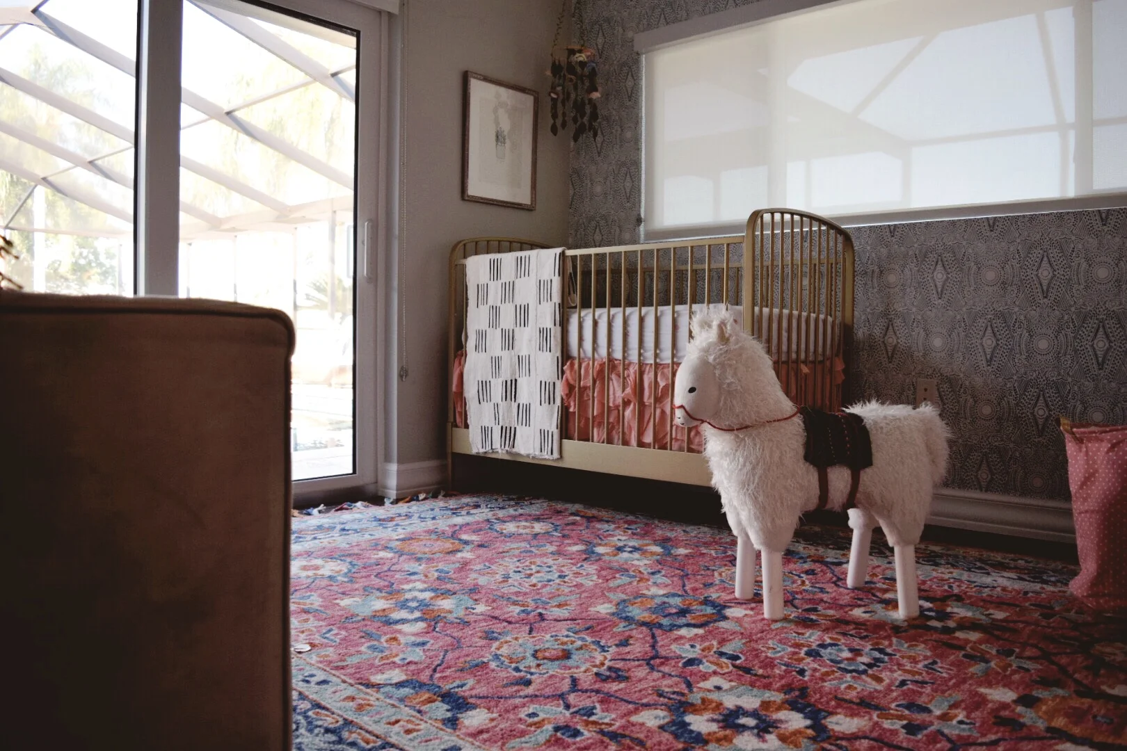
Whimsical Bohemian Nursery by Lisa Gilmore Design
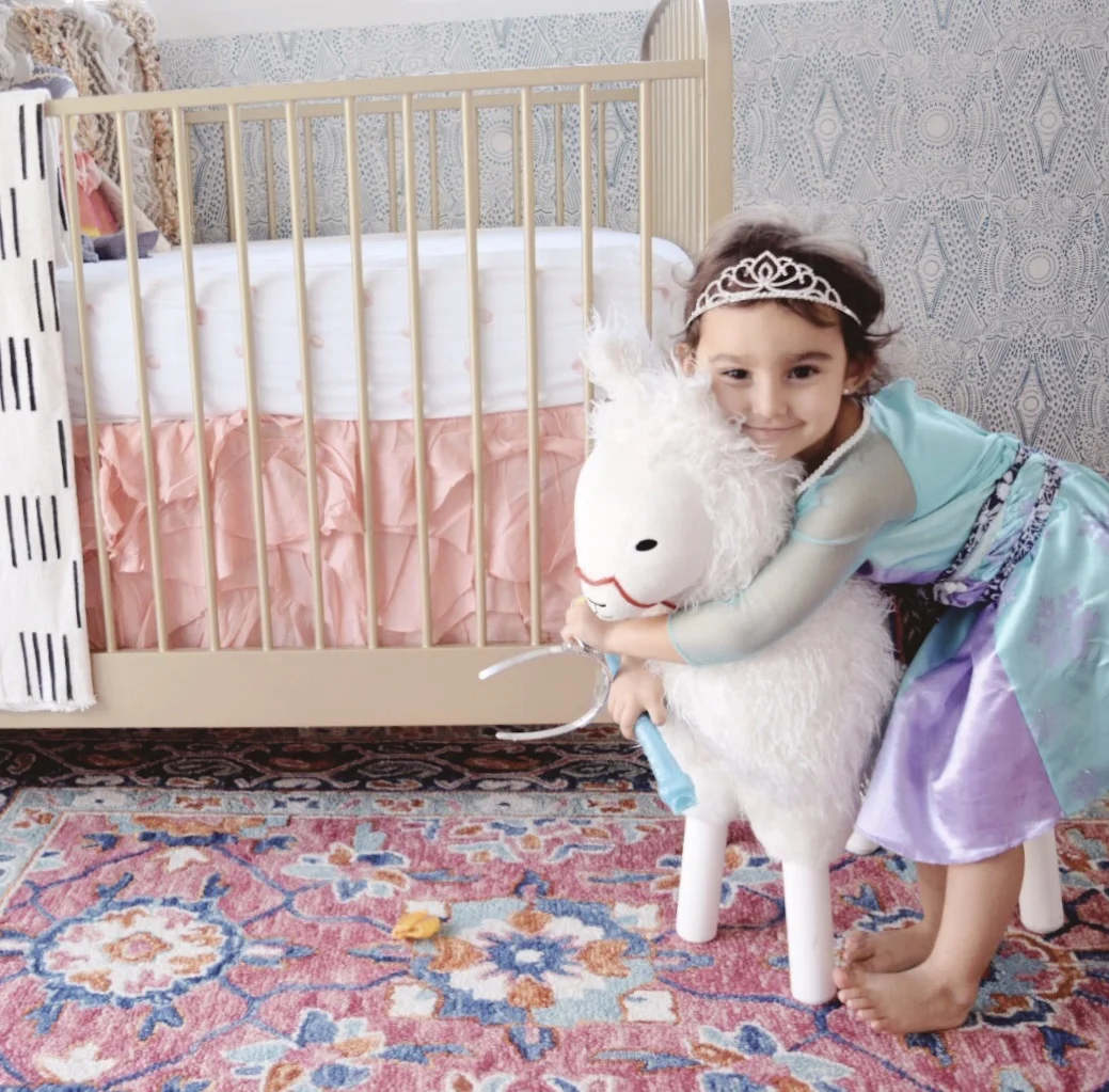
Whimsical Bohemian Nursery by Lisa Gilmore Design

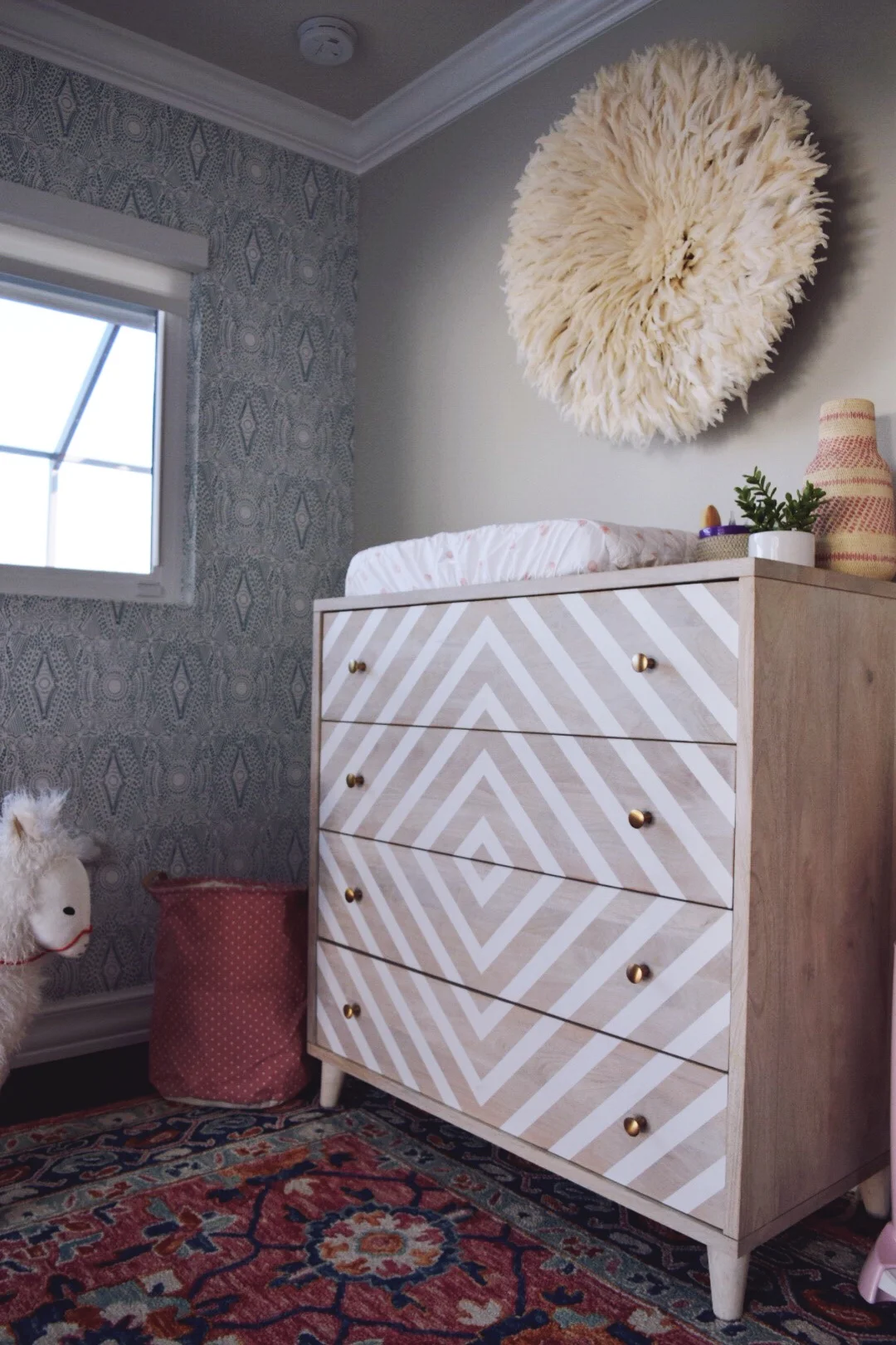
Juju headdress brings in all the gorgeous texture -Lisa Gilmore Design

Juju headdress brings in all the gorgeous texture -Lisa Gilmore Design

Whimsical Bohemian Nursery by Lisa Gilmore Design

Whimsical Bohemian Nursery by Lisa Gilmore Design
Bringing in the Whimsy with Narwhals- the unicorns of the sea! -Lisa Gilmore Design

Bringing in the Whimsy with Narwhals- the unicorns of the sea! -Lisa Gilmore Design

Layers and Layers of texture- Lisa Gilmore Design

Layers and Layers of texture- Lisa Gilmore Design

The proudest big sister around! -Lisa Gilmore Design

The proudest big sister around! -Lisa Gilmore Design

As a mom of two little girls, tiny human spaces have always been my favorite. However, creating a space where mother and daughter will bond and memories will be made is fulfilling in so many wonderful ways. A beautiful space is great but all the laughs and smiles which will be shared within it... well thats what makes it perfect :)

Till next time!

nicole signature.jpg
 

DESIGN PROJECT:: MODERN BOHEMIAN COLORFUL FAMILY LIVING

Last week, we shared Part I of this property with you. If you missed it, don't fret, you can see it right here.   

As promised, here is the second half. The family room and kitchen nook areas are much lighter and airier than the more "formal" areas of the house. 

We incorporated and super cozy velvety sectional sofa (I see your eye rolls, YES, this fabric IS super kid friendly and durable.) A few custom built ins and window seats provide ample storage for books and kids toys. Their son has actually dubbed this as his "car garage" for his toys, go on kid, load it up! Floating floor poufs combined with all the seating, make for many great seating options throughout the room.

BOHEMIAN LIVING ROOM - LISA GILMORE DESIGN
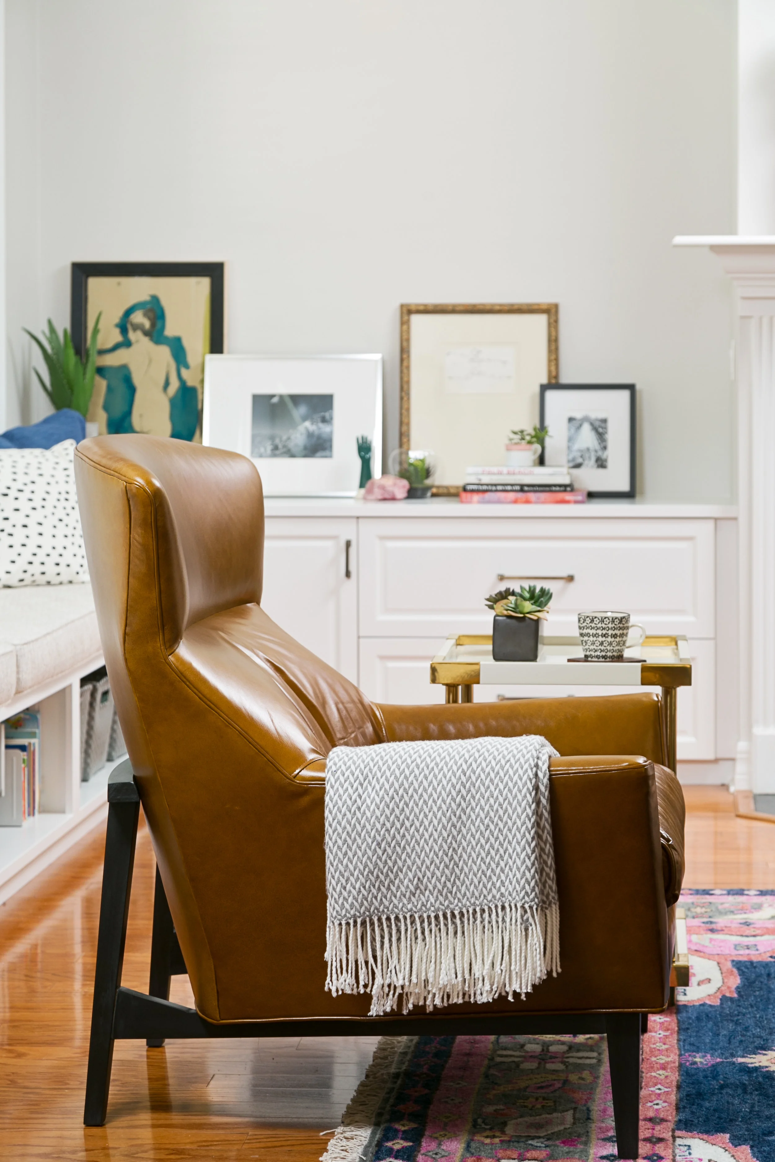
MODERN LEATHER CHAIR COGNAC | LISA GILMORE DESIGN
colorful area rug-pattern poufs-tuftedottoman - lisa gilmore design
bohemian modern family room and kitchen nook - lisa gilmore design

KITCHEN NOOK

Moving over to the kitchen nook, we had a lot of fun there. This needed to be a practical space for everyday eating, homework and daily life. We had our carpenter build a custom "L" shaped built in, complete with hidden storage in a pull out drawer. That's right, no more piles of shoes at the back door! *Can we get a high five?!* 

kid art gallery - kitchen nook - lisa gilmore design
creative shoe storage - lisa gilmore design

We really enjoyed framing all this really fantastic art created by their son, it really took the whimsy of the space to the next level, top it off with a glam chandelier and you've got a pretty fun space for kids and adults. 

Also, I must say, their 4 year old son was over the moon with happiness to see his art on the walls. He was full of so many stories to tell me about each piece. I definitely encourage you to showcase your children's works if possible, it's so good for their little souls and pride! 

glam family friendly kitchen nook - lisa gilmore design

We really adored working with this family on their home. We hope to continue to be in their lives for many years to come! Hopefully you enjoyed this residential property as much as we did designing it. 

Could you see yourself living in this super chic but family friendly space?!