When our client approached us about this project she was so excited to work on their home, they are a military family and as you know - move often. This would not be the case with this home and they were going to put some roots into St. Petersburg!
The home they purchased has a great layout and style it just needed to be a bit happier and showcase their personal style. So the LGDesign team got to work, pulling inspiration - all the things that make for a happy vibe and started working on a floor plan that would flow and accomplish all of their needs.
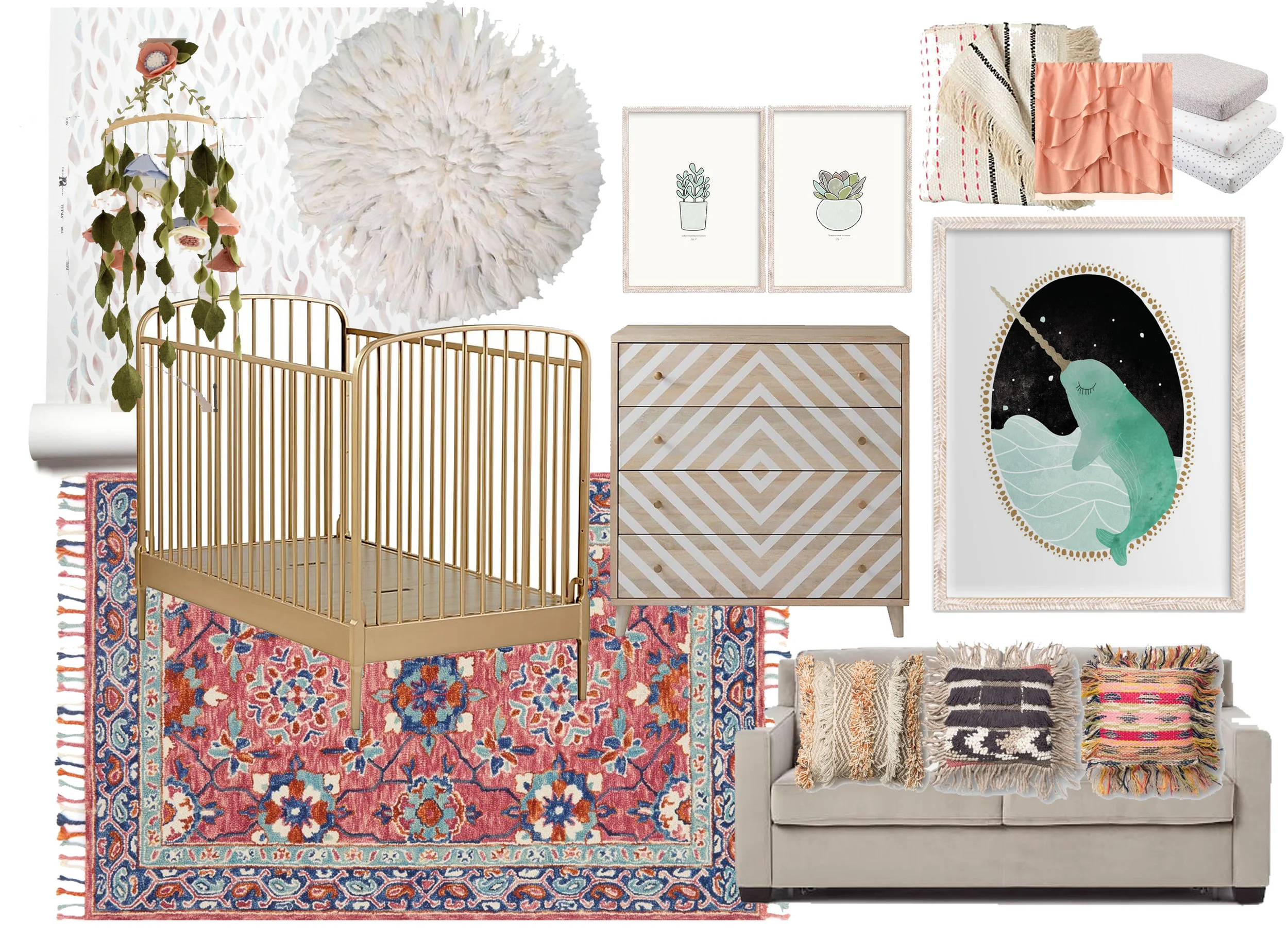
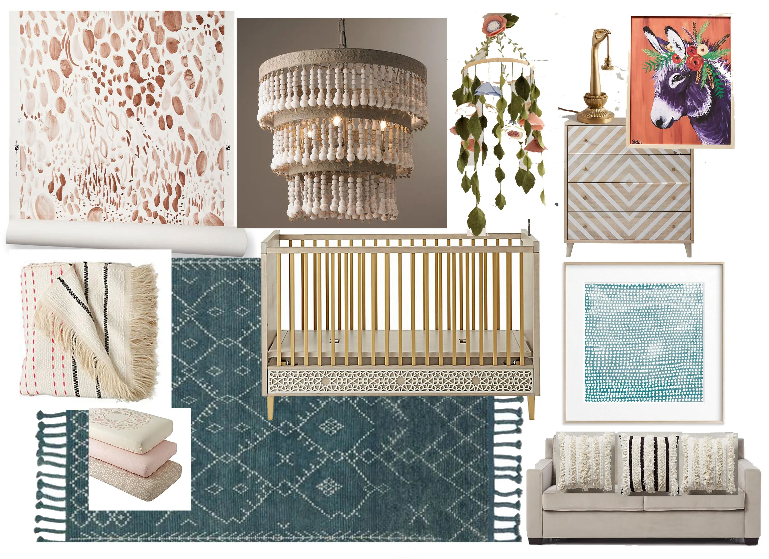
VISION BOARD BY LISA GILMORE DESIGN FOR PRIVATE RESIDENCE
LIVING & DINING ROOM BEFORE:
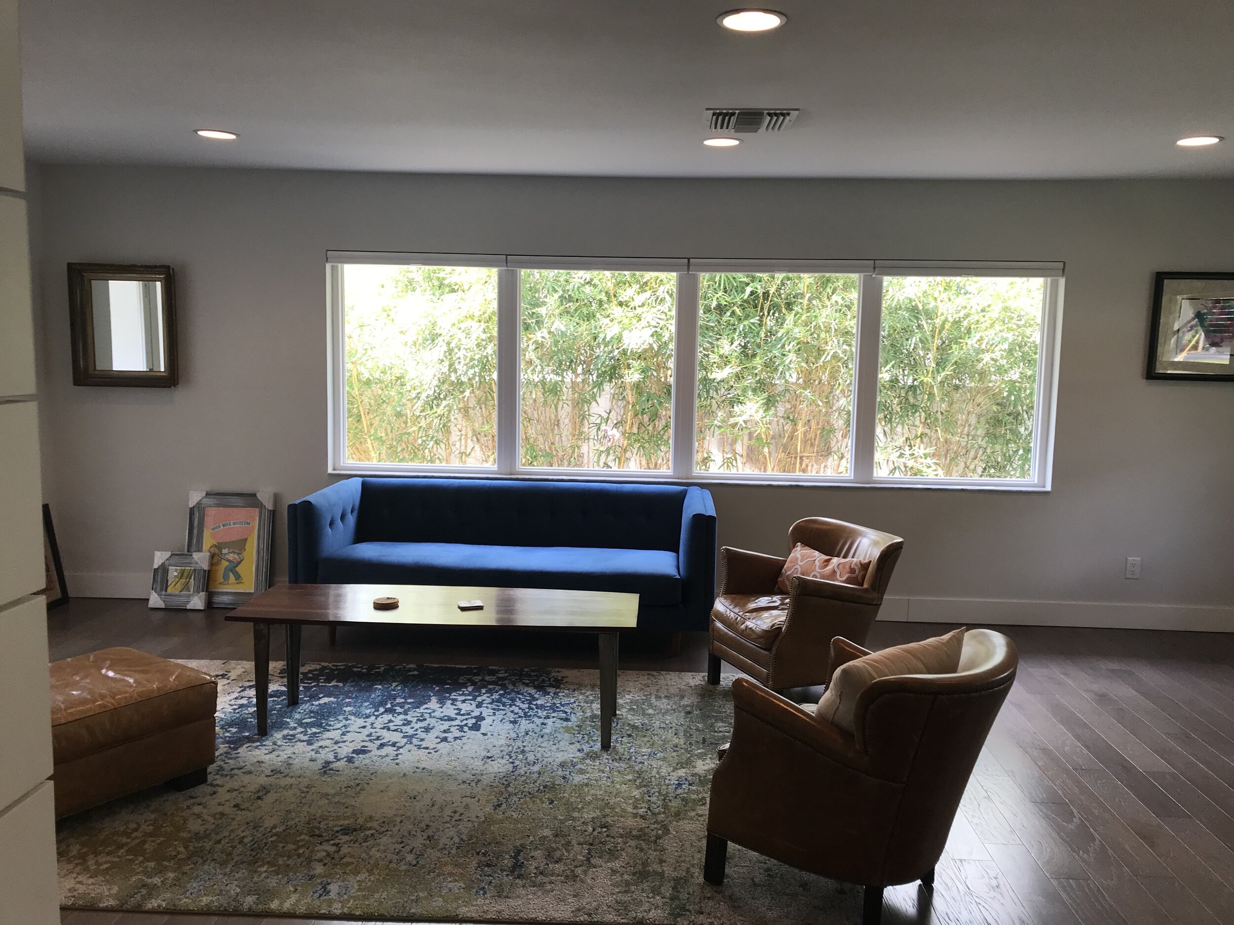
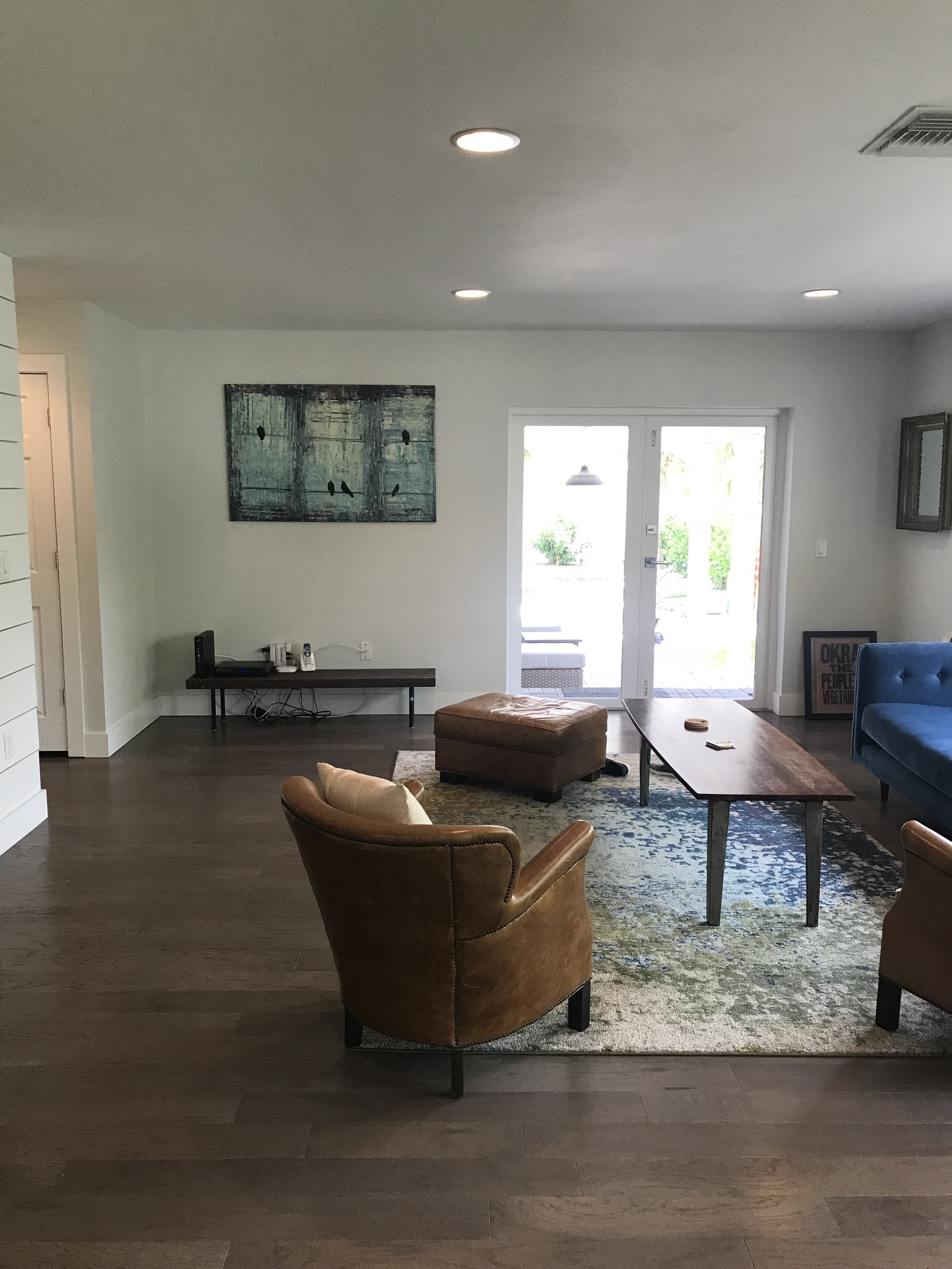

Looking at the before photos, you can see the potential, right? We knew we could give that room more justice, working on the flow of furniture, color choices and complimenting elements. We really loved the lush greenery backdrop and allowed that to play into our choices as well.
LIVING & DINING ROOM AFTER:
Creating a balance between the kitchen, dining and living room was important. Furniture layout, scale and color played a large role in this also allowing the sunlight to naturally flow through the space. A mixture of furniture selections with “visual weight” combined with sleek more “airy” options really suited the size of the space well, also allowing no interruption of sunlight to soak through the space.
LISA GILMORE DESIGN | NATIVE HOUSE PHOTOGRAPHY
We mentioned that happy, sunny and modern was the goal, right?
Well, if these sleek vintage mid century modern dining chairs revamped in this bright yellow doesn’t strike a smile and joy… we aren’t really sure what can! We personally love how the dining area is very light and airy, however, it doesn’t lack wow factor at all. Minimalist with a colorful punch.
LISA GILMORE DESIGN | NATIVE HOUSE PHOTOGRAPHY
Our client had some pretty great existing items to work with, including art collected over the years and a few key furniture pieces with personality. This home doesn’t lack in individuality.
LISA GILMORE DESIGN | NATIVE HOUSE PHOTOGRAPHY
LISA GILMORE DESIGN | NATIVE HOUSE PHOTOGRAPHY
When we talk about the art collection, we don’t mean just a few random things. They have some really cool stuff! Memorabilia from different World’s Fair’s, music posters, a collection of patches, maps, and original art. In addition to their cool and sassy art collection, they are also quite the music lovers and have a collection of records.
So we decided, these important pieces need a home, but not just tucked away storage, we wanted them to sing. (pun intended.) That inspired this functional and artsy music lounge corner.
Ample space for a large and continuously growing record collection, with the perfect perch for their record player, open shelving for plants and collectables, complete with their unique art collection, thoughtfully framed and hung in our beloved gallery style, topped off with some wall sconce lighting to create the perfect ambience.
LISA GILMORE DESIGN | NATIVE HOUSE PHOTOGRAPHY
We are pretty proud to say that we feel the happy and sunny vibe was achieved. Check out more of the home here, (complete with monkey wallpaper!) if you would like to see how we continued this feeling throughout!
