DESIGN PROJECT

DESIGN PROJECT | A CUSTOM CAPE DUTCH HOME

We just started working on a new custom residential home that is being built in sunny St. Petersburg, in the Snell Isle neighborhood. We absolutely love the start of a new project, meeting with clients, learning their styles, about their families, hobbies including everything that goes into a happy home. I joke often, but it really is a lot like dating - going back and forth, understanding likes and dislikes. Here is the vision we have created for this breezy upscale property.

A DREAMY FAMILY HOME INSPIRED BY CAPE DUTCH ARCHITECTURE

Vision board created by Lisa Gilmore Design for Custom Cape Dutch Style Home


BRITISH WEST INDIES MEETS DUTCH CAPE VIBE: POLISHED AND ELEGANT WITH MIXES OF NATURAL, APPROACHABLE AND DURABLE ELEMENTS.

 
  • Monochromatic tone all over incorporating the use of contrast to make it fresh and modern. 

  • Wow factors throughout: uses of interesting tile, lighting, architectural details, all shaking hands with supporting characters to create a beautiful and cohesive design.

  • High end resort feel: lush greenery, indoor & outdoor drapery, lovely & durable textiles and unique furnishings. Everyone comes to your house for a great time and they can leave their worries at the door, as if they were stepping into a Slim Aarons photograph  โ€œI'm concentrated on photographing attractive people doing attractive things in attractive placesโ€- Slim Aarons

  • Fashion influences: posh and tailored with an approachable feel, not trying too hard, luxury style that comes at an ease and makes heads turn. 

  • Modern art mixed in with modern and traditional furniture: a curated vibe, nothing will feel matchy, as if you picked up a side table on a trip to South Africa, a painting in France and a light fixture in New York. 

Rendering of Cape Dutch custom home by ClearPH

The home was designed and is being built by our friends at Peregrine Construction. We are so excited to break ground January 2019, follow along with the progress in our social media. #lisagilmore #capedutchmodern
DESIGN CHAT: BLACK & WHITE COLOR PALETTE

As much as we love color here at Lisa Gilmore Design.  We also LOVE a black & white palette. There is something timeless, classic yet versatile about the opposite attraction of black & white.  Whether itโ€™s tile or drapery or vintage zebra print chairs, we have done it all and will continue to. The key to a black & white palette is texture and to not be afraid to go BOLD. 

Texture and Mixed Metals can make an amazing palette! 

Texture and Mixed Metals can make an amazing palette! 

Living Room Vignette by Lisa Gilmore Design 

Contemporary black and white master bedroom by Lisa Gilmore Design

Black and white formal living room by Lisa Gilmore Design 

DESIGN CHAT:: KID ART GALLERY WALLS

HOW TO DISPLAY YOUR BUDDING ARTISTS' MASTERPIECS

As parents, we all think our children's artwork is amazing and has the potential of being world famous some day.  We are bombarded with handprints, scribbles, sweet holiday sentiments, and everything in between.  We love our children and their budding talents but what can we do with ALL the art that is sent home?  My answer is... MAKE A GALLERY WALL!!  Gallery walls are fun, sentimental, and a great way to have your children get involved in personalizing your home.  

Lisa Gilmore Design has recently installed two family homes incorporating kid art gallery walls.

Lisa Gilmore Design New England Family Home Project

We changed up the frames with this design.  We chose mixed metals, white, and black frames to highlight the children's art.  We added some structural, non-kid design elements to break up the wall a bit.  The art is hung in a balanced yet, whimsical way.  

Lisa Gilmore Design Bold, Vibrant, Chic Project

Lisa Gilmore Design Bold, Vibrant, Chic Project

For this project, we hugged a corner and varied the size of frames and artwork size significantly.  The bright colors of this growing Picasso flows into the bold, chicness of the home's design. 

To add a kid art gallery wall in your home, please remember these few tips: keep it fun & creative, leave room for additions, and be prepared to feel random sentimentality when you look on your wall. 

Happy Hanging! 

kristin signature.jpg
 

BOHO CHIC NURSERY

DREAMY LITTLE SPACES

Excited would be an understatement when we were approached by a long time client and friend to design their second daughters nursery!

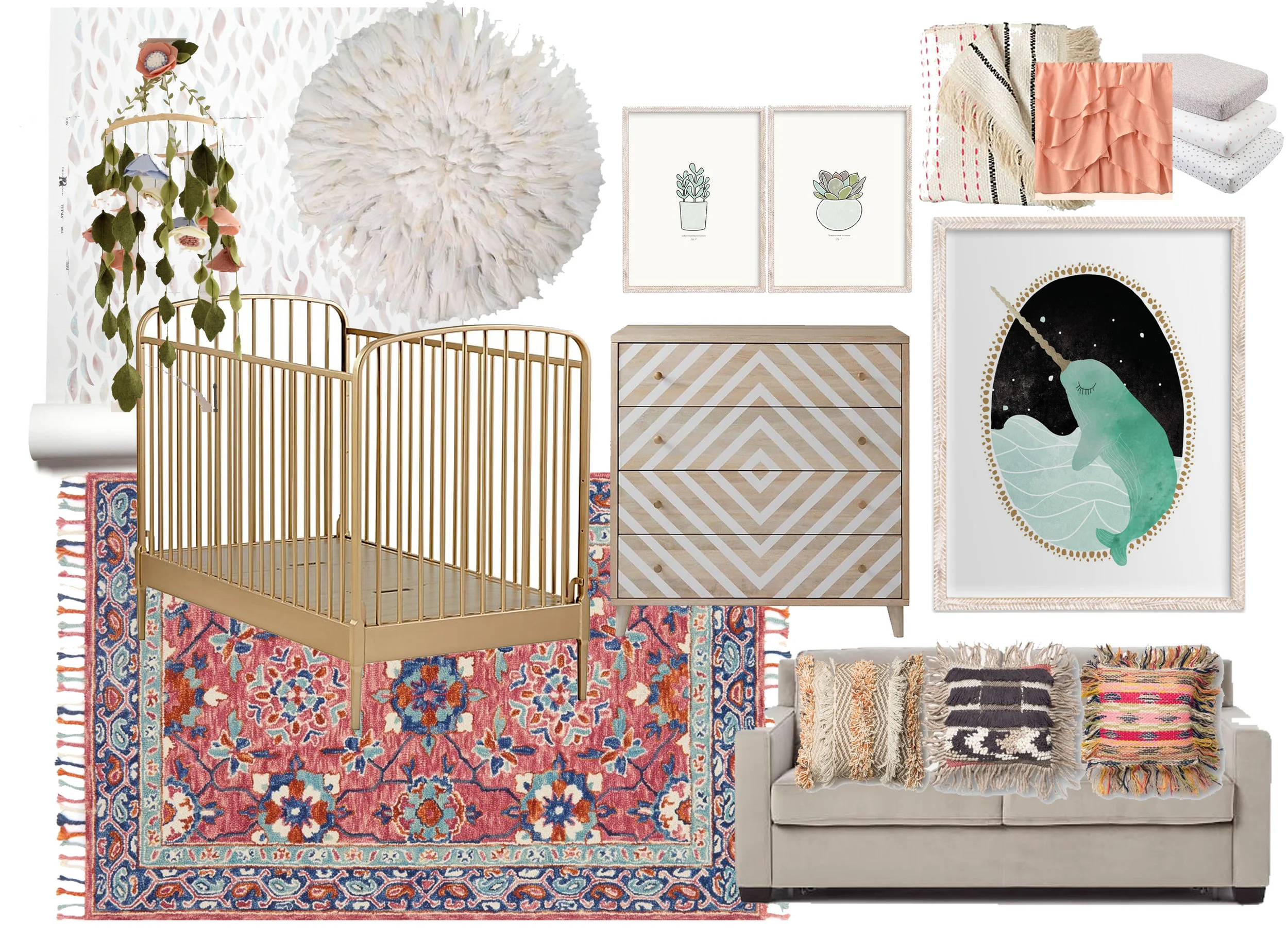
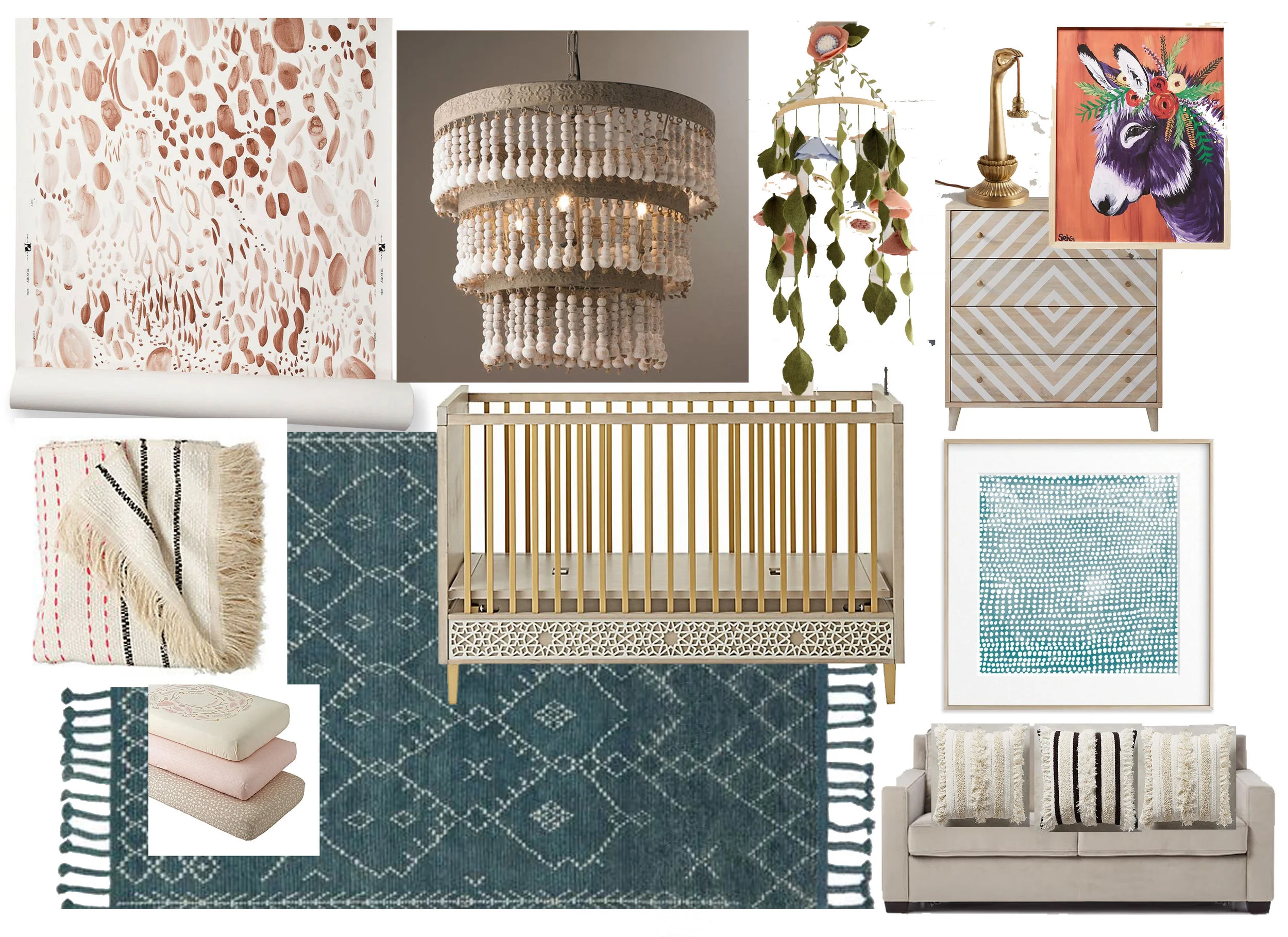
When we found out our client wanted a bohemian vibe- visions of tassel, textures, muted tones, and layers emerged. Just enough detail to create a cozy yet playful space!


Option 1- Whimsical Bohemian Vibes

Option 1- Whimsical Bohemian Vibes

Option 2- Wildflower Boho Chic

Option 2- Wildflower Boho Chic


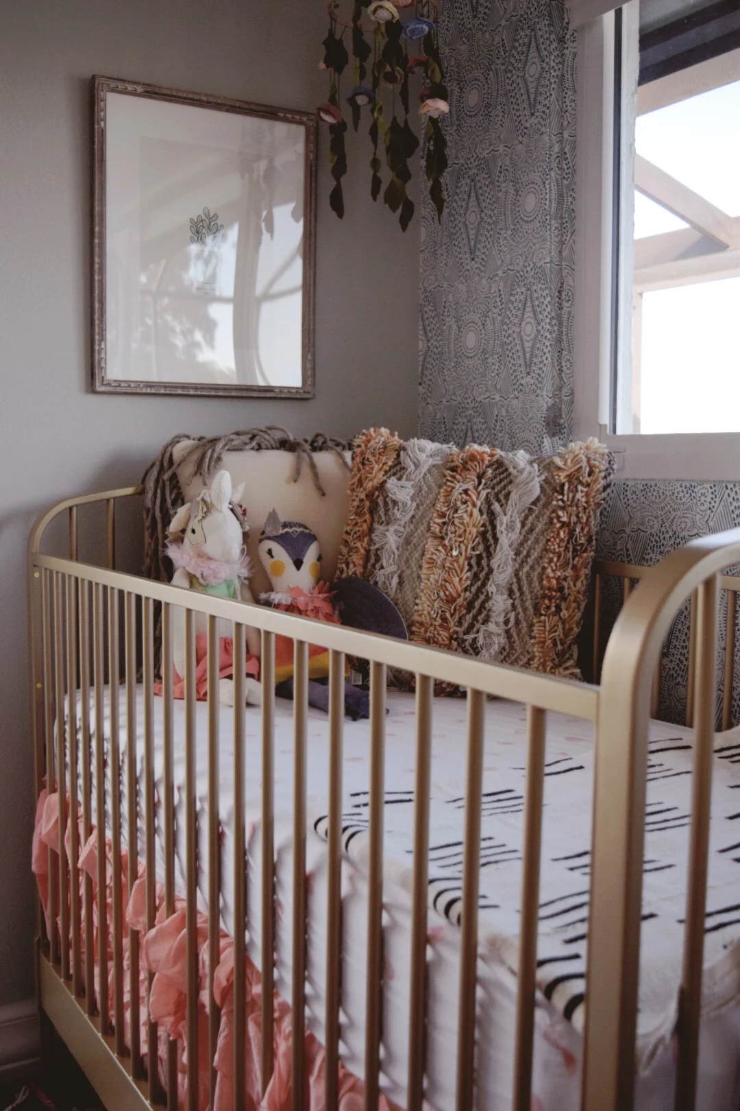
And the winner was ..... Whimsical Bohemian Vibes (well with a few minor tweaks)!


Mixing bold patterns and subtle prints- Lisa Gilmore Design

Mixing bold patterns and subtle prints- Lisa Gilmore Design

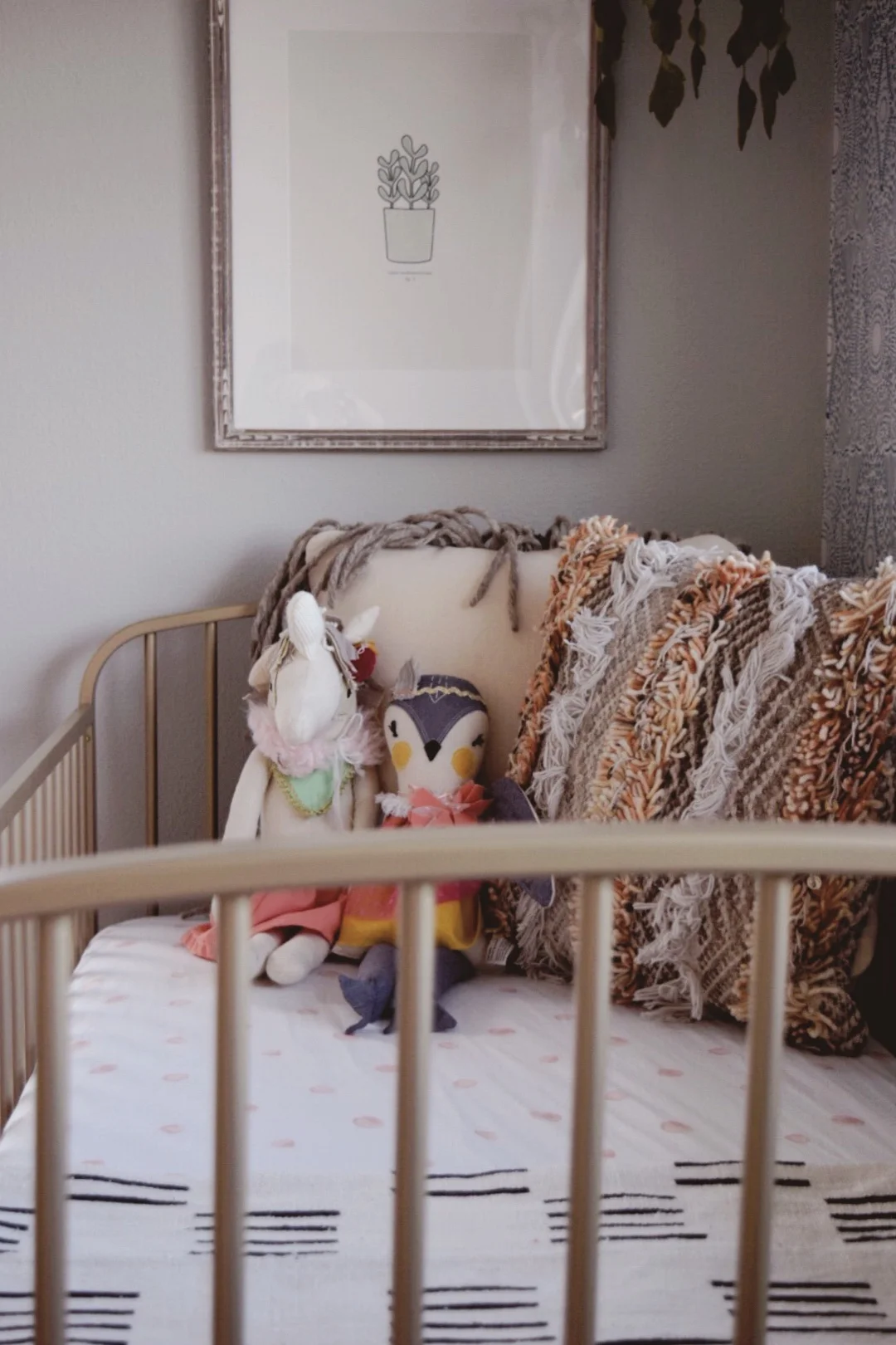
Minimalist artwork and layers of texture -Lisa Gilmore Design

Minimalist artwork and layers of texture -Lisa Gilmore Design

Brass elements paired with ornate wallpaper details- Lisa Gilmore Design

Brass elements paired with ornate wallpaper details- Lisa Gilmore Design

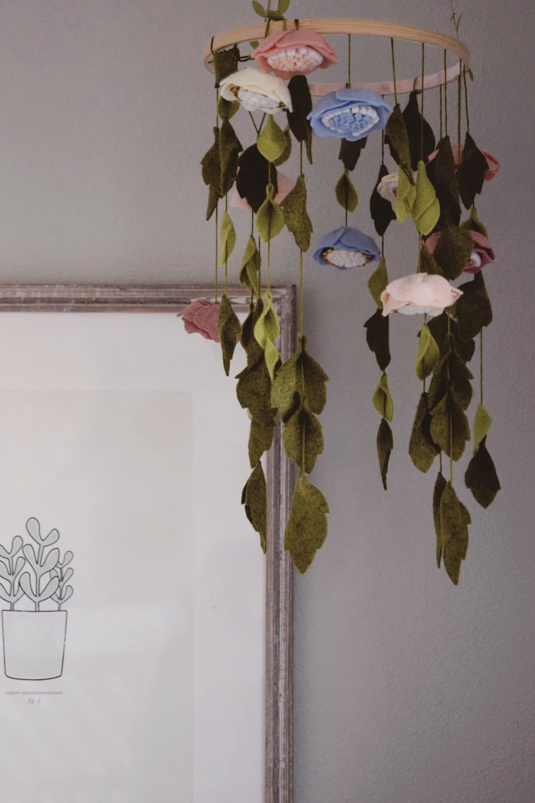
Delicate handmade felt flower mobile- Lisa Gilmore Design

Delicate handmade felt flower mobile- Lisa Gilmore Design

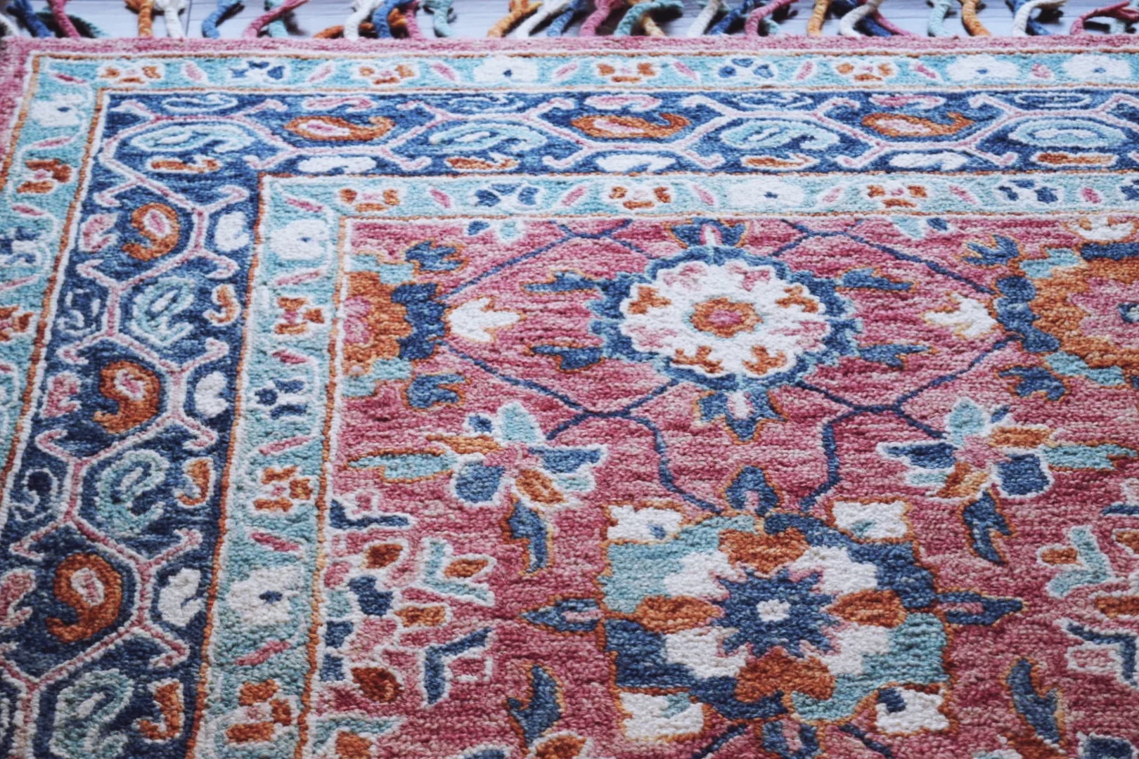
Beautiful tassel rug to tie every element in the room together -Lisa Gilmore Design

Beautiful tassel rug to tie every element in the room together -Lisa Gilmore Design

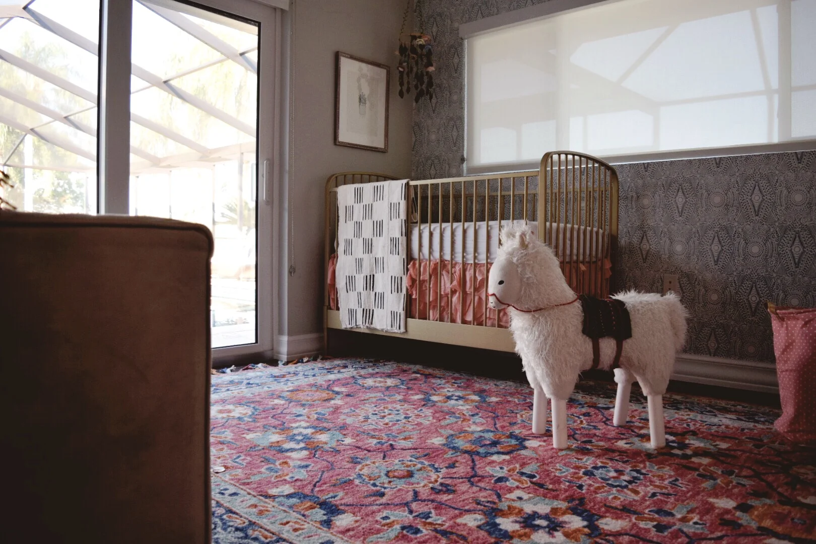
Whimsical Bohemian Nursery by Lisa Gilmore Design

Whimsical Bohemian Nursery by Lisa Gilmore Design

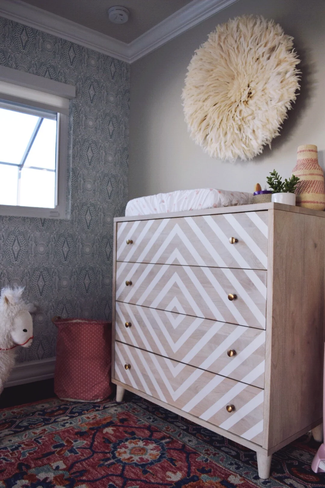
Juju headdress brings in all the gorgeous texture -Lisa Gilmore Design

Juju headdress brings in all the gorgeous texture -Lisa Gilmore Design

Whimsical Bohemian Nursery by Lisa Gilmore Design

Whimsical Bohemian Nursery by Lisa Gilmore Design

Bringing in the Whimsy with Narwhals- the unicorns of the sea! -Lisa Gilmore Design

Bringing in the Whimsy with Narwhals- the unicorns of the sea! -Lisa Gilmore Design

Layers and Layers of texture- Lisa Gilmore Design

Layers and Layers of texture- Lisa Gilmore Design

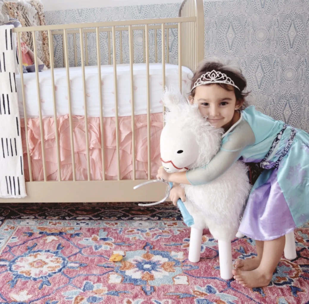
The proudest big sister around! -Lisa Gilmore Design

The proudest big sister around! -Lisa Gilmore Design

As a mom of two little girls, tiny human spaces have always been my favorite. However, creating a space where mother and daughter will bond and memories will be made is fulfilling in so many wonderful ways. A beautiful space is great but all the laughs and smiles which will be shared within it... well thats what makes it perfect :)

Till next time!

nicole signature.jpg