DESIGN PROJECT VIDEO TOUR:: COLOR ME TRADITIONAL

Here is a beautiful glimpse into a recent full home renovation project. We are so pleased with how this turned out, from every tile selection, and furniture piece, down to every little tassel. Enjoy!

Timeless traditional elements, beautiful colors and an array of patterns fill this home with just the perfect amount of character and style. This project was also featured on Homes & Gardens UK.

DESIGN PROJECT BEFORE & AFTER:: ONCE DULL, NOW A MODERN, SUNNY & FUNCTIONAL LIVING & DINING ROOM

When our client approached us about this project she was so excited to work on their home, they are a military family and as you know - move often. This would not be the case with this home and they were going to put some roots into St. Petersburg!

The home they purchased has a great layout and style it just needed to be a bit happier and showcase their personal style. So the LGDesign team got to work, pulling inspiration - all the things that make for a happy vibe and started working on a floor plan that would flow and accomplish all of their needs.

VISION BOARD BY LISA GILMORE DESIGN FOR PRIVATE RESIDENCE


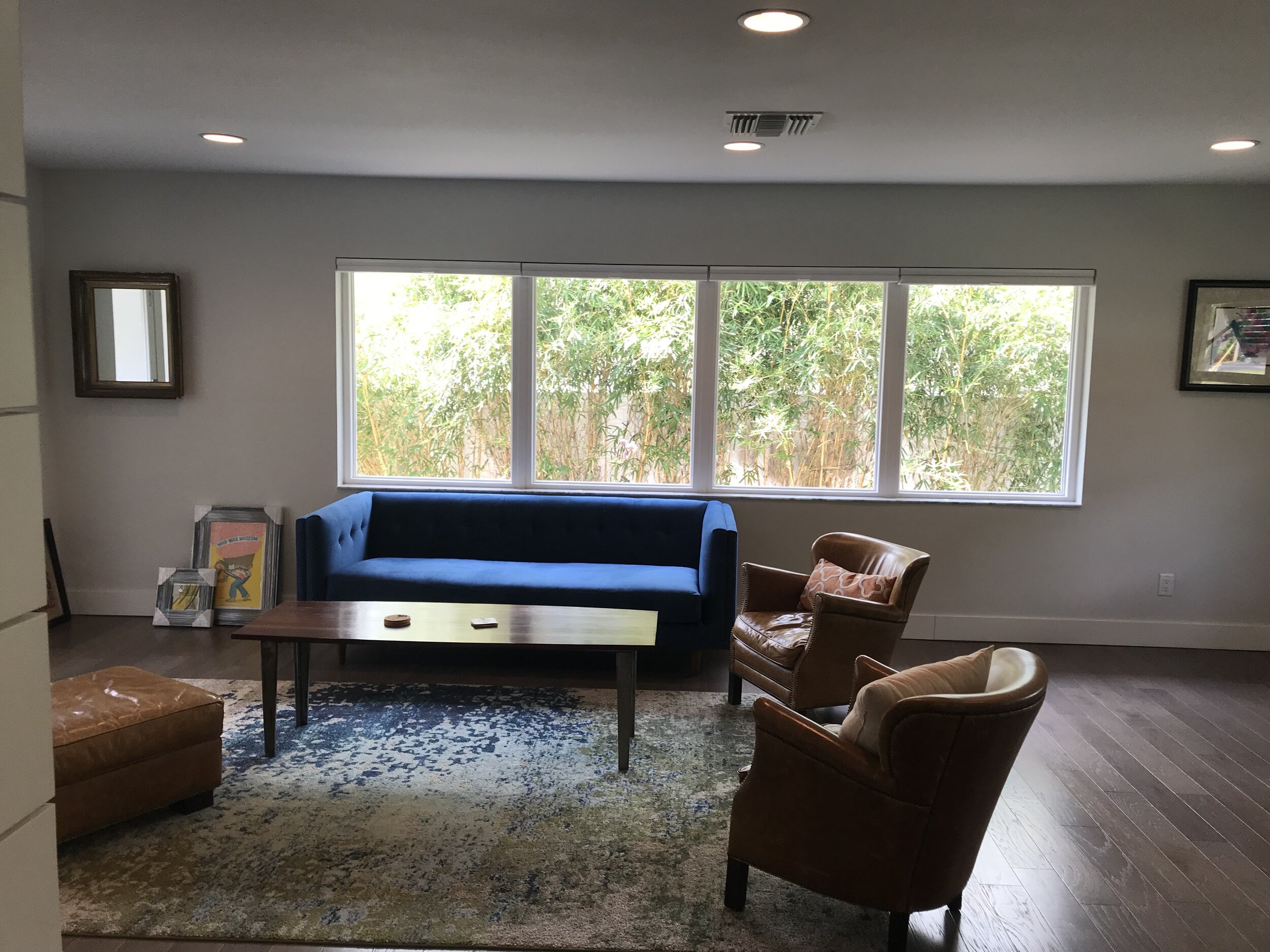
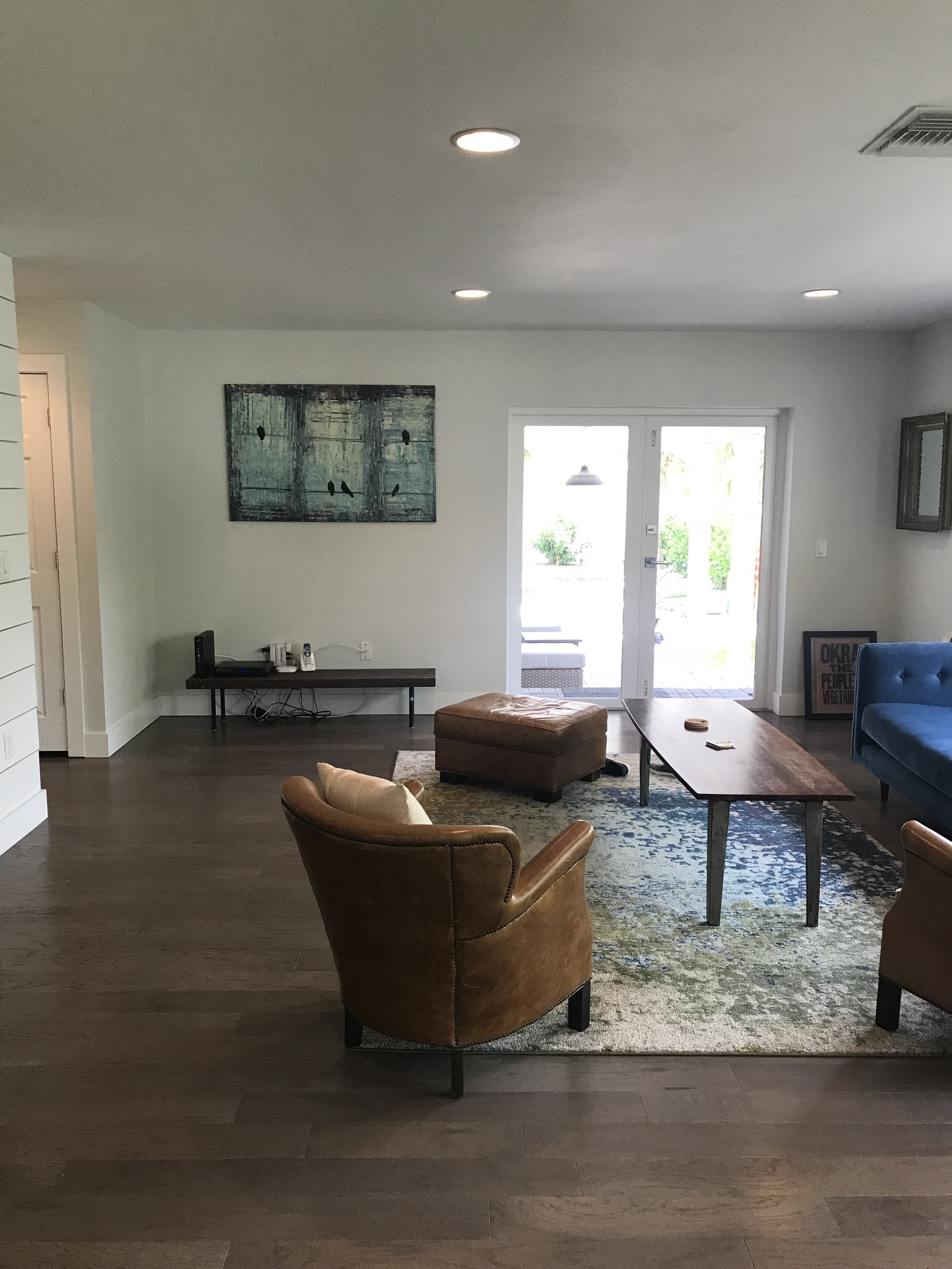
LIVING & DINING ROOM BEFORE:

Looking at the before photos, you can see the potential, right? We knew we could give that room more justice, working on the flow of furniture, color choices and complimenting elements. We really loved the lush greenery backdrop and allowed that to play into our choices as well.


LIVING & DINING ROOM AFTER:

Creating a balance between the kitchen, dining and living room was important. Furniture layout, scale and color played a large role in this also allowing the sunlight to naturally flow through the space. A mixture of furniture selections with “visual weight” combined with sleek more “airy” options really suited the size of the space well, also allowing no interruption of sunlight to soak through the space.

LISA GILMORE DESIGN | NATIVE HOUSE PHOTOGRAPHY

We mentioned that happy, sunny and modern was the goal, right?

Well, if these sleek vintage mid century modern dining chairs revamped in this bright yellow doesn’t strike a smile and joy… we aren’t really sure what can! We personally love how the dining area is very light and airy, however, it doesn’t lack wow factor at all. Minimalist with a colorful punch.

LISA GILMORE DESIGN | NATIVE HOUSE PHOTOGRAPHY

Our client had some pretty great existing items to work with, including art collected over the years and a few key furniture pieces with personality. This home doesn’t lack in individuality.

LISA GILMORE DESIGN | NATIVE HOUSE PHOTOGRAPHY

LISA GILMORE DESIGN | NATIVE HOUSE PHOTOGRAPHY

When we talk about the art collection, we don’t mean just a few random things. They have some really cool stuff! Memorabilia from different World’s Fair’s, music posters, a collection of patches, maps, and original art. In addition to their cool and sassy art collection, they are also quite the music lovers and have a collection of records.

So we decided, these important pieces need a home, but not just tucked away storage, we wanted them to sing. (pun intended.) That inspired this functional and artsy music lounge corner.

Ample space for a large and continuously growing record collection, with the perfect perch for their record player, open shelving for plants and collectables, complete with their unique art collection, thoughtfully framed and hung in our beloved gallery style, topped off with some wall sconce lighting to create the perfect ambience.
LISA GILMORE DESIGN | NATIVE HOUSE PHOTOGRAPHY

We are pretty proud to say that we feel the happy and sunny vibe was achieved. Check out more of the home here, (complete with monkey wallpaper!) if you would like to see how we continued this feeling throughout!

WALLPAPER DREAMS

WALLPAPERED BEDROOMS THAT GIVE YOU THE SWEETEST DREAMS

In our opinion, bedrooms are such an important place and they should be planned well with your design. Often bedrooms are forgotten or maybe not seen as that important because it’s kind of a “hidden room”. However, we feel the exact opposite! Bedrooms are the last thing you see when you fall asleep and the first thing you see when you wake up. It sets the tone for your day and your mood, it’s also a great place to show your personality and have some fun!

A well designed bedroom can rejuvenate you and give you the perfect comfort you need and we feel it shouldn’t sacrifice style. Wallpaper is one way we really like to punch it up in the bedroom.

Here are a few bedrooms we have designed over the years that showcase all the wallpaper feels.


CHIC HIGH RISE MASTER BEDROOM

Lisa Gilmore Design | Seamus Payne Photography

Often high rise living comes with amazing views, but sometimes smaller spaces. For this master, we opted to keep it rather monochromatic with the design, but mixing patterns and textures. This wallpaper has a bit of an urban flair that paired so nicely with more feminine elements. We just love how the horizontal lines lead your eye out beyond the floor to ceiling windows.


BOHEMIAN MODERN MASTER BEDROOM

Lisa Gilmore Design | Native House Photography

Inviting warm tones, layered rugs, modern furniture - the perfect compliment for this space is a wallpaper with an artistic hand. The navy and white hand painted details create the perfect amount of movement and add more depth to the space.


CALMING MASTER BEDROOM

Lisa Gilmore Design | Native House Photography

This wall mural has such a tranquil and moody vibe to it. The space leans to be more transitional and calming, however the wallpaper takes it up a notch with the stormy cloud feelings.


WHIMSICAL & CHEERFUL MASTER BEDROOM

Lisa Gilmore Design | Native House Photography

This master bedroom is filled with so much sunshine and happiness! We love that our client wasn’t afraid to have a bit of fun with the wallpaper. Monkeys and lemon trees set the tone for this space. Paired with tailored furniture pieces and natural textiles this bedroom is whimsical and chic all in the same breathe.


FASHION FORWARD ART DECO MASTER BEDROOM

Lisa Gilmore Design | Seamus Payne Photography

Our client has such an amazing collection of Art Deco furniture and lighting, when designing this master bedroom we really had fun pulling together the wallpaper to compliment her stunning headboard. The base of the wall is a monochromatic black abstract design, layered with an amazing embroidered wallpaper on top. Truly layers of decadence.


CHARMING ANTIQUE GUEST BEDROOM

Lisa Gilmore Design | Seamus Payne Photography

It all started with our clients existing antique bed, we reupholstered it in a beautiful merlot velvet, the gorgeous palm wallpaper in varying shades of pinks and greens makes such a great statement for this guest bedroom suite.


As you can see, we feel that wallpaper is often the perfect element for an added layer of luxury for your bedroom. It’s a great way to bring in style, artistic quality, additional color and texture.

Which of the above styles are you most attracted to?

WASHROOMS WITH WOW FACTOR

Beautiful tile, perfectly paired wallpapers, lighting that dazzles -

these washrooms create some serious wow factor!

If you have had a design meeting with me, chances are you have heard me say “I love to design sweet little powder rooms, they are like the little jewel box of your home!” I say it a lot, because, quite frankly, I just believe in it that much. That’s a space where you can have fun, get creative and really give your guests something really unexpected when they open the door.

Lisa presenting different selections for a residential renovation

However, as of lately, we have been so fortunate to work with such amazing and trusting clients, that this “jewel box” philosophy has worked its way into the everyday functional washrooms, too!

Here are a few of our favorite washrooms and powder baths with wow factor of the years, no particular order, just beautiful spaces that make us happy!


CHARMING SOUTHERN STYLE WASHROOM

When designing the guest bathroom for this custom home last year, we wanted it to be bright and airy, but have a bit of southern charm, to match the style of the whole property. So we had fun with textured tiles, wallpaper and tiles that showcased hand painted patterns. I love how the window in the shower allows the room to be flooded with natural light. See the rest of the property tour here.

Lisa Gilmore Design | LaBram Custom Homes | Seamus Payne Photography


ABSTRACT ART INSPIRED POWDER ROOM

This powder bath was truly an interesting situation! When diving into the renovation of this home, the house only had 2 full bathrooms… and one awkward hall with lots of doors and a weird closet. Our pal, Brooke, the awesome kitchen & bath designer of Bee Studios, who we collaborated with on this project had the great idea to rework the space and fit in this really great powder bath. So the LGDesign team got to work to make this new washroom a stylish new addition. Beautifully selected tiles paired with chic metal tones all topped off with a great hand painted mural from one of our favorite local artists!

Lead Interior Design: Lisa Gilmore Design | Kitchen & Bath Design: Bee Studios Design | Native House Photography


HIGH STYLE POWDER ROOM

For this modern high rise property we went full throttle with color, pattern and texture. The raspberry hues flow throughout the condo and do not rest in the powder bath. Mixing different tones of marble create an elegant nod to design, while the fun wallpaper, lighting and hardware make it layered and modern. Loving this vibe? Check out the whole property tour here.

Lisa Gilmore Design | DHM Construction | Seamus Payne Photography


BOHEMIAN MODERN WASHROOM

This is another one of the bathrooms we had fun working on with Bee Studios, in the same house as mentioned above with the added powder bath. This bathroom turned out so sweet, just as intended for the 4 year old it was designed for! The house is an older home, so keeping some historic referenced tiles made perfect sense. Then we had fun topping it off with whimsical and modern lighting. All in all, it’s fun, beautiful and something she will be able to grow up with over time! To see more of this modern bohemian renovation check it out here.

Lead Interior Design: Lisa Gilmore Design | Kitchen & Bath Design: Bee Studios Design | Native House Photography


FASHION FORWARD WASHROOM

This next washroom is fresh out of the design vault! As in literally, our client just got certificate of occupancy a week ago! We can’t wait to get this pretty space professionally photographed, but for now - this iPhone photo will have to do.

There are so many beautiful things to talk about in this space, it’s hard to say what we love most… so in this case, we will just let the photo do the talking! Stay tuned for when we reveal the rest of the project in the near future.

Lisa Gilmore Design | LaBram Custom Homes

Which of these projects above speak to your personal style best? Are you ready to take your washrooms up a notch with the design? They can be such great conversation starters and provide spaces to really showcase some unique style!