INSPIRATION

SUNSHINE, WHIMSY & A BIT OF MONKEYS FOR YOUR MORNING

More and more I am finding that people are really craving uniqueness and pops of fun in their home, thankfully, the days of not stepping outside of the box and fearing re-sell value are long gone… people are truly wanting to live genuinely and express their personalities in their homes and I feel that is such a beautiful thing!

This master bedroom is the perfect example of that, from the show stopping, smile inducing, whimsical wallpaper adorning monkeys and lemons, to the perfectly cheerful coral drapery trimmed in happy little pom-poms, to the sophisticated night stands, this master bedroom has it all.

Lisa Gilmore Design | Native House Photography

Lisa Gilmore Design | Native House Photography

One of the things that I love about this space is the art collection. We used a great collection of memories, like concert posters, maps and other things to display on the wall. The perfect amount of personality plus pops of colors.

This master bedroom is a great example of personality, charm and sophistication created for one room - and a small room at that!

Lisa Gilmore Design | Native House Photography
DESIGN PROJECT BEFORE & AFTER:: A DINING ROOM FROM STYLE-LESS TO STYLE-MAX!

DESIGN PROJECT BEFORE & AFTER:: A DINING ROOM FROM STYLE-LESS TO STYLE-MAX!

A closer look into designing a dining room that once was just a style-less room to creating a dining room filled with style to the max!

This dining room is truly a visual treat. Honestly, it was quite the designer treat! This entire home is filled with so many different colors, patterns, textures and exciting elements that I could truly just go on and on about it for hours.

Read More

KITCHENS WITH STYLE

More often than not, clients are stepping outside of the box from the simple all white kitchen, and we couldn’t be more thrilled!

Here are seven gorgeous kitchens of various styles that we love. Each project showcases different personalities, charm and elements special to each homeowner. Dive in and get inspired for your personal kitchen with style.

MODERN GLAM KITCHEN

Lisa Gilmore Design | Custom Kitchen: DHM Construction | Seamus Payne Photography

Lisa Gilmore Design | Custom Kitchen: DHM Construction | Seamus Payne Photography

Keeping with a soft overall palette, the perimeter of this kitchen features a custom “city loft” color finish, with light glazing. The island is a deep charcoal. We pumped it up with a very modern geometric backsplash combined with three different types of marble.

REFRESHING TRADITIONAL

Lisa Gilmore Design | Custom Kitchen: Bee Studios | Native House Photography

Lisa Gilmore Design | | Native House Photography

These days traditional doesn’t mean stuffy, don’t be afraid to take your traditional style up a notch! Our client was fearless when it came to color - so we had fun and didn’t a custom “Lemon Grass” finish, keeping the over all feeling open and airy with a soft pale green hue giving the space personality. A classic marble penny round mosaic has a light shimmering prettiness to it. Cheerful window treatments, and sweet little birds perch upon the island on the brass pendants.

SILVERY GRAY CHIC

Lisa Gilmore Design | Custom Kitchen: Bee Studios

With interior design I absolutely love mixing metals and finishes. With this kitchen, the overall cabinet color has a beautiful silvery gray finish, it almost has a metal look to it. Combined with the brass fixtures and plumbing I love it! We opted to keep the hood and the backsplash simple and lacking color, full of dimension and hand made imperfection.

STYLISH TRANSITIONAL

Lisa Gilmore Design | Custom Kitchen: Olde World Cabinetry

Here again is an example of an all over light perimeter, a nice soft white combined with a deeper tone island. A lot of people find they get break out of their comfort zone a bit with the island, which we are fans of! This client allowed us to put a bit more bold of a backsplash featuring a beautiful hand painted design, while all the other elements nicely play together in the space. We absolutely love how the kitchen flows into the oversized kitchen nook where we incorporated a custom wainscoting design to really bring dimension in the room!

BOHEMIAN MODERN

Lisa Gilmore Design | Custom Kitchen: Bee Studios | Native House Photography

Lisa Gilmore Design | Custom Kitchen: Bee Studios | Native House Photography

Light gray cabinetry paired with a super soft blue subway tile that has the most delicate basketweave pattern, that is so ever subtle. It plays gracefully with the classic stripe wallpaper in the adjoining eat in kitchen.

SOUTHERN GLAM

Lisa Gilmore Design | Custom Kitchen: Olde World Cabinetry | Seamus Payne Photography

Lisa Gilmore Design | Custom Kitchen: Olde World Cabinetry | Seamus Payne Photography

If you are feeling like you want a bit of spark and color, however, do not want a full color commitment cabinetry, add it with your backsplash! In this kitchen we opted to do a light perimeter, deep navy island and add pops of rusty and blue to the backsplash. Then over at the wine bar, we incorporated a pretty antique mirror tile!

MODERN FARMHOUSE

Lisa Gilmore Design | Custom Kitchen: Total Design Source

Mixed wood tones, hand painted backsplash tile, wallpaper at the built in desk area, oversized pendants, double islands, my-oh-my! This home has the popular modern farmhouse style, without leading with too many trends or things that will date it a few years from now.

Can you tell with this round up, why we absolutely love our job?! We get to work with so many amazing people with all different personalities and style, no day is ever the same.

So maybe you find you are ready to bring in more color, mixed wood tones or bold backsplashes - follow your heart and bring happiness into your home!

DESIGN PROJECT BEFORE & AFTER:: ONCE DULL, NOW A MODERN, SUNNY & FUNCTIONAL LIVING & DINING ROOM

When our client approached us about this project she was so excited to work on their home, they are a military family and as you know - move often. This would not be the case with this home and they were going to put some roots into St. Petersburg!

The home they purchased has a great layout and style it just needed to be a bit happier and showcase their personal style. So the LGDesign team got to work, pulling inspiration - all the things that make for a happy vibe and started working on a floor plan that would flow and accomplish all of their needs.

VISION BOARD BY LISA GILMORE DESIGN FOR PRIVATE RESIDENCE


LIVING & DINING ROOM BEFORE:

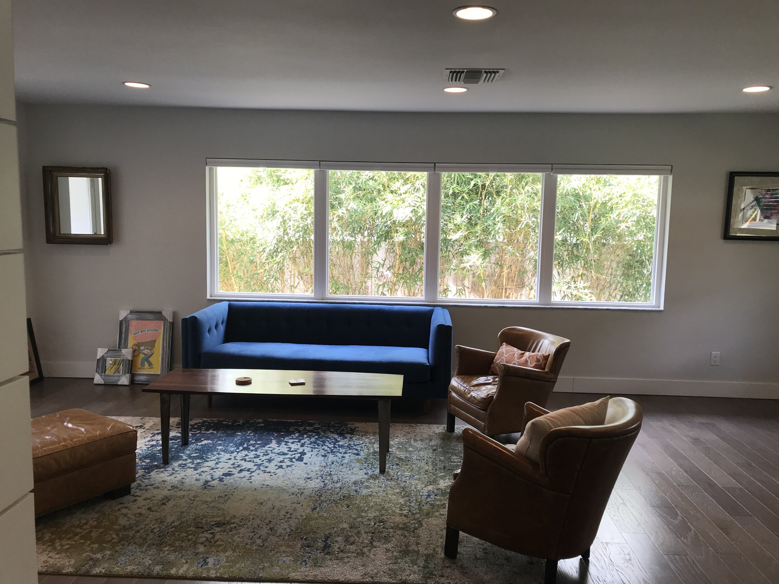
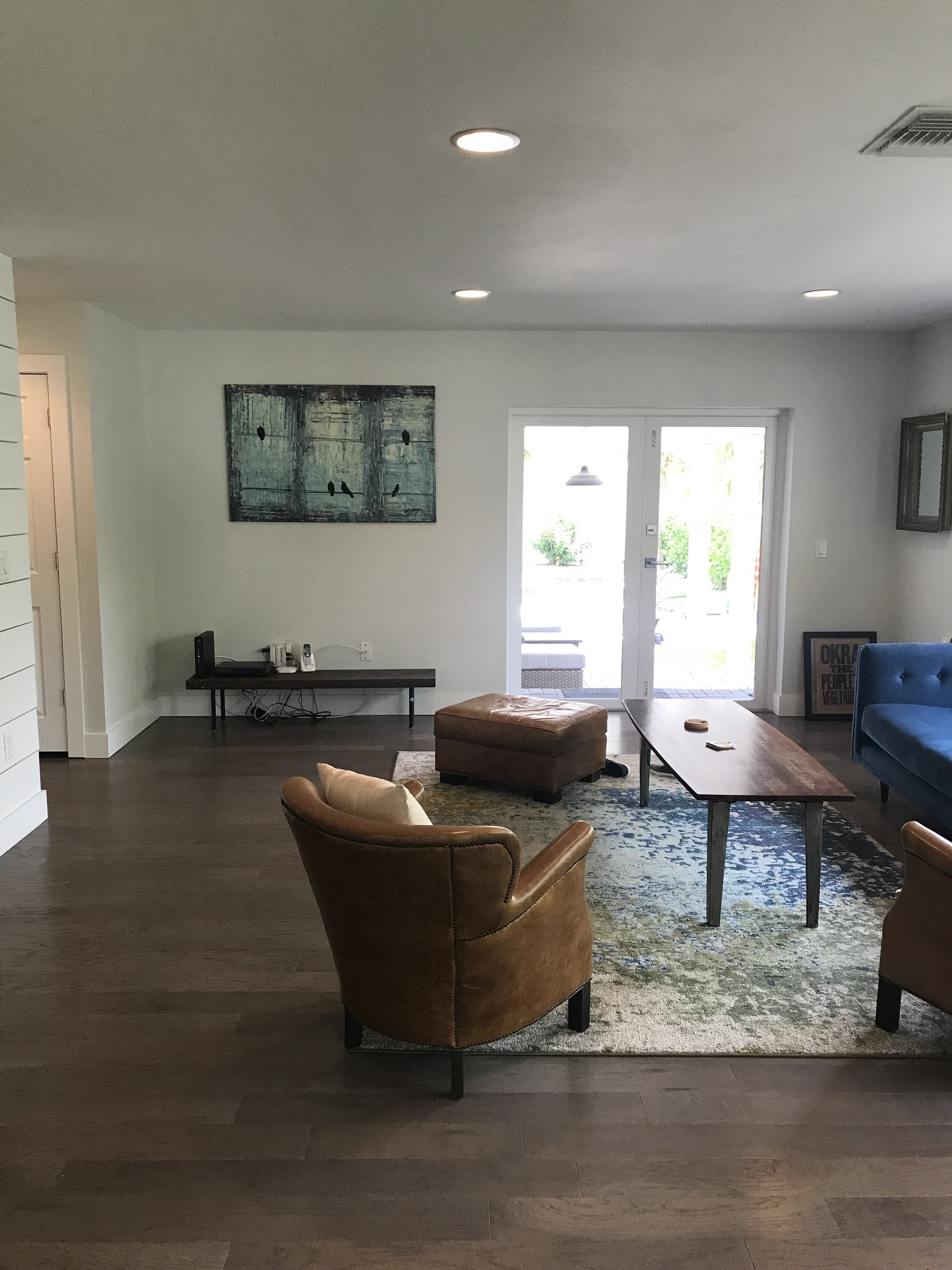
Looking at the before photos, you can see the potential, right? We knew we could give that room more justice, working on the flow of furniture, color choices and complimenting elements. We really loved the lush greenery backdrop and allowed that to play into our choices as well.


LIVING & DINING ROOM AFTER:

Creating a balance between the kitchen, dining and living room was important. Furniture layout, scale and color played a large role in this also allowing the sunlight to naturally flow through the space. A mixture of furniture selections with “visual weight” combined with sleek more “airy” options really suited the size of the space well, also allowing no interruption of sunlight to soak through the space.

LISA GILMORE DESIGN | NATIVE HOUSE PHOTOGRAPHY

We mentioned that happy, sunny and modern was the goal, right?

Well, if these sleek vintage mid century modern dining chairs revamped in this bright yellow doesn’t strike a smile and joy… we aren’t really sure what can! We personally love how the dining area is very light and airy, however, it doesn’t lack wow factor at all. Minimalist with a colorful punch.

LISA GILMORE DESIGN | NATIVE HOUSE PHOTOGRAPHY

Our client had some pretty great existing items to work with, including art collected over the years and a few key furniture pieces with personality. This home doesn’t lack in individuality.

LISA GILMORE DESIGN | NATIVE HOUSE PHOTOGRAPHY

LISA GILMORE DESIGN | NATIVE HOUSE PHOTOGRAPHY

When we talk about the art collection, we don’t mean just a few random things. They have some really cool stuff! Memorabilia from different World’s Fair’s, music posters, a collection of patches, maps, and original art. In addition to their cool and sassy art collection, they are also quite the music lovers and have a collection of records.

So we decided, these important pieces need a home, but not just tucked away storage, we wanted them to sing. (pun intended.) That inspired this functional and artsy music lounge corner.

Ample space for a large and continuously growing record collection, with the perfect perch for their record player, open shelving for plants and collectables, complete with their unique art collection, thoughtfully framed and hung in our beloved gallery style, topped off with some wall sconce lighting to create the perfect ambience.

LISA GILMORE DESIGN | NATIVE HOUSE PHOTOGRAPHY

We are pretty proud to say that we feel the happy and sunny vibe was achieved. Check out more of the home here, (complete with monkey wallpaper!) if you would like to see how we continued this feeling throughout!