INSPIRATION

5 REASONS WHY YOU SHOULD PAINT YOUR WALLS BLACK


Lisa Gilmore Design | Seamus Payne Photography

In an era of bright and white instagramable spaces (yes, we swoon over those too!) - we are think you should paint your walls black. It’s no surprise that I am a fan of dark moody spaces. I try to slide in some saturated color into a project every. single chance I get. So here are our top reasons why you should say yes to that darkest color swatch on the paint color fan deck.


1. MAKE IT COZY

Lisa Gilmore Design | Seamus Payne Photography

A dark room (especially black) has the ability to wrap you in color and create a cozy inviting space that light colors simply can’t achieve. It’s almost like the room is opening its arms to you and pulling you in for a big bear hug.


2. BENEFIT FROM CONTRASTS

Lisa Gilmore Design | Native House Photography

Other colors will contrast and bounce off like you would’t believe, so the end result is actually bringing more life to the space.


3. BLACK IS SEXY

Lisa Gilmore Design | Seamus Payne Photography

Everyone looks sexy in a black room. A black interior is flatering. Your skin tone will thank you.


4. YOUR ART WILL LOOK PHENOMENAL

Lisa Gilmore Design | Seamus Payne Photography

Your art will look PHENOMENAL. It doesn’t matter if you are an avid fine art collector, pick up art from the thrift store, have only a few key pieces and a massive collection. Your art will sing on the dark moody backdrop.


5. NO NEED TO FEAR

Lisa Gilmore Design | Seamus Payne Photography

It will not feel small, we promise. Okay - so a few factors do come into play with this promise. One, your ceilings really can’t be lower than 8 ft, and if they are, make sure you balance that dark wall with some of the following: light or bright area rugs and drapery OR light and bright furniture, also varying wood tones add interest to a dark space. (really, any space.) Additionally, if you don’t have a lot of natural light in the space, be sure to add ambient lighting through chandeliers, floor lamps, table lamps and/or wall sconces

Lisa Gilmore | Roohi Photography


GO AHEAD, PULL THE TRIGGER ON THE BLACK PAINT.

There you have it, I rest my case. Hopefully you are now dreaming up which room (or maybe you should just go for it and paint your whole place black!) that you will tackle with this amazing color. And if you get a little scared, don’t worry, we’ve got your back.

With love & design-y dreams,

Lisa Gilmore

GREEN INTERIOR DESIGN MOMENTS

A FEW OF OUR FAVORITE GREEN INTERIOR DESIGN INSPIRATION

It’s Saint Patrick’s Day weekend… while many are out drinking green brews, gathering around green rivers and hoping for the best of lucks - I am reminiscing over some of my favorite green moments with design. To be totally honest, it looks like a large amount of them deal with green velvet…

GREEN VELVET CHESTERFIELDS

There are two things that my design soul loves, and here I get to combine them all. A classic chesterfield + a juicy green velvet. Life, complete. Paired with the colorful antique area rug and its the perfect situation of color, traditional elements and modern whimsy.

Lisa Gilmore Design | Photography :: Seamus Payne

Lisa Gilmore Design | Photography :: Seamus Payne

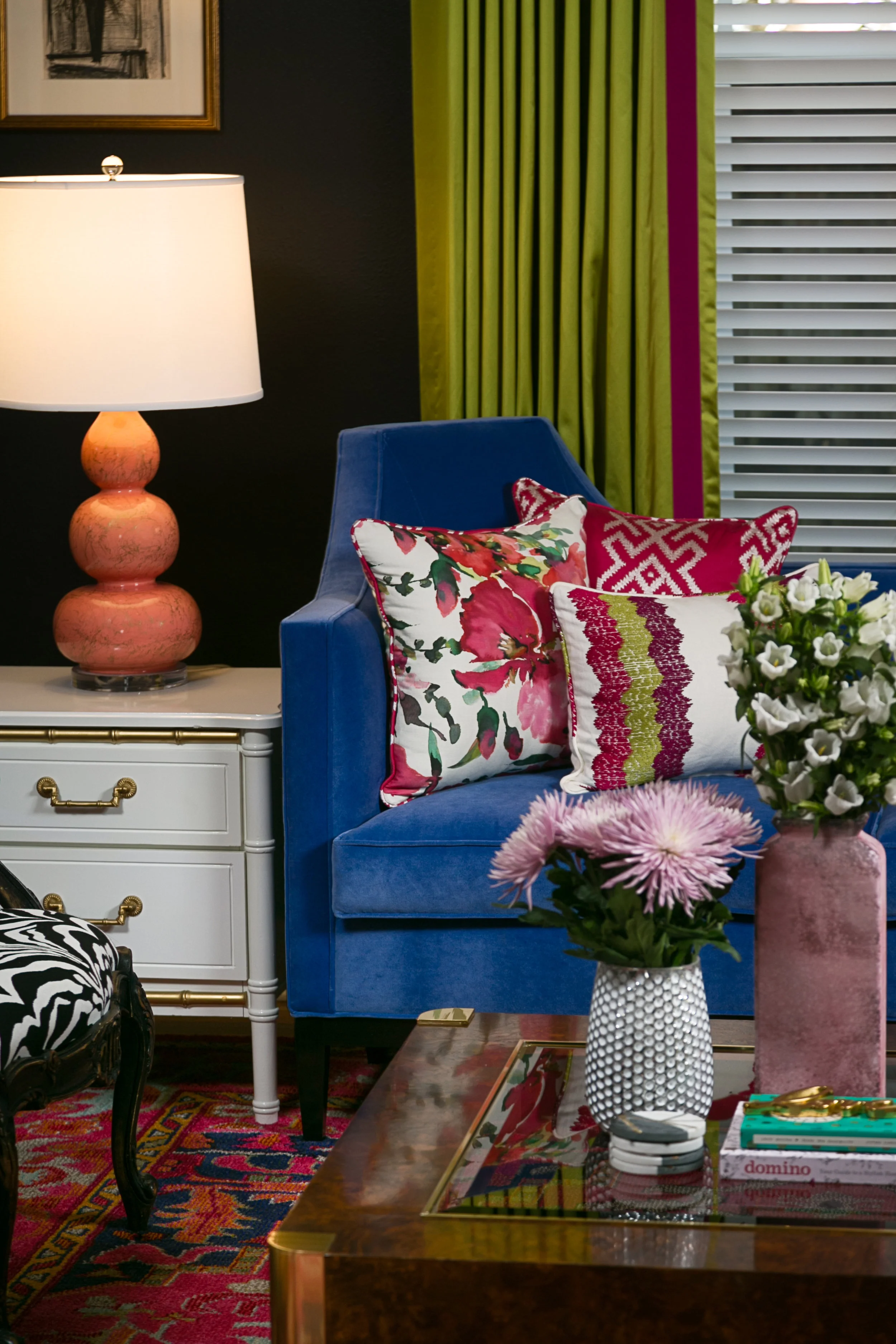
CHARTREUSE GREEN DRAPERY

What a fun space this is - silky chartreuse drapery with a pop of magenta on the leading edge. The beautiful green and magenta was delicately sprinkled throughout the rooms offset with rich black walls.

Lisa Gilmore Design | Photography:: Native House Photography

Lisa Gilmore Design | Photography:: Native House Photography

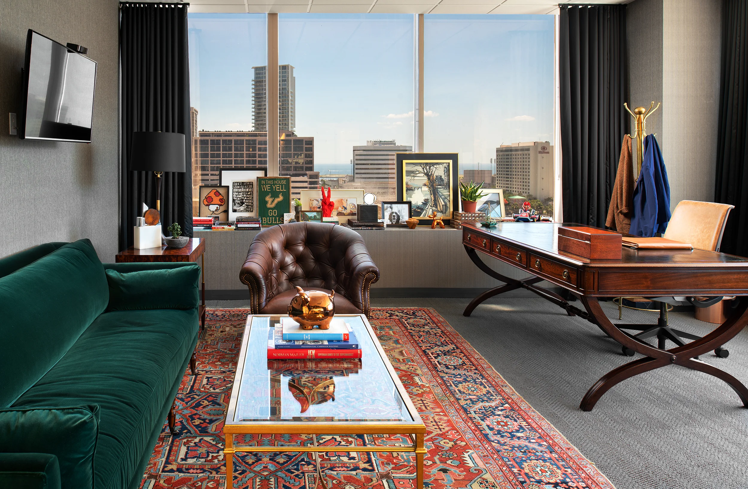
CHIC CEO OFFICE

This CEO’s office is anything but boring, this super amazing sofa is like sitting on an emerald cloud, pure heaven. I love how the entire room jives so well with the antiques, color, layers of art all while not distracting from that amazing city view!

Lisa Gilmore Design | Photography:: Seamus Payne

Lisa Gilmore Design | Photography:: Seamus Payne

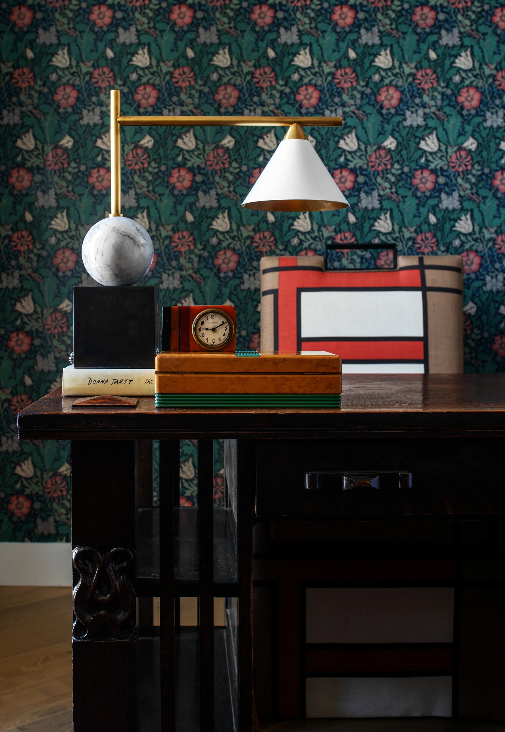
WILLIAM MORRIS WALLPAPER

What would a conversation about design be here, without at least one wallpaper showcase?! I LOVE this classic William Morris pattern wallcovering in this home office. The shades are green are so beautiful with the pops of orange hues.

Lisa Gilmore Design | Photography:: Seamus Payne

Lisa Gilmore Design | Photography:: Seamus Payne

OUTDOOR SPACE AT MANDARIN HEIGHTS

This tile for the outdoor space at Mandarin Heights makes us think of an abstract take on the forever famous banana leaf motif.

Lisa Gilmore Design | Photography:: Seamus Payne

Lisa Gilmore Design | Photography:: Seamus Payne

GREEN VELVET SECTIONAL

So, this may come as a surprise to you… (or maybe not at all!) But my personal home has velvet of its own. Everyday I walk into my living room I love this green velvet sectional finished off with the perfect antique brass nailheads. Double bonus - it’s ultra comfy, too!

Lisa Gilmore Design

Lisa Gilmore Design

I’m always inspired by my surroundings for design - there is something about the fresh green hues that our lovely mother nature has to offer that allows my heart to flutter and feel extra inspired for our projects.

So how do you take your green? Would you implement it into your home environment or would you rather keep it in your festive beer?

With love & design-y dreams,

lisa signature.jpg
Admiring green natureStanley Park, Vancouver, BC Canada

Admiring green nature

Stanley Park, Vancouver, BC Canada


DESIGN PROJECT | A CUSTOM CAPE DUTCH HOME

We just started working on a new custom residential home that is being built in sunny St. Petersburg, in the Snell Isle neighborhood. We absolutely love the start of a new project, meeting with clients, learning their styles, about their families, hobbies including everything that goes into a happy home. I joke often, but it really is a lot like dating - going back and forth, understanding likes and dislikes. Here is the vision we have created for this breezy upscale property.

A DREAMY FAMILY HOME INSPIRED BY CAPE DUTCH ARCHITECTURE

Vision board created by Lisa Gilmore Design for Custom Cape Dutch Style Home


BRITISH WEST INDIES MEETS DUTCH CAPE VIBE: POLISHED AND ELEGANT WITH MIXES OF NATURAL, APPROACHABLE AND DURABLE ELEMENTS.

 
  • Monochromatic tone all over incorporating the use of contrast to make it fresh and modern. 

  • Wow factors throughout: uses of interesting tile, lighting, architectural details, all shaking hands with supporting characters to create a beautiful and cohesive design.

  • High end resort feel: lush greenery, indoor & outdoor drapery, lovely & durable textiles and unique furnishings. Everyone comes to your house for a great time and they can leave their worries at the door, as if they were stepping into a Slim Aarons photograph  “I'm concentrated on photographing attractive people doing attractive things in attractive places”- Slim Aarons

  • Fashion influences: posh and tailored with an approachable feel, not trying too hard, luxury style that comes at an ease and makes heads turn. 

  • Modern art mixed in with modern and traditional furniture: a curated vibe, nothing will feel matchy, as if you picked up a side table on a trip to South Africa, a painting in France and a light fixture in New York. 

Rendering of Cape Dutch custom home by ClearPH

The home was designed and is being built by our friends at Peregrine Construction. We are so excited to break ground January 2019, follow along with the progress in our social media. #lisagilmore #capedutchmodern