Tuscan Kitchen’s Complete Transformation

Kitchens are one of the most fun spaces for the Lisa Gilmore Design team to design because they are often the most used room in a home. And, when we create a more beautiful and functional space for our clients, we know it changes how they have family meals, entertain, and enjoy holidays. And, it’s those everyday and special moments that make things like selecting a backsplash and countertops much more meaningful. 

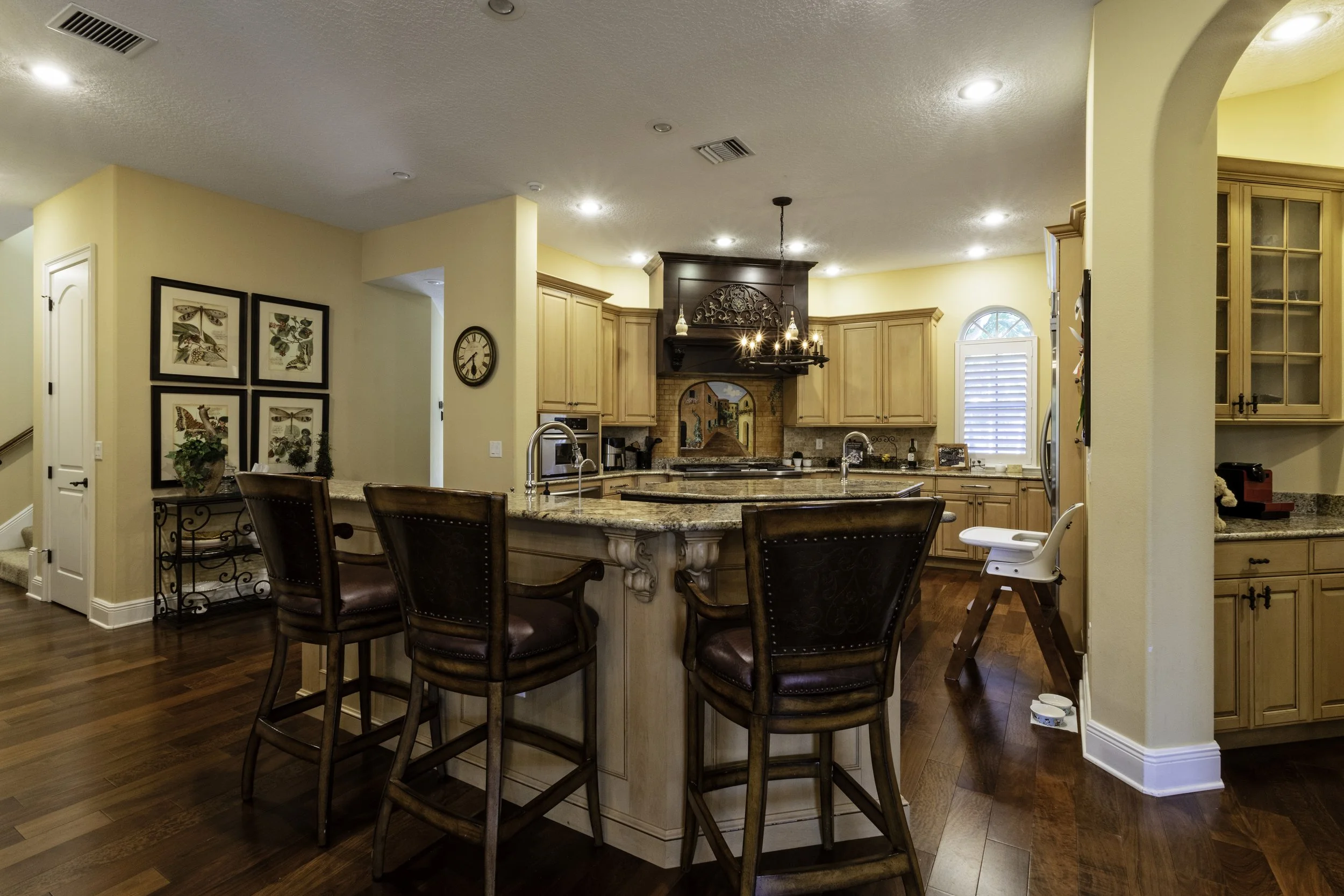
This client’s home was beautiful – a rich, Tuscan style– but they wanted something brighter and more modern. And, they needed the space to work and function better.

Dated tuscan kitchen before and after renovation

Tuscan kitchen before renovation

Dated tuscan kitchen before and after renovation

Tuscan kitchen before renovation

The original space was very awkward and overly yellow; it felt triangular and like it had been shoved into a corner of the house. What it desperately needed was a new configuration, which was central to our design.

Kitchen renovation before and after by Lisa Gilmore Design

Kitchen renovation after - Lisa Gilmore Design

Photo by: Native House Photography

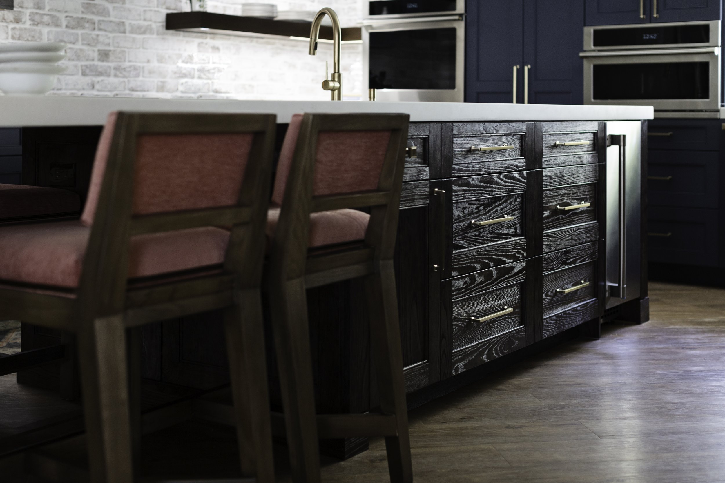
By reconfiguring the space, we were able to fit a 14-foot island in the center for food preparation and eat-in dining. And, we created a hidden pantry on the back wall that felt like a secret room!

navy blue kitchen renovation after

Kitchen renovation after - Lisa Gilmore Design

Photo by: Native House Photography

The Lisa Gilmore Design team selected concrete for the counters, and for the backsplash, brick with a pretty limewash. One of our favorite things about this kitchen is the oversized pendants that still have a bit of Tuscan flair but are more streamlined. 

We are huge fans of mixing metals, and the weathered pendants mixed with the natural brass island legs are a perfect example of how different metals can be combined well.

large kitchen island, beautiful renovated kitchen

Kitchen renovation after - Lisa Gilmore Design

Photo by: Native House Photography

And, the local carpenter we worked with did a fantastic job on the finishes, specifically the wood on the island– beating it up by hand and giving it a great patina. 

Plus, the counter stools are not only beautiful but highly durable! We dressed them in a performance fabric that is suitable for restaurants and hotels but has a soft hand for residential. This makes them ideal for families with young kids who spill things. 

The homeowners were blown away at the final reveal. “She made the heart of our home bigger without physically adding any square footage. Through unique space planning and furniture design, she really opened up the space and made it work better for our family.” 

With the holiday season quickly approaching, we love knowing that this family has a wonderful kitchen to gather and make many, many memories!

Renovating this kitchen was a great example of the importance of liveable glamour. No matter how beautiful a space is, if it doesn’t work well, it is a poor design. 

Great interior design isn’t a result of a designer imposing his or her design preferences on clients. Great design comes from discovering what glamour means to an individual homeowner and translating that into a space in a way that is functional and liveable. 

To get more tips, see our projects, and find ideas for adding liveable glamour to your home, follow me on Instagram or sign up for our newsletter.
Four Condos. Four Different Styles.

Condo construction is on the rise in metropolitan areas, especially cities in the southern and western U.S. And with good reason. 

Living in a condo has its advantages. They are ideal for individuals and families who want to avoid the maintenance of a larger home, travel frequently, want community amenities, or enjoy being close to entertainment and businesses. 

But, there are a few disadvantages that make potential buyers hesitant to select a condo, including a lack of privacy and limited parking. 

Another potential drawback is the myth that condos limit a homeowner’s style and decor, because it is essentially a concrete box. That’s where we beg to differ.

Lisa Gilmore Design wants to inspire you to think outside the box when it comes to condos.

We want to spotlight four condo projects we have designed with four completely different styles.


  1. High Rise, High Style

This 2,000-square-foot condo has three bedrooms, three bathrooms, and a den. The Lisa Gilmore Design team fully furnished the entire condo and renovated the kitchen and powder room.

Chic and glamorous interior design, luxury condo real estate, St. Petersburg , Tampa Bay, Florida

Lisa Gilmore Design | Seamus Payne Photography

One of our favorite parts of this project was the custom marble backsplash that we designed to go perfectly with the space - it's a true piece of art.

black and white kitchen, marble kitchen backsplash, luxury high rise, st. petersburg, florida

Lisa Gilmore Design | Seamus Payne Photography

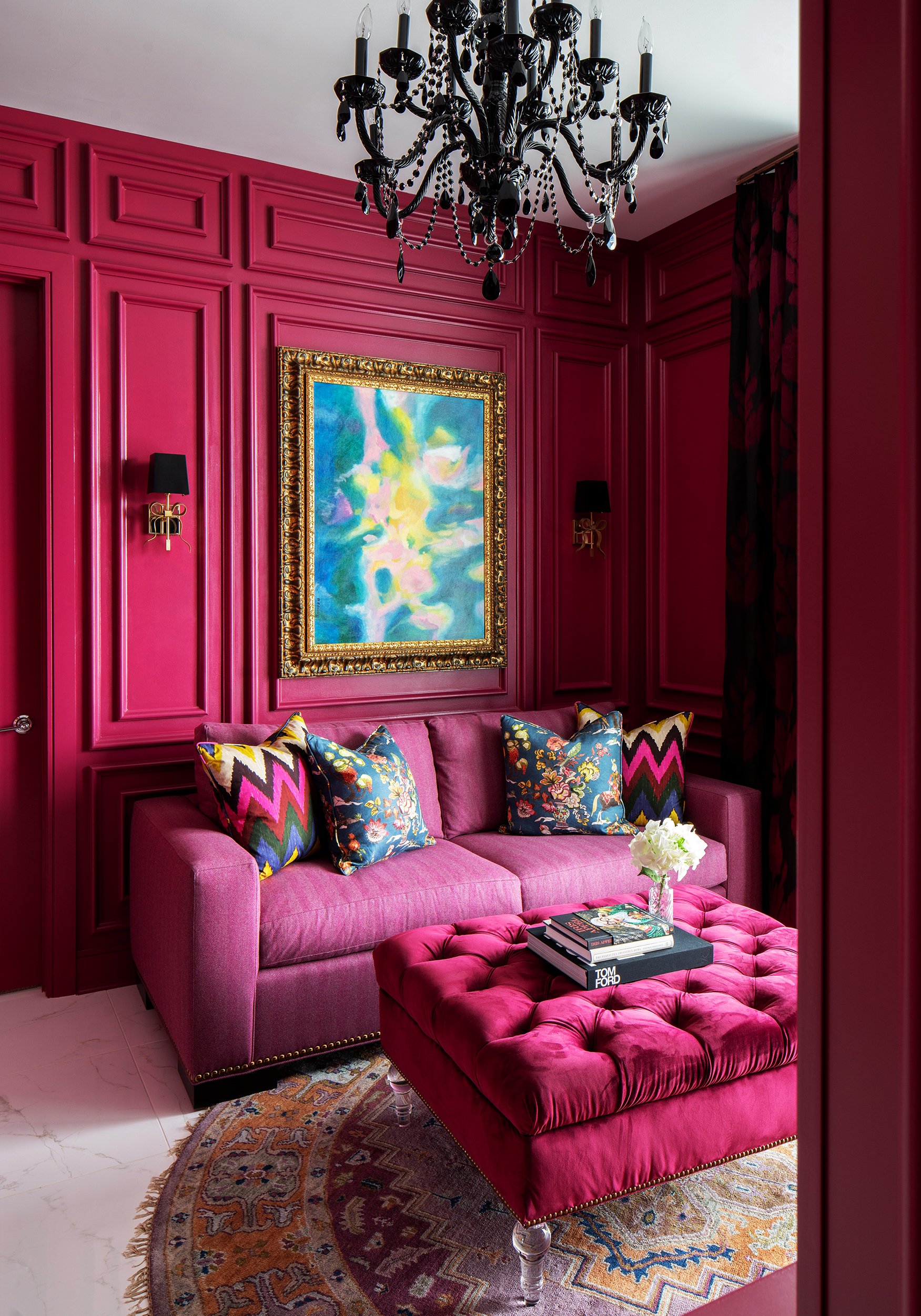
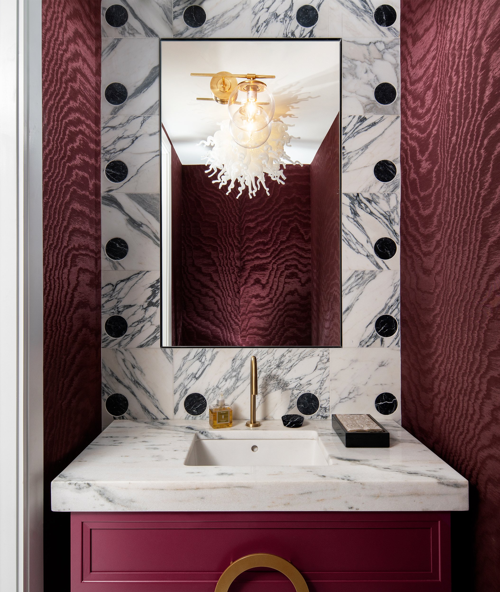
The lighting selections, the millwork details in the raspberry-colored den, and the tile in the powder room were highlights as well.


2. Color-Blocked Painters Palette

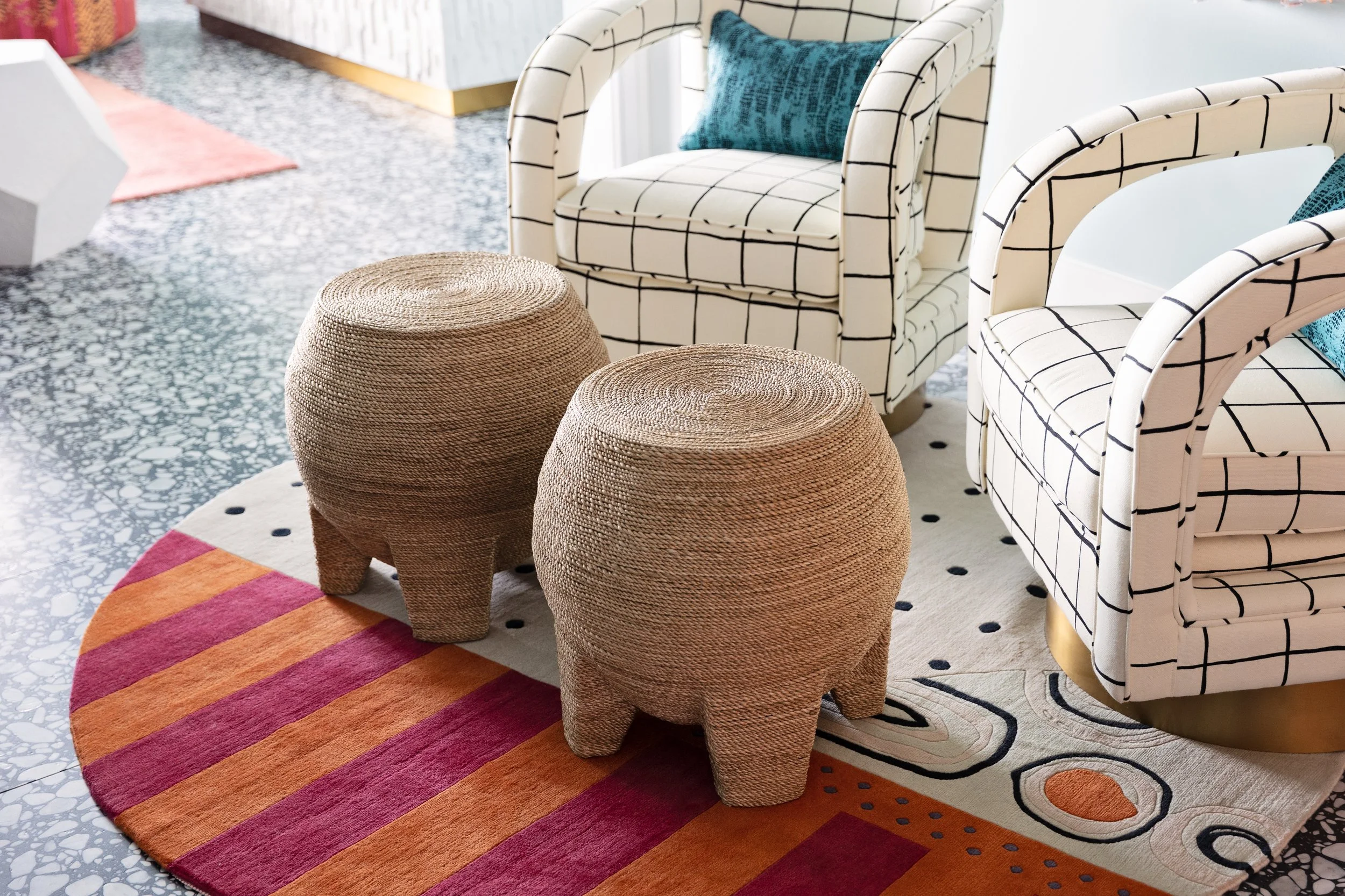
Our team designed everything in this 2 bedroom, 2.5 bath, and den condo as featured in Florida Design. The project entailed everything from flooring and tile, to lighting, to paint and wallpaper, to all the furnishings.

Colorful, modern and artsy luxury condo in St. Petersburg, Florida

Lisa Gilmore Design | Native House Photography

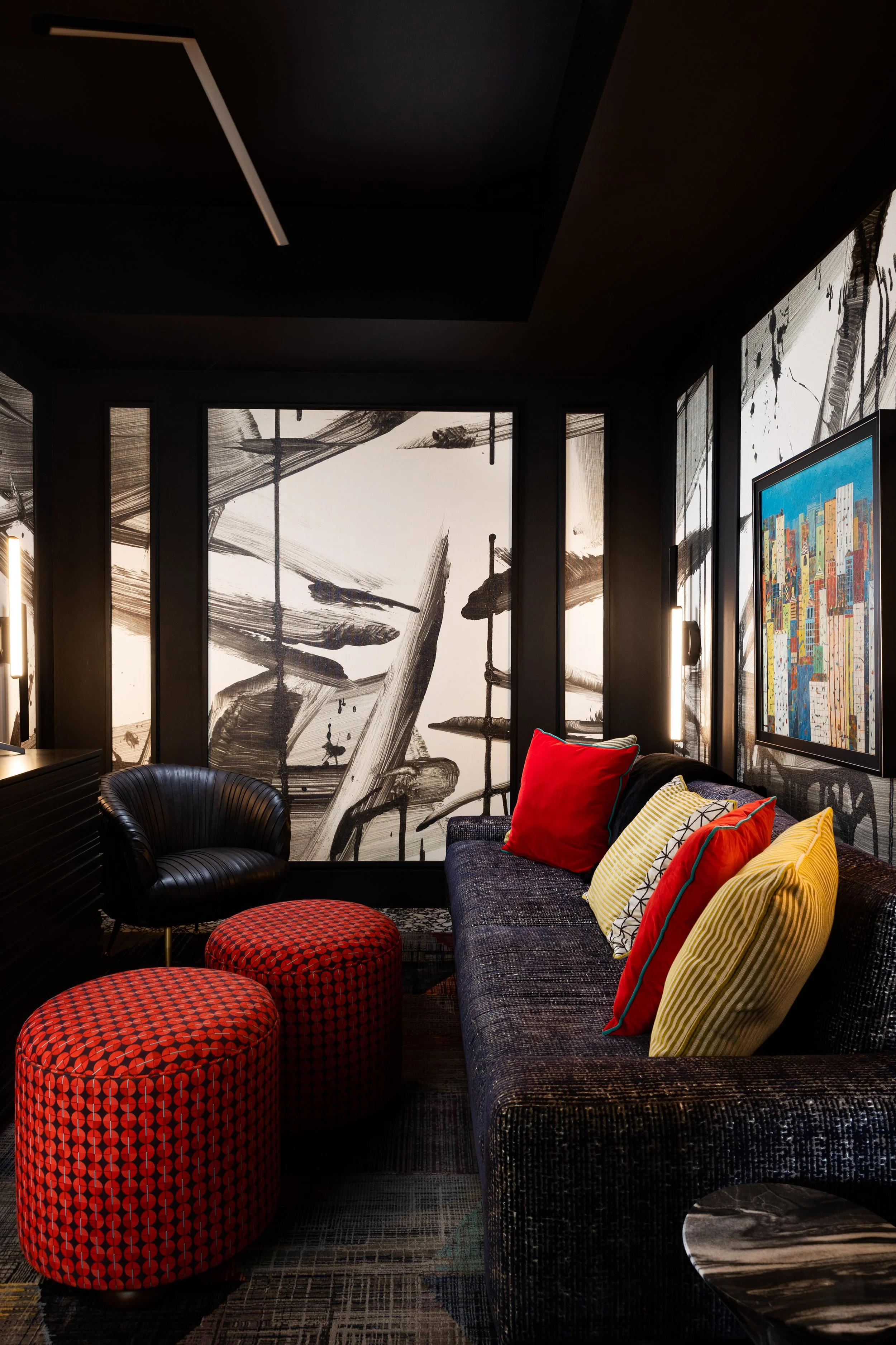
One of the highlights of this project were the ottomans and area rug (pictured below) that we designed and fabricated exclusively for this home.

colorful and modern luxury interior design, high rise interior design, tampa bay florida

A moody den, complete with custom ottomans by Lisa Gilmore Design | Native House Photography

modern and funky area rug, luxury interior design_ lisa gilmore design

A custom designed area rug by Lisa Gilmore. Lisa Gilmore Design | Native House Photography

Another favorite was the red desk, which was custom designed and made by OTTRA, which is based out of Brooklyn, NY. Lisa met the owners of OTTRA several years ago during the Brooklyn Design Festival, and they were finally able to collaborate on this beautiful desk in the home office/guest room.

colorful home office interior design, bold art, modern living, lisa gilmore design, St. Petersburg, Florida

Lisa Gilmore Design | Native House Photography


3. Artful Art Deco

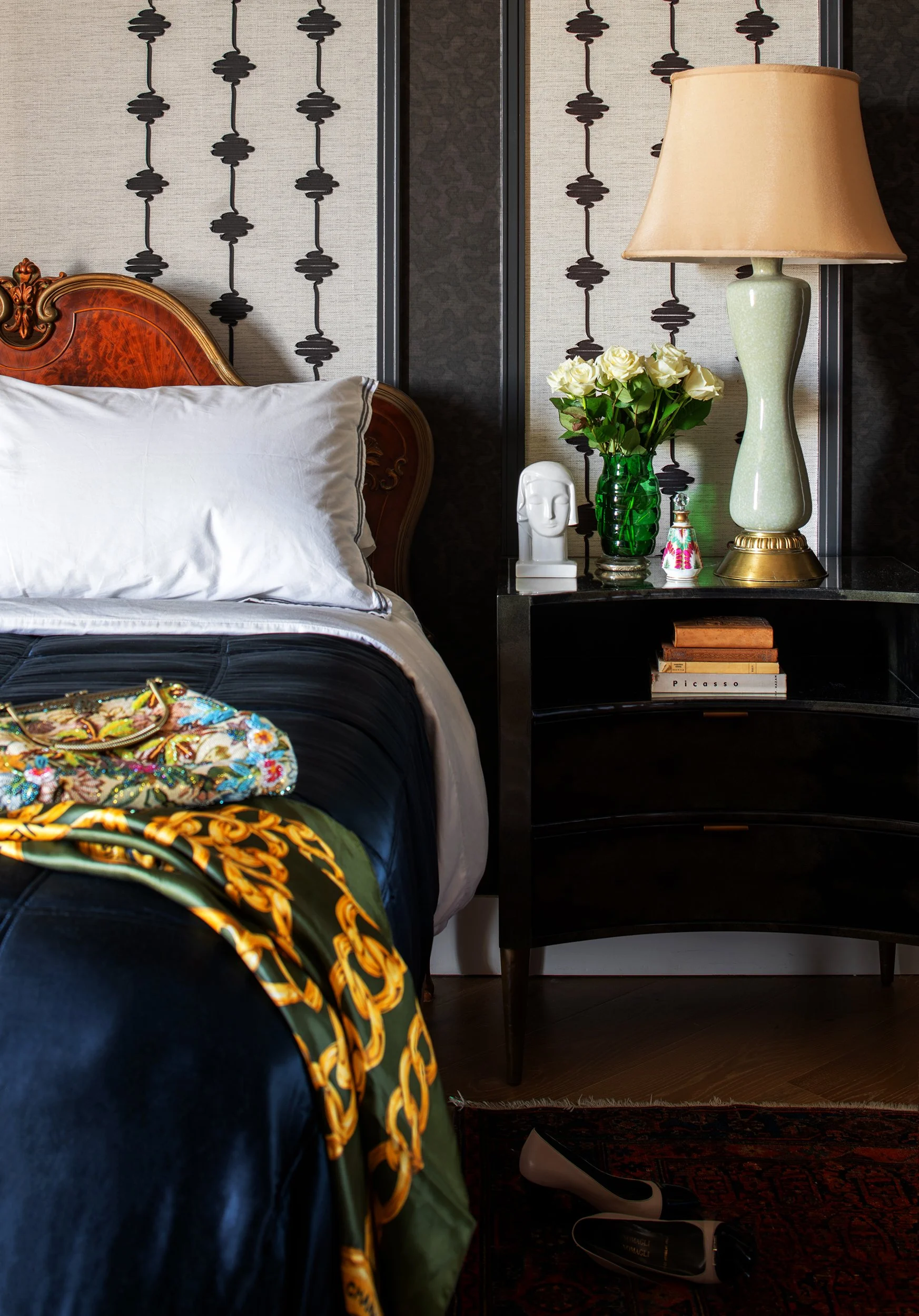
This 2 bedroom, 2 bath condo was featured in RUE magazine. The LGD team’s design included all the furnishings, converting the dining area into a music lounge, and the guest room into a home office.

art deco eclectic interior design, luxury high rise interior design, st petersburg, florida, lisa gilmore design

Lisa Gilmore Design | Seamus Payne Photography

The client had a wonderful collection of antique area rugs that were a treat to work with.

art deco interior design_eclectic living_antiques and modern living_ luxury high rise, st petersburg, florida, lisa gilmore design

Lisa Gilmore Design | Seamus Payne Photography

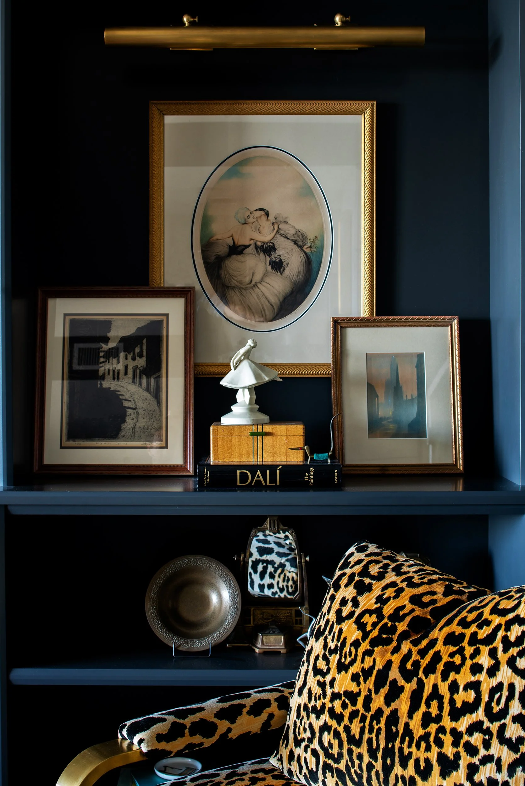
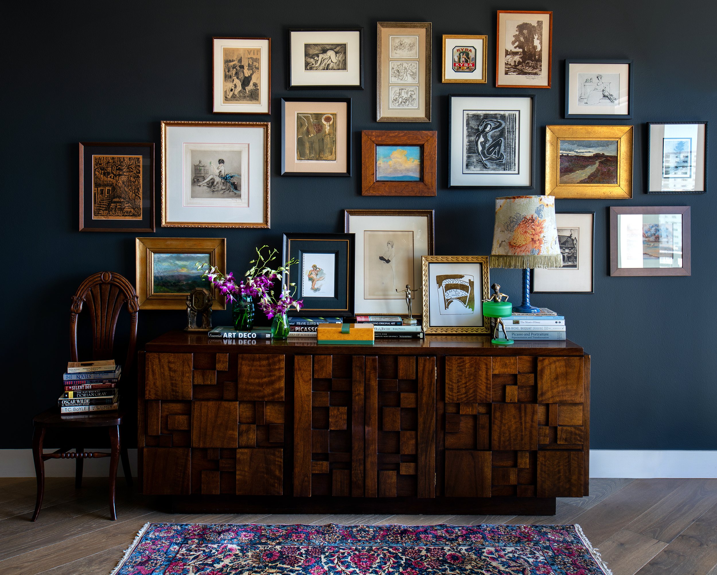
She also had several arts and crafts and art deco pieces, which allowed us to capture her spirit, while pairing the pieces with modern items for an updated look.

art deco interior design, eclectic modern interiors, luxury high rise interior design, antiques, st. petersburg, florida, lisa gilmore design

Lisa Gilmore Design | Seamus Payne Photography

art deco interior design, art collection, luxury high rise interior design, moody interior design, st. petersburg, florida, lisa gilmore design

Lisa Gilmore Design | Seamus Payne Photography


4. Fresh Hues Waterfront Retreat

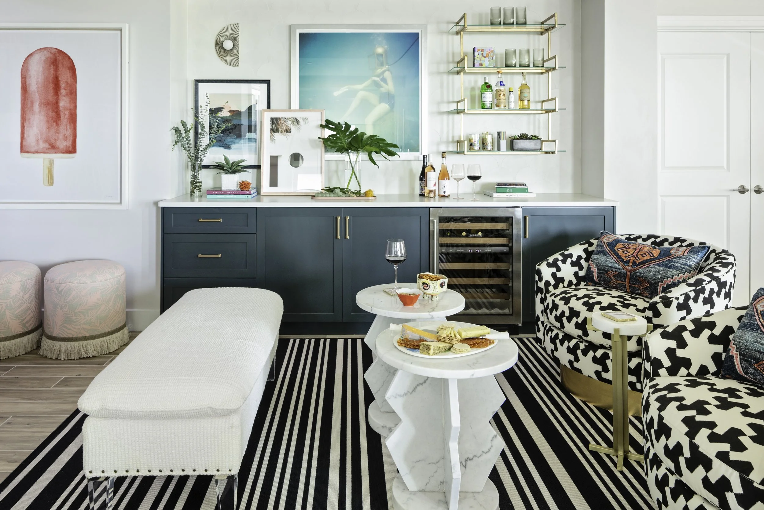
This 3 bedroom, 3.5 bath condo project involved furnishing the entire space and assisting with hard surface selections. Lisa Gilmore Design created a bar lounge area that flows wonderfully with the living room, dining room, and kitchen - the ultimate entertaining set up!

vacation home interior design, coastal interior design, modern interior design, whimsical vacation home, florida waterfront living, lisa gilmore design, florida design

Lisa Gilmore Design | Native House Photography

One of the unique aspects of this project was the amazing use of the space with 80% of the selections being indoor/outdoor items. Because this is a beach condo, this helps increase the longevity of the space, and extend the living areas outdoors. We truly loved all our use of textiles, pattern and color here. It feels so fresh, exciting, and not at all overwhelming.

colorful vacation home interior design, coastal modern interior design, unique beach interiors, lisa gilmore design, waterfront living, florida home

Lisa Gilmore Design | Native House Photography

And, this was also a special project because we designed the banana-leaf chandelier in the living room with a local metalworker and electrician.

coastal interior design, colorful interiors, artsy interior design, luxury waterfront living, florida, lisa gilmore design, porter teleo fabric

Lisa Gilmore Design | Native House Photography

brass banana leaf lighting, chandelier, luxury interior design, unique lighting, lisa gilmore design

Lisa Gilmore Design | Native House Photography

Despite their box-like layout, condos actually make a fantastic blank canvas for a designer to infuse your personality and style into your home. By combining unique colors, custom furnishings and lighting, and luxurious flooring, we can highlight the best features of your space and show off one of the best aspects of condo living– an abundance of natural light and incredible views.

To get more tips, see our projects, and find ideas for adding liveable glamour to your home, follow me on Instagram or sign up for our newsletter.

Take Your Gallery Wall from Boring to Glamorous

Gallery walls first became popular in the early 2000s, and even more than 20 years later, they are still a feature many homeowners love and want to incorporate into their homes.

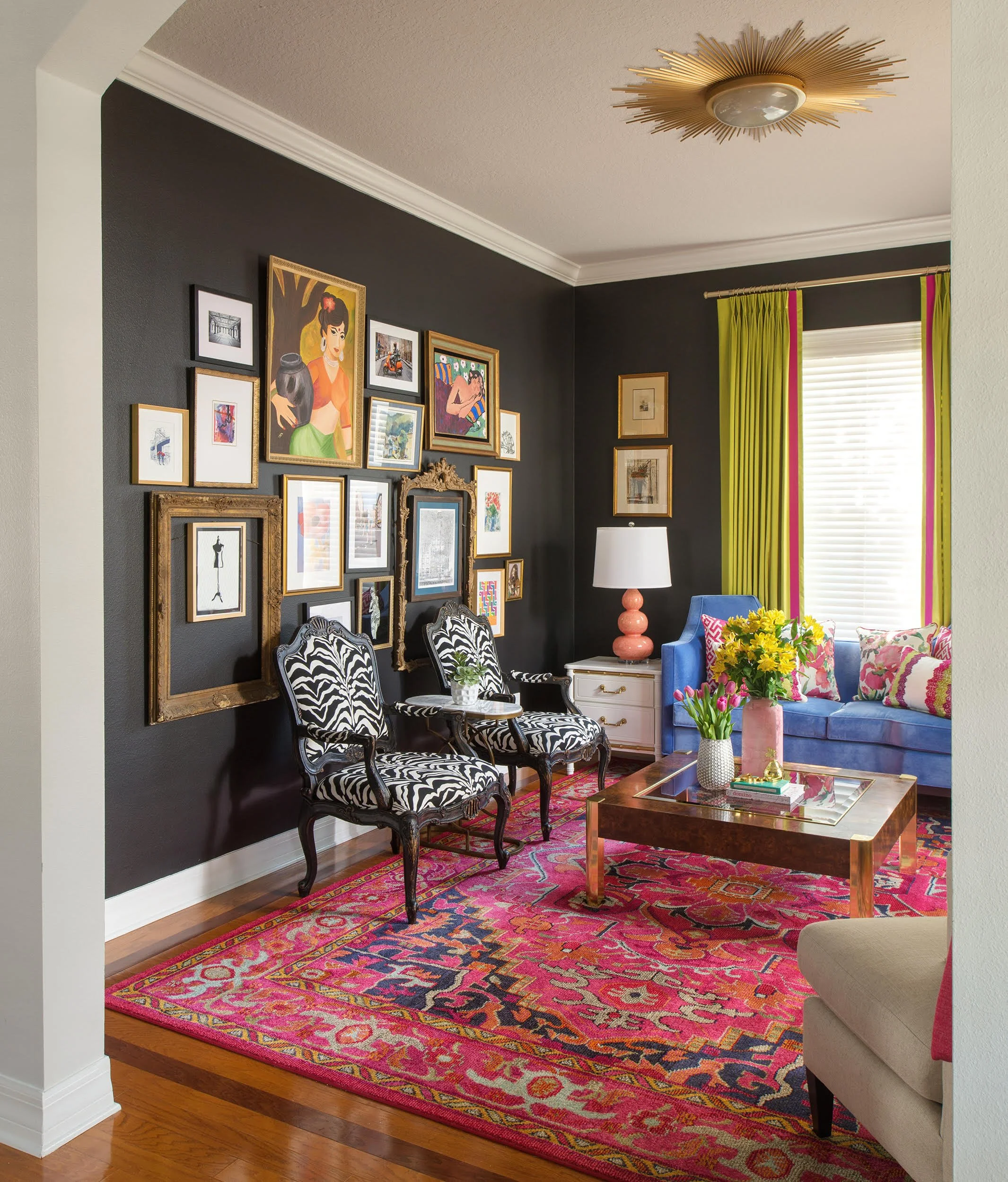
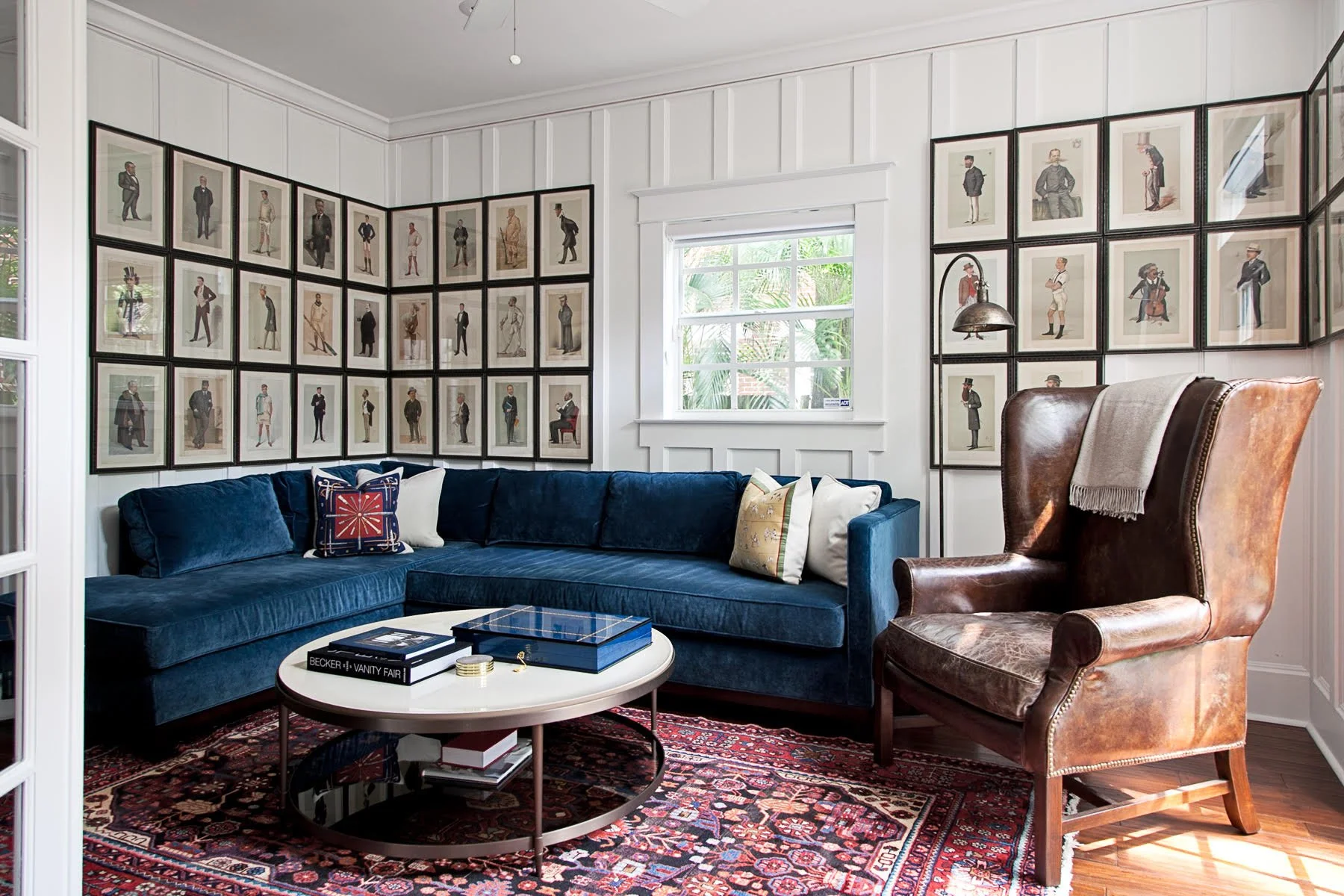
However, there is no reason a gallery wall has to be a traditional collection of photos. The Lisa Gilmore Design team has created many gallery wall installations, but always with a creative twist.

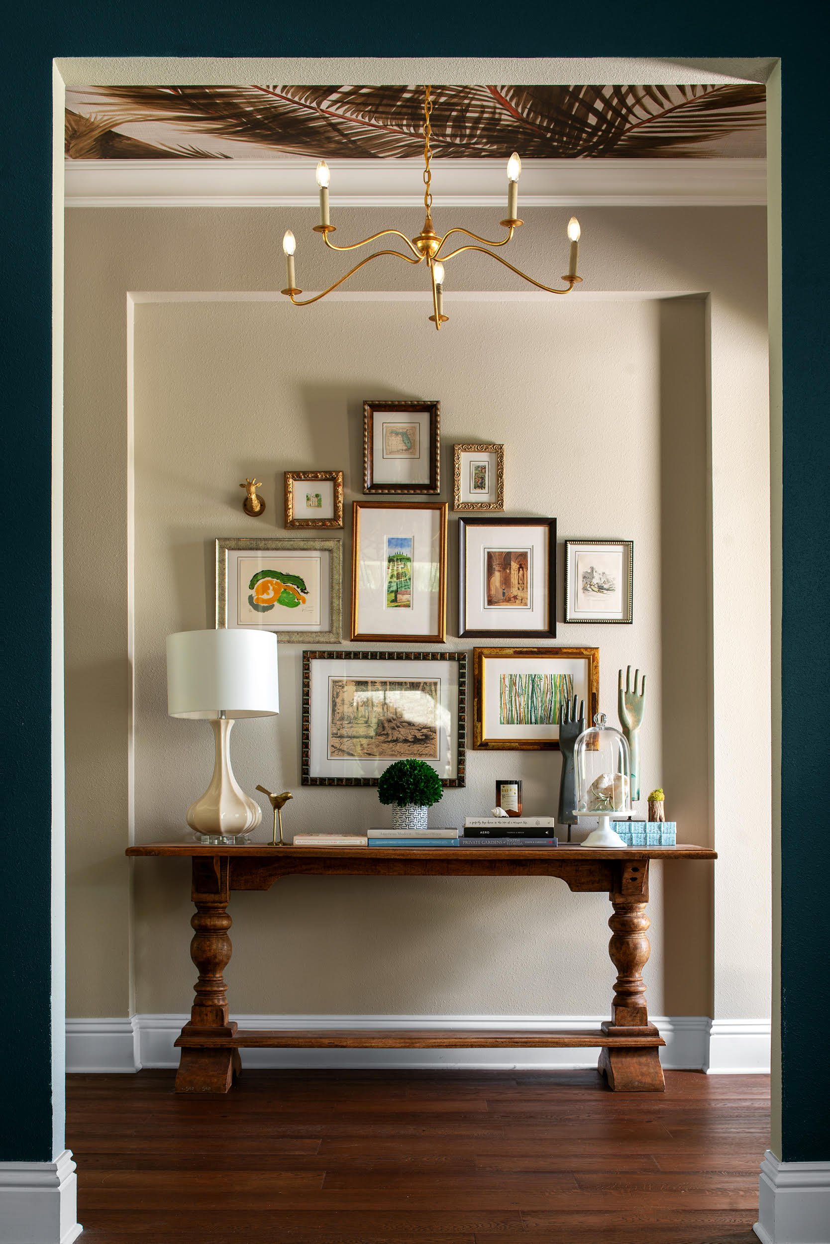
Lisa Gilmore Design Gallery Wall

Here are a few ideas for giving traditional gallery walls a fresh and modern twist. 

6 Creative Gallery Wall Looks 

Child Artwork

Display your child’s favorite masterpieces on your gallery wall. Swap the pieces out every so often to keep your gallery wall fresh.

Travel Postcards

Relive your travel memories every day by placing postcards on a gallery wall. You can add other travel-related items to your gallery wall too, such as ticket stubs, maps, and currency.

Living room gallery wall designed by Lisa Gilmore a Florida Interior Designer

What better way to remember your loved ones than to display family mementos. Things like recipes, handwritten cards, and war memorabilia keep your loved one’s memory alive and foster conversation with guests.

Mirrors

We all know that mirrors reflect light and make rooms feel larger. Mirrors also invite energy into a space and add dimension to a gallery wall. And, you don’t have to stick to a traditional, rectangular shape. You can look for a mirror with a funky frame or shape to add interest to your wall.

Creative Framing

Speaking of different types of frames, there are so many options to choose from, but it is best to commit to one style for your wall. You could go with a wild and whimsical vibe or pick frames that are more stately and grand.

Non-Traditional Items 

Think outside the box when it comes to selecting items for your gallery wall. Non-traditional items like hats, shallow baskets, and plates add interest and texture to a gallery wall.

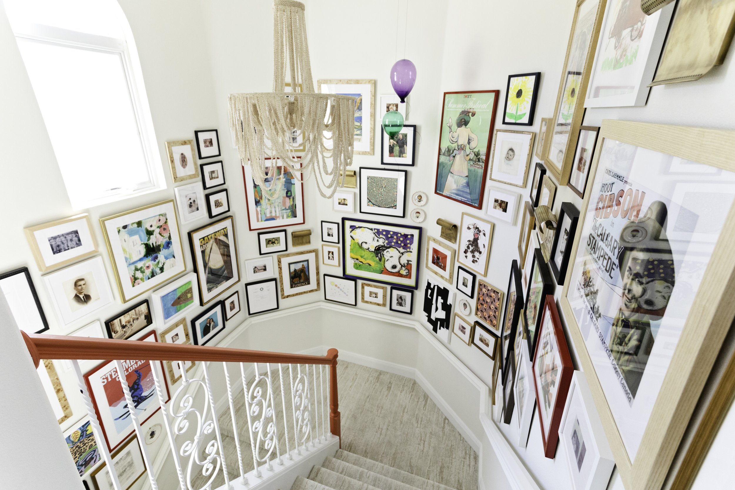
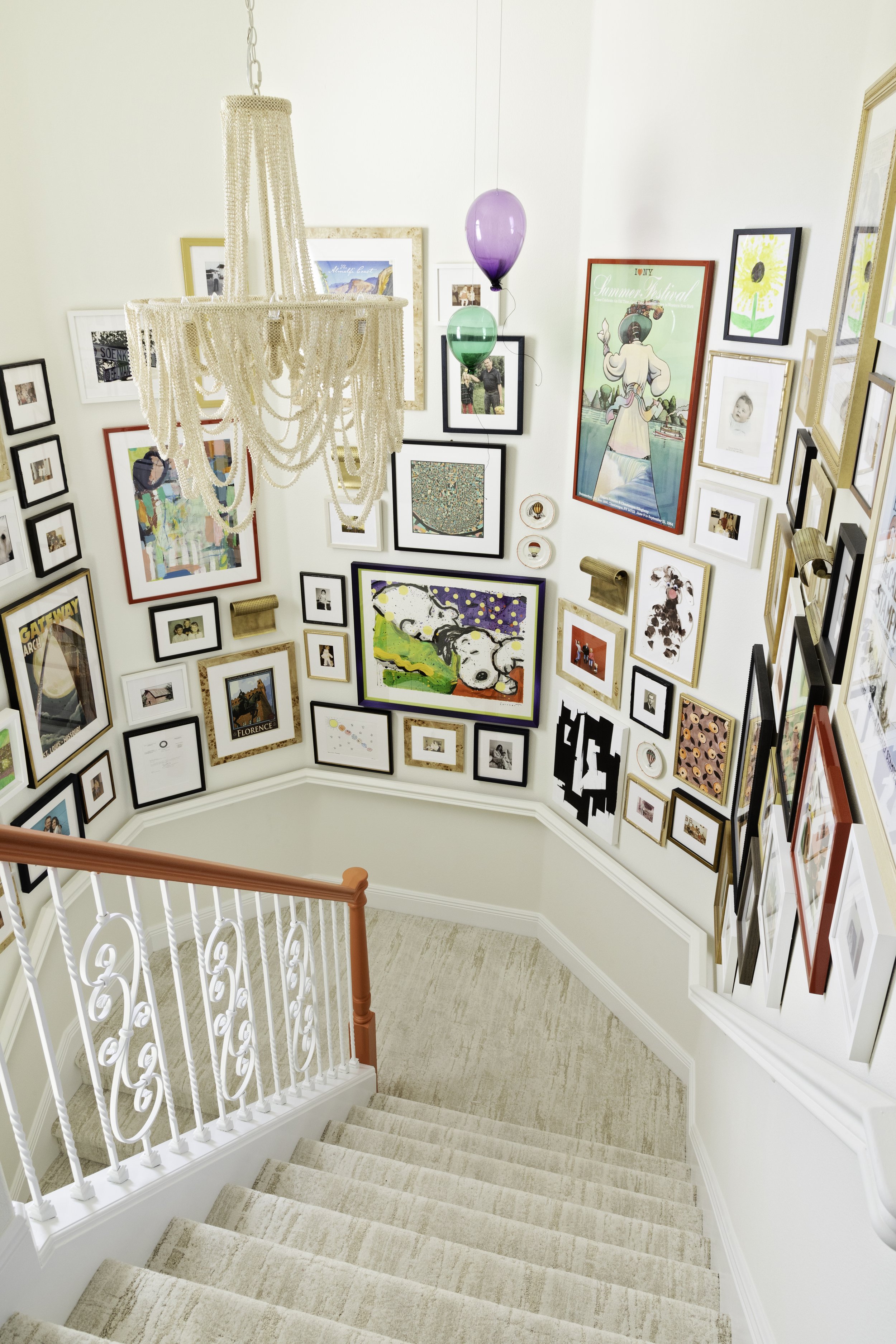
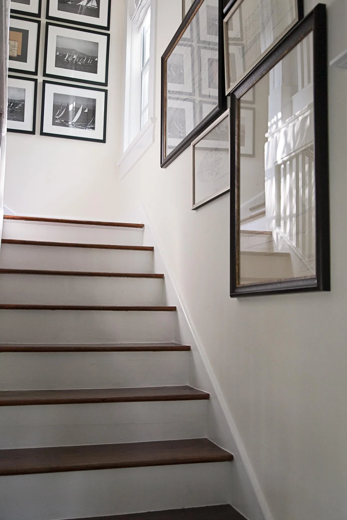
Installing a gallery wall in your home is a great way to add interest, and, at the same time, display objects that are meaningful to you. When creating your wall, think of yourself as a museum curator, and consider what type of art you might like to add to your collection. The possibilities are endless.

A stairway gallery wall designed by Lisa Gilmore a Florida interior designer.

To get more tips, see our projects, and find ideas for adding liveable glamour to your home, follow me on Instagram or sign up for our newsletter.


Unexpected Use of Purple in a Home Office

It’s no secret that the Lisa Gilmore Design team loves injecting bold and bright colors into our clients’ homes.

But, even more important to us is giving our clients spaces that are reflections of their unique personalities and lifestyles. 

And, on some projects, those two things– client desires and bold colors– combine to create something really special.

That’s what happened on this project. The homeowners had spent 12 years living in Singapore where the style was all-white and minimal. When they purchased a 1,522-square-foot condo in downtown St. Petersburg, they were ready for a change. In fact, the homeowner said, “I told Lisa we wanted bright and colorful, and that if [my wife] went behind my back to ask for off-white, to please report back to me.”

Our team kept this in mind when approaching the home office. 

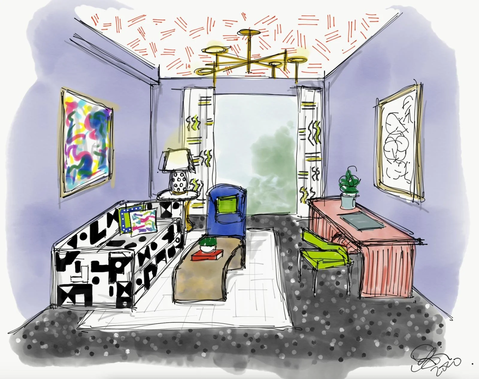
Lisa Gilmore Design Purple Office Rendering

There were two rooms in the house– the office and the primary suite– in which we didn’t use the client’s existing art. At first, it was intimidating to not have a prized art piece for direction; it was true open design! But then we found the Erin McIntosh piece and knew it would be perfect over the sofa. 

And, for the space adjacent over the desk, we selected a beautiful embroidery piece stitched on handwoven silk canvas made by Akiko Kotani in the 70s. It was the perfect delicate, but bold, piece to complement the geometric sofa and drapery.

Photo by Native House Photography

When it came to paint color, we wanted a color that set a playful tone for bold art and fabrics but didn’t look childish. We looked at many colors, and honestly questioned if we were pushing the limits too much with Benjamin Moore’s Softened Violet, but instinct kept bringing us back to it. It feels fresh, happy, and soothing all at once. When you walk in the room, you instantly feel the happy, artsy energy!

This room intentionally throws color in your face. And, the clients were thrilled with the end result.

Photo by Native House Photography

Photo by Native House Photography

If you like purple and violet hues, there are many ways to incorporate them into your home. If painting an entire wall or room purple is too bold for you, consider incorporating purple through upholstery or drapery fabrics. Or, find an older, vintage piece of furniture, and give it new life with fresh paint. Imagine a lovely bookcase in this striking, happy color!

To get more tips, see our projects, and find ideas for adding liveable glamour to your home, follow me on Instagram or sign up for our newsletter.

The homeowner works from home and frequently has Zoom calls, so having a pretty background was important.